When it comes to transforming your living space with art, minimalist landscape art prints offer a unique combination of sophistication and tranquility. These artworks strip away unnecessary details to reveal the essence of natural beauty, creating powerful visual statements through simplicity. Whether you’re redesigning your entire home or adding a finishing touch to a single room, understanding the nuances of minimalist landscape prints will help you make informed choices that elevate your interior design.
Minimalist landscape art prints focus on essential elements like clean lines, muted color palettes, and negative space to convey serene natural scenes. These prints typically feature simplified compositions that might include distant horizons, abstract representations of mountains, or stylized depictions of coastlines. The beauty lies in what is left out rather than what is included, creating a sense of calm and spaciousness that complements modern interiors perfectly.
Defining Characteristics of Minimalist Landscape Art
Minimalist landscape prints are distinguished by several core visual elements that set them apart from traditional landscape artwork. These characteristics work together to create pieces that feel both modern and timeless.
The primary feature is the emphasis on negative space, which refers to the empty or unoccupied areas within the composition. This deliberate use of “nothing” draws attention to the subject matter and creates breathing room for the eye. Furthermore, these prints often employ limited color palettes, typically featuring two to four colors that harmonize effortlessly.
Essential Visual Elements
Understanding the building blocks of minimalist landscape art helps you identify authentic pieces and appreciate their design philosophy. These elements include:
- Simplified geometric forms that reduce natural landscapes to basic shapes
- Strong horizontal or vertical lines that create structure and balance
- Subdued color schemes often featuring earth tones, pastels, or monochromatic ranges
- Absence of intricate details or busy textures
- Strategic focal points that guide the viewer’s attention
- High contrast between elements to create visual interest without complexity
These visual elements combine to produce artwork that feels intentional and contemplative. Consequently, minimalist landscape prints work exceptionally well in spaces where you want to promote relaxation and mental clarity. The fundamental principles of landscape composition still apply, but they’re distilled to their purest form.
Color Theory and Palette Selection
Color plays a crucial role in minimalist landscape art, despite the typically limited palette. The strategic use of hue, saturation, and value creates mood and depth without overwhelming the composition.
Most minimalist landscape prints favor either monochromatic schemes or analogous color combinations. Monochromatic palettes use variations of a single color, creating unity and sophistication. Meanwhile, analogous schemes combine colors that sit next to each other on the color wheel, such as blues and greens or oranges and yellows.
Popular Color Combinations
Certain color schemes have become particularly popular in minimalist landscape art due to their psychological effects and design versatility. Neutral palettes featuring beige, gray, and white create a sense of calm and work with virtually any decor style. Earth-toned combinations using terracotta, ochre, and sand evoke warmth and connection to nature.
Cool palettes dominated by blues, grays, and soft greens promote tranquility and work beautifully in bedrooms or meditation spaces. Additionally, warm minimalist palettes incorporating blush pinks, soft corals, and warm grays add gentle energy without sacrificing simplicity. For guidance on matching these colors to your existing decor, color coordination principles can prove invaluable.
Psychological Impact of Color Choices
Understanding how different colors affect mood helps you select prints that serve your space’s intended purpose. Blue-dominated landscapes create feelings of serenity and openness, making them ideal for stress-reduction areas. Conversely, warmer tones with subtle oranges and yellows can energize a space while maintaining minimalist restraint.
Neutral palettes allow other design elements to take center stage, making them perfect for spaces where the art should complement rather than dominate. Therefore, consider both the aesthetic appeal and the emotional response when selecting your minimalist landscape prints.
Composition Techniques That Define the Style
The compositional approach in minimalist landscape art follows specific principles that maximize visual impact while maintaining simplicity. These techniques separate compelling pieces from those that merely appear empty or unfinished.
The rule of thirds remains important, but minimalist artists often push subjects to the extreme edges of the frame. This creates tension and interest through unconventional placement. Moreover, leading lines guide the viewer’s eye through the composition, even when those lines are implied rather than explicitly drawn.
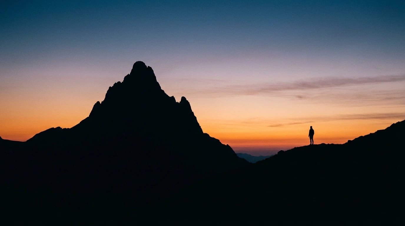
Creating Depth Without Detail
Minimalist landscape prints achieve a sense of depth through layering simple shapes at different scales and using atmospheric perspective. This technique involves making distant elements lighter and less distinct, mimicking how our eyes perceive distant landscapes naturally.
Overlapping geometric forms create spatial relationships without requiring detailed rendering. A simple silhouette of a mountain range in the foreground with a lighter wash representing sky demonstrates this principle perfectly. Additionally, the strategic use of value contrast—placing light against dark—creates separation between elements.
Balance and Symmetry Considerations
While symmetrical compositions appear occasionally in minimalist landscape art, asymmetrical balance is more common. This approach distributes visual weight unevenly but harmoniously across the composition. A small, dark element might balance a larger, lighter area, creating dynamic equilibrium.
Therefore, successful minimalist landscapes feel stable and intentional rather than accidentally sparse. The placement of each element serves a purpose, contributing to the overall composition’s harmony. This deliberate approach aligns with the broader minimalist art movement that emerged in the mid-20th century.
Room-by-Room Placement Strategies
Different rooms in your home benefit from specific approaches to displaying minimalist landscape art prints. Understanding these nuances ensures your artwork enhances each space’s function and aesthetic.
Living rooms typically serve as social spaces where conversation and relaxation occur. Here, larger minimalist landscape prints create focal points without overwhelming the room’s energy. Position these prints at eye level, approximately 57-60 inches from the floor to the center of the artwork.
Bedroom Display Considerations
Bedrooms require artwork that promotes restful sleep and personal tranquility. Consequently, minimalist landscape prints with cool color palettes and horizontal orientations work exceptionally well. The horizontal format mimics the horizon line, which our brains associate with rest and stability.
Consider placing a single large print above the headboard or creating a small gallery wall with three matching pieces. The simplicity of minimalist art prevents visual overstimulation before sleep. Furthermore, proper display techniques ensure your prints maintain their serene quality.
Office and Workspace Applications
Home offices and workspaces benefit from minimalist landscape art that inspires focus without distraction. Vertical formats can make rooms with lower ceilings feel taller, while simplified landscapes provide mental breaks during intensive work sessions.
Position prints where you can see them during brief pauses but not directly in your primary line of sight when working. This placement allows the artwork to serve as a visual reset point. Additionally, neutral or cool-toned minimalist landscapes help maintain a professional atmosphere while adding personality to the space.
Framing and Presentation Methods
The way you frame and present minimalist landscape art prints significantly impacts their overall effect. The right framing choices complement the artwork’s simplicity rather than competing with it.
Simple, clean frames in natural wood, black, or white work best with minimalist landscapes. These neutral options allow the artwork to remain the focal point. Moreover, the frame width should be proportional to the print size—larger prints can handle wider frames, while smaller pieces benefit from slimmer profiles.
Matting and Border Decisions
Matting creates visual breathing room between the print and frame, which particularly enhances minimalist artwork. White or off-white mats are classic choices that work with virtually any color palette. However, selecting a mat color that appears in the print can create sophisticated continuity.
The mat width typically ranges from 2-4 inches, with larger prints accommodating wider mats. Nevertheless, some minimalist prints benefit from frameless presentation or float mounting, where the print appears to hover within the frame. For comprehensive guidance, professional hanging techniques can ensure optimal results.
Alternative Presentation Styles
Beyond traditional framing, several contemporary presentation methods suit minimalist landscape prints. Canvas-mounted prints offer a modern, gallery-style appearance without glass or frames. Acrylic face mounting creates a sleek, high-end look where the print is bonded to clear acrylic, adding depth and luminosity.
Magnetic poster hangers provide a minimalist presentation method that’s easily changeable and works particularly well in modern or Scandinavian-inspired interiors. These options allow you to update your display seasonally or as your tastes evolve without investing in new frames.
Historical Context and Artistic Movements
Understanding the historical roots of minimalist landscape art enriches your appreciation and helps you identify different substyles within the genre. This movement didn’t emerge in isolation but evolved from several influential art movements.
The minimalist art movement gained prominence in the 1960s and 1970s, emphasizing simplicity and objectivity. However, landscape-focused minimalism draws additional inspiration from Japanese aesthetics, particularly the concept of “ma” or negative space, and traditional ink wash paintings that reduce scenes to their essential elements.
Contemporary Interpretations
Modern minimalist landscape artists combine traditional principles with contemporary sensibilities. Digital tools allow for precise geometric compositions and perfectly graduated color transitions that would be challenging to achieve with traditional media. Consequently, today’s minimalist landscape prints often feature cleaner lines and more consistent textures than their historical predecessors.
Scandinavian design principles have significantly influenced contemporary minimalist landscape art, introducing muted color palettes and emphasis on natural materials. This intersection creates artwork that feels both artistic and design-forward, seamlessly integrating into modern interiors. When exploring different approaches, various landscape art styles offer additional context for minimalist aesthetics.
Selecting the Right Prints for Your Space
Choosing the perfect minimalist landscape prints requires considering multiple factors beyond simple aesthetic preference. A systematic approach ensures your selections enhance your space rather than feeling like afterthoughts.
Start by assessing your existing color scheme and identifying dominant and accent colors in your space. Your minimalist landscape prints should either complement these colors or provide deliberate contrast. Additionally, consider the room’s lighting—natural light reveals subtle color variations, while artificial lighting can alter how colors appear throughout the day.
Size and Scale Considerations
Print size dramatically affects visual impact and spatial perception. A common mistake is selecting prints that are too small for the wall space, which can make rooms feel disconnected and poorly planned. As a general guideline, artwork should occupy approximately two-thirds to three-quarters of the available wall space above furniture.
For large, empty walls, consider either a single oversized print or a carefully arranged gallery wall of smaller pieces. The minimalist aesthetic particularly suits single-statement pieces, which allow negative space around the artwork to enhance rather than diminish its presence. Resources like large wall art ideas can inspire appropriate scaling decisions.
Quality and Print Medium
The print quality significantly impacts how minimalist landscape art appears in your home. Giclée prints using archival inks on high-quality paper or canvas offer superior color accuracy and longevity. These prints maintain their appearance for decades when properly cared for, making them worthwhile investments.
Pay attention to paper weight and texture, as these characteristics affect the print’s overall feel. Heavier papers (over 200 gsm) convey quality and durability, while different textures can enhance specific aesthetic qualities. Matte finishes typically suit minimalist art better than glossy alternatives, which can create distracting reflections.
Building a Cohesive Collection
If you’re acquiring multiple minimalist landscape prints, establishing visual connections between pieces creates cohesion. This might involve selecting prints from the same artist, maintaining consistent color palettes, or choosing works with similar compositional approaches.
However, perfect matching isn’t necessary or even desirable. Variation in orientation, size, or specific color use adds interest while maintaining overall harmony. When browsing options, visit the collection of available prints to find pieces that work together organically. The principles outlined in essential buying tips apply equally to minimalist selections.
Care and Maintenance Guidelines
Proper care ensures your minimalist landscape art prints remain vibrant and pristine for years to come. Fortunately, these maintenance requirements are straightforward and require minimal ongoing effort.
Protect prints from direct sunlight, which causes fading regardless of ink quality. Position artwork away from windows or use UV-filtering glass in frames for pieces that will receive sun exposure. Additionally, maintain consistent temperature and humidity levels, as extreme fluctuations can cause paper to warp or inks to deteriorate.
Cleaning and Dust Prevention
Framed prints behind glass require minimal cleaning—simply dust the glass periodically with a soft, dry microfiber cloth. Avoid spray cleaners that might seep behind the frame. For unframed or canvas prints, use a soft brush or compressed air to gently remove dust without touching the print surface directly.
Never use water or cleaning solutions directly on unprotected prints, as these will damage the paper and inks irreversibly. Therefore, prevention through proper framing provides the best long-term protection. Handling prints with clean hands or cotton gloves prevents oil transfer that can cause discoloration over time.
Storage Recommendations
If you rotate artwork seasonally or need to store prints temporarily, proper storage techniques prevent damage. Store prints flat rather than rolled when possible, as rolling can cause creasing in thicker papers. Place acid-free tissue paper between prints to prevent friction damage.
Keep stored prints in a climate-controlled environment away from basements or attics where temperature and humidity fluctuate dramatically. Acid-free portfolio boxes provide excellent protection from light, dust, and physical damage. Following these guidelines ensures your minimalist landscape art collection remains an enduring source of beauty and tranquility.
Minimalist landscape art prints offer a timeless approach to home decoration that emphasizes quality over quantity and intention over excess. By understanding the defining characteristics, composition principles, and practical considerations covered in this guide, you’re well-equipped to select and display these pieces effectively. Whether you’re drawn to cool monochromatic seascapes or warm abstract mountains, the right minimalist landscape prints will transform your space into a sanctuary of calm sophistication that reflects your personal aesthetic while honoring the fundamental principles of simplicity and balance.

|
joerussell Australian abstract artists based in Byron Bay and curator of the GumPrints art print collection. |
Leave a Reply