Blog

  • The Ultimate Guide to Choosing Landscape Art

    The Ultimate Guide to Choosing Landscape Art

    Choosing the right landscape art for your home can feel overwhelming when you’re faced with countless options. From sweeping coastal vistas to serene forest scenes, the variety is endless. The question which landscape art fits your home isn’t just about aesthetics—it’s about creating harmony between your living space and the natural beauty you bring into it. Understanding your room’s characteristics, your personal style, and how different landscape elements interact with your decor will guide you toward the perfect choice.

    The key to selecting landscape art that truly fits your home lies in assessing three core elements: your room’s lighting and size, your existing color palette, and the emotional atmosphere you want to create. Large, dramatic landscapes work best in spacious rooms with ample natural light, while smaller, intimate scenes suit cozy spaces. Cool-toned landscapes with blues and greens bring calmness to bedrooms and bathrooms, whereas warm-toned pieces with golden hues and earthy browns energize living areas and dining rooms. By matching the scale, color temperature, and mood of your landscape art to your space, you’ll create a cohesive environment that feels intentional and inviting.

    Understanding Your Room’s Characteristics

    Before selecting landscape art, you must thoroughly evaluate the physical characteristics of your space. Natural light dramatically affects how colors appear throughout the day. A north-facing room receives cooler, indirect light that can make warm-toned landscapes appear muted, while south-facing rooms bathe in warm sunlight that enhances golden and earthy tones.

    Room dimensions play an equally important role in determining which landscape will work best. Ceiling height, wall width, and overall square footage all influence your art selection. A small room with an oversized landscape can feel cluttered, whereas a tiny print on a vast wall gets lost in the space. Therefore, measuring your available wall space is essential before making any decisions.

    Assessing Light Quality

    The quality and quantity of light in your room should guide your landscape choice. Rooms with abundant natural light can handle darker, more dramatic landscape scenes without feeling oppressive. Conversely, dimly lit spaces benefit from brighter landscapes featuring expansive skies and lighter color values that reflect available light and make the room feel more open.

    Additionally, consider artificial lighting. Track lighting, picture lights, or strategic lamp placement can transform how your landscape art appears during evening hours. Testing how your chosen piece looks under different lighting conditions helps ensure it maintains its appeal throughout the day.

    Architectural Elements and Features

    Your room’s architectural features—such as molding, built-in shelving, fireplaces, or large windows—affect art placement and selection. Landscape art should complement these features rather than compete with them. For instance, a horizontal landscape perfectly balances above a fireplace mantel, while vertical orientations suit narrow wall spaces between windows or doorways.

    Color Coordination and Palette Matching

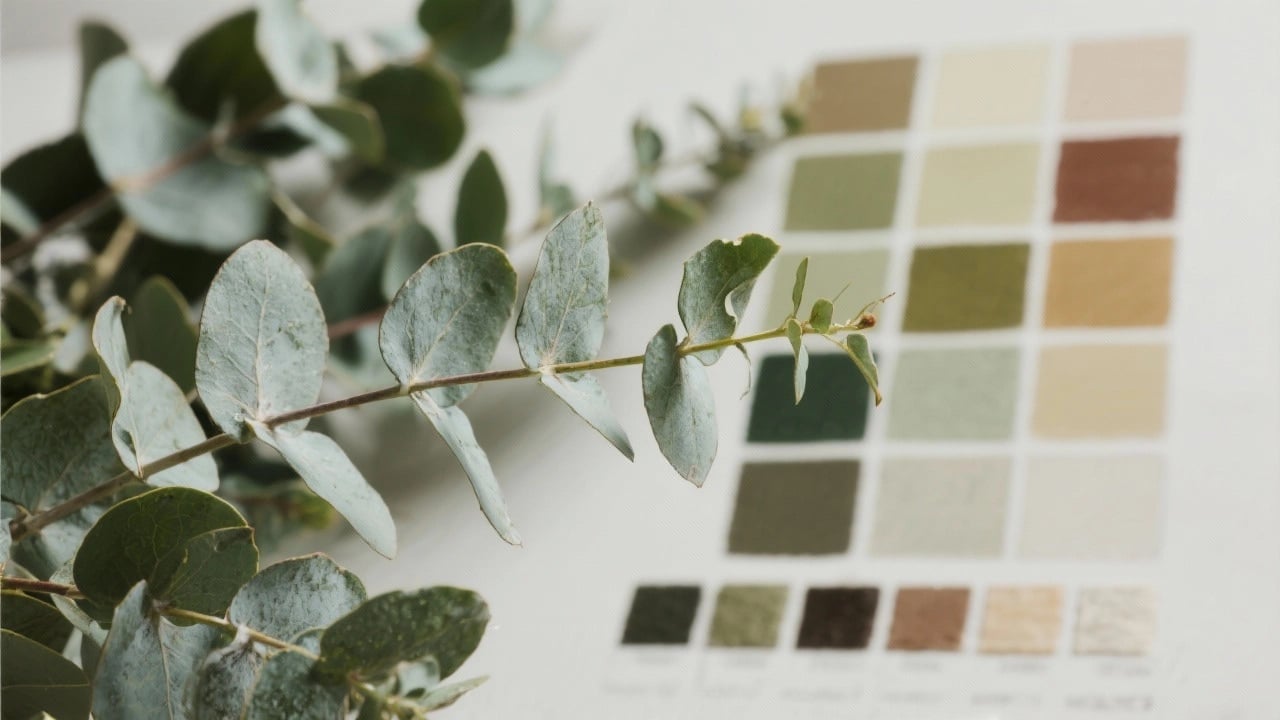
    Color harmony between your landscape art and existing decor creates visual cohesion that makes your space feel professionally designed. Start by identifying your room’s dominant colors in furniture, textiles, and wall paint. Your landscape should either complement these colors or provide intentional contrast that serves as a focal point.

    Many interior designers recommend the 60-30-10 rule: 60% dominant color, 30% secondary color, and 10% accent color. Your landscape art can reinforce this balance or provide that crucial accent color that ties everything together. For detailed guidance on matching artwork to your existing palette, explore our landscape art color matching guide for beginners.

    Warm Versus Cool Color Schemes

    Understanding color temperature is fundamental to selecting appropriate landscape art. Warm landscapes featuring oranges, reds, and yellows create energy and intimacy, making them ideal for social spaces like living rooms and dining areas. These tones advance visually, making walls feel closer and spaces more intimate.

    Cool landscapes dominated by blues, greens, and purples recede visually, creating a sense of spaciousness and tranquility. These work beautifully in bedrooms, bathrooms, and home offices where calm concentration is desired. Moreover, cool tones pair exceptionally well with contemporary and minimalist decor styles.

    Neutral Palettes and Versatility

    Neutral landscapes—featuring grays, beiges, blacks, and whites—offer maximum versatility. These pieces adapt to changing decor trends and color schemes, making them wise long-term investments. Neutral landscapes also allow you to introduce color through accessories like pillows, throws, and decorative objects without creating visual chaos.

    Choosing the Right Artistic Style

    The artistic style of your landscape should align with your home’s overall aesthetic and your personal taste. From photorealistic representations to abstract interpretations, landscape art spans numerous styles, each evoking different emotions and working with specific decor schemes.

    Traditional homes with classic furnishings pair beautifully with realistic landscape paintings or botanical art that celebrates detailed natural forms. Contemporary spaces, however, often benefit from abstract landscapes or stylized interpretations that emphasize shape, color, and composition over literal representation.

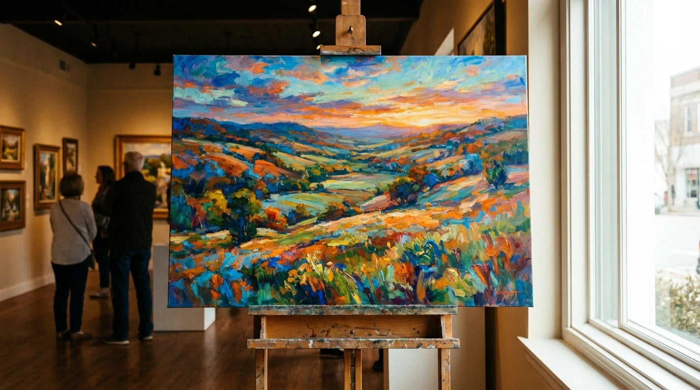
    Realistic and Photographic Landscapes

    Realistic landscape art provides immediate recognition and connection. These pieces transport viewers to specific places, evoking memories of travels or aspirations for future adventures. Photographic landscapes work particularly well in modern and transitional homes, offering crisp detail and contemporary appeal.

    However, highly detailed realistic landscapes require careful consideration. They command attention and can overwhelm small spaces or rooms already filled with patterns and visual interest. Balance is crucial when incorporating this style into your decor scheme.

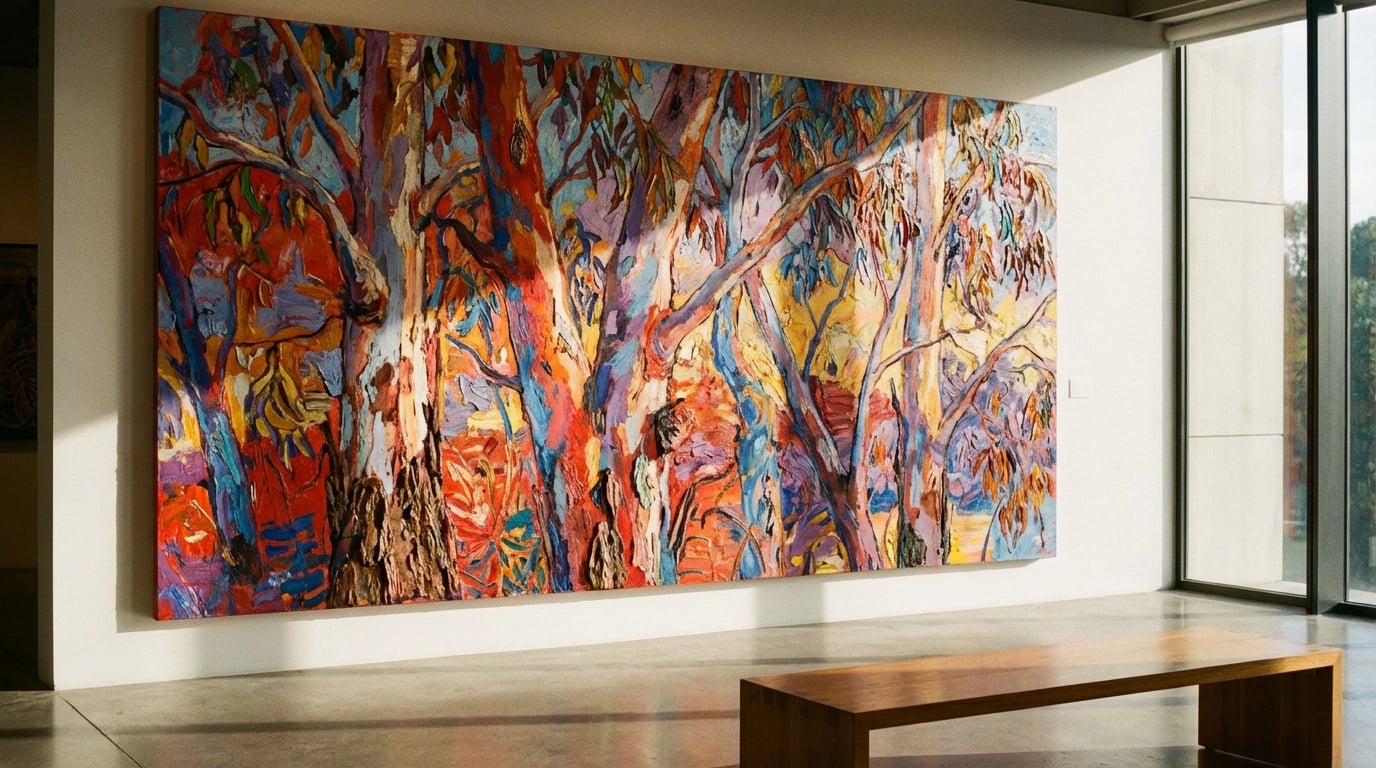
    Impressionistic and Abstract Landscapes

    Impressionistic landscapes offer softer focus and emotional interpretation rather than precise detail. These pieces work wonderfully in spaces where you want to suggest rather than define, creating atmosphere without demanding constant attention. The loose brushwork and color harmonies in impressionistic pieces often complement eclectic and bohemian design styles.

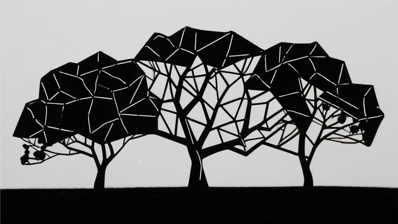
    Abstract landscapes push interpretation further, reducing natural scenes to essential elements of color, line, and form. According to abstract art principles, these pieces invite personal interpretation and work exceptionally well in contemporary and minimalist spaces. They provide visual interest without the literal representation that might clash with modern design sensibilities.

    Regional and Cultural Considerations

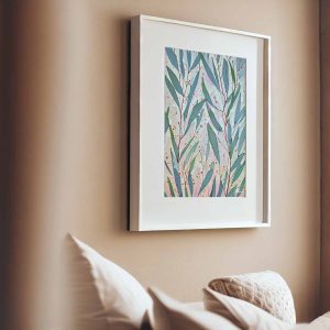
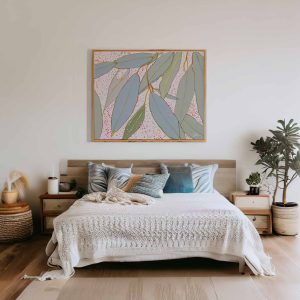
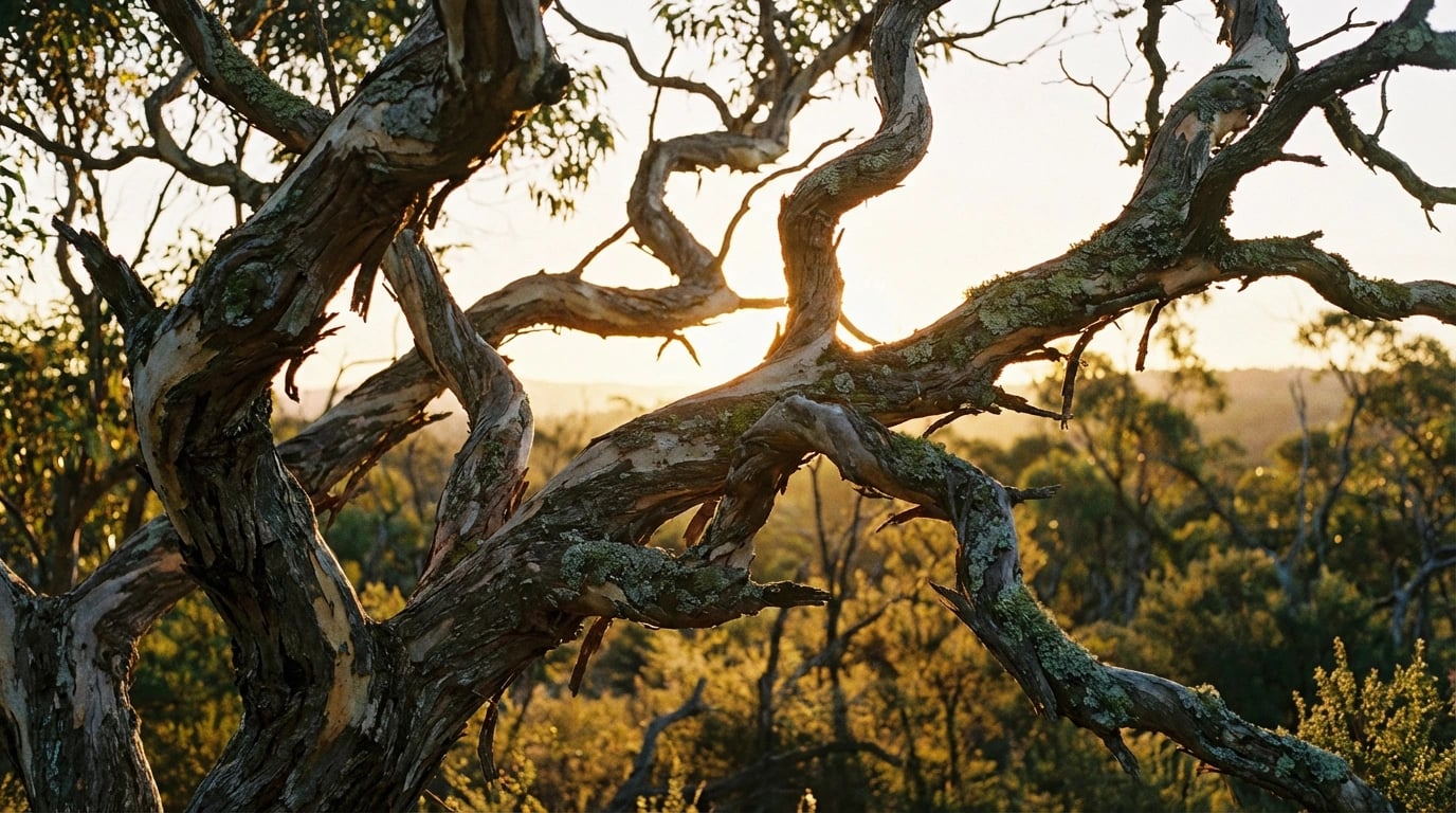
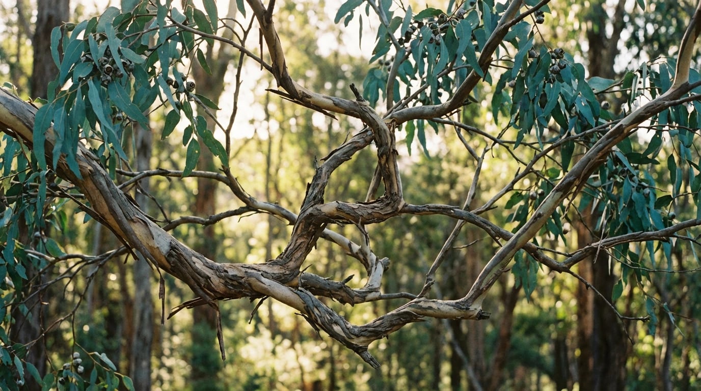
    Landscapes reflecting your regional environment create authentic connections to place. Australian homes, for example, might feature eucalyptus forests, coastal scenes, or outback vistas. These locally-inspired pieces resonate deeply with residents while introducing visitors to the unique character of the area. Discover how Australian artists have captured these distinctive landscapes in hidden stories behind Australian eucalyptus art.

    Scale and Proportion Considerations

    Getting the scale right is perhaps the most common challenge when selecting landscape art. A piece that’s too small disappears on the wall, while oversized art overwhelms the space and other furnishings. Professional designers use specific guidelines to determine appropriate sizing for different wall spaces and room contexts.

    For wall art above furniture, the general rule suggests the artwork should span approximately two-thirds to three-quarters of the furniture width. This creates visual balance without making either element appear disproportionate. For instance, art above a 72-inch sofa should ideally measure between 48 and 54 inches wide.

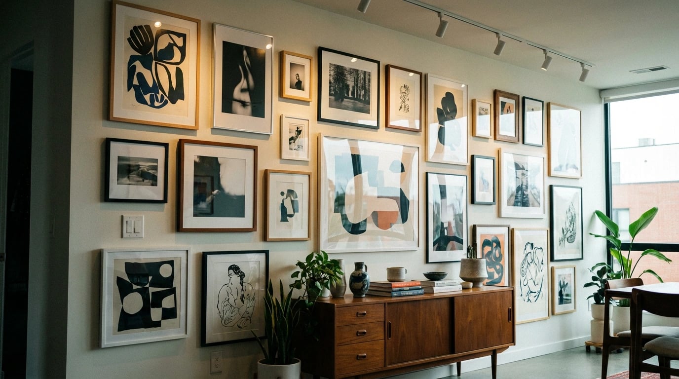
    Gallery Wall Versus Statement Piece

    You must decide whether a single statement landscape or a gallery collection better suits your space and style. Large statement pieces simplify decision-making and create immediate visual impact, working especially well in minimalist spaces where the art becomes the focal point. These bold choices require confidence but deliver dramatic results.

    Gallery walls featuring multiple smaller landscapes offer flexibility and personality. They allow you to combine different perspectives, seasons, and styles while maintaining a cohesive theme. This approach works beautifully in eclectic homes or when you want to display personal travel photography alongside purchased art. Furthermore, gallery walls can grow and evolve as your collection expands.

    Orientation and Composition

    Landscape orientation (horizontal) naturally suits landscape subject matter, hence the shared terminology. Horizontal compositions create stability and calm, making them perfect for above sofas, beds, and console tables. They emphasize width and can make narrow rooms feel more spacious.

    However, don’t overlook vertical landscapes, especially for tall, narrow wall spaces. Vertical compositions draw the eye upward, emphasizing ceiling height and working well in entryways, hallways, and between architectural features. Additionally, square formats offer balanced versatility for various placement scenarios.

    Creating the Right Mood and Atmosphere

    Beyond aesthetics, landscape art profoundly influences a room’s emotional atmosphere. Different landscape elements evoke specific psychological responses, making mood consideration essential when determining which piece fits your home. Water scenes promote tranquility, forests encourage contemplation, and mountain vistas inspire ambition and strength.

    Consider each room’s purpose when selecting landscape themes. Bedrooms benefit from serene scenes that promote relaxation—gentle seascapes, misty morning forests, or peaceful meadows. Living rooms and family spaces can handle more dynamic landscapes with dramatic skies, active water, or striking seasonal elements that stimulate conversation and engagement.

    Seasonal Considerations

    Seasonal landscape art allows you to rotate pieces throughout the year, keeping your decor fresh and responsive to changing light and weather. Spring and summer landscapes featuring blooming flora and vibrant greenery energize spaces during warmer months. Autumn scenes with golden foliage and harvest tones create warmth as temperatures drop, while winter landscapes with snow-covered scenes or bare-branch compositions align with the season’s quiet introspection.

    Alternatively, selecting neutral-season landscapes—those without obvious seasonal indicators—provides year-round appeal without requiring rotation. Coastal scenes, desert landscapes, and evergreen forests typically work across all seasons, making them practical choices for permanent installations.

    Biophilic Design Principles

    Incorporating landscape art aligns with biophilic design, which recognizes humans’ innate connection to nature. Research consistently demonstrates that natural imagery reduces stress, improves mood, and enhances cognitive function. Therefore, bringing landscape art into your home isn’t merely decorative—it’s a wellness strategy that supports mental health and overall well-being.

    Maximize biophilic benefits by choosing landscapes featuring elements proven to reduce stress: water, verdant vegetation, natural light, and expansive views. These elements trigger positive psychological responses even when experienced through artistic representation rather than direct exposure.

    Strategic Placement and Display Techniques

    Once you’ve selected your landscape art, proper placement maximizes its impact and integration with your space. Eye-level placement remains the standard guideline, typically positioning the artwork’s center approximately 57 to 60 inches from the floor. This height aligns with average human sight lines in museums and galleries, ensuring comfortable viewing.

    However, adjust this guideline based on viewing context. Art in dining rooms should be viewed while seated, suggesting slightly lower placement. Conversely, artwork in hallways where people typically stand and move might sit slightly higher. Always consider the primary viewing position when determining final placement.

    Lighting Your Landscape Art

    Proper lighting transforms good art into stunning focal points. Natural light offers the truest color representation but varies throughout the day and seasons. Supplement with dedicated picture lighting, adjustable track lights, or strategically placed accent lighting to maintain consistent visibility and impact during evening hours.

    Avoid direct sunlight on valuable prints, as UV rays cause fading and deterioration over time. If your artwork hangs in bright natural light, consider UV-protective glazing or periodically rotating pieces to preserve their vibrancy. For comprehensive display strategies, review these art print tips for beautiful home decor.

    Creating Conversation with Surrounding Decor

    Your landscape art should dialogue with surrounding elements rather than exist in isolation. Echo colors from the artwork in nearby textiles, incorporate natural materials that complement landscape themes, and position complementary objects on nearby surfaces. This creates visual rhythm and demonstrates intentional design thinking.

    Negative space around artwork is equally important. Avoid crowding art with too many nearby elements, which creates visual competition and diminishes impact. Allow breathing room for the eye to focus on and appreciate the landscape without distraction.

    Common Mistakes to Avoid

    Several common mistakes undermine even carefully selected landscape art. Recognizing these pitfalls helps you achieve professional-looking results that enhance rather than detract from your space.

    Size Misjudgment

    The most frequent error is selecting art that’s too small for the intended space. What appears substantial in a gallery or online often disappoints when placed on your wall. Always measure your space and visualize dimensions using painter’s tape or paper templates before purchasing. When uncertain between sizes, larger typically succeeds better than smaller.

    Ignoring Frame Quality and Style

    Even exceptional landscape art suffers when paired with inappropriate or low-quality framing. Your frame should enhance the artwork while complementing your room’s style. Modern spaces typically favor simple, clean-lined frames in black, white, or natural wood, while traditional rooms accommodate ornate gilded or detailed wood frames. Moreover, quality framing with proper matting and UV-protective glass preserves your investment for years.

    Overlooking the Room’s Existing Focal Point

    Every room has natural focal points—fireplaces, large windows, architectural features, or statement furniture. Your landscape art should enhance or create a focal point, not compete with existing ones. Identify your room’s hierarchy and place art accordingly. In rooms with strong architectural features, choose complementary rather than competing artwork.

    Following Trends Over Personal Connection

    Design trends come and go, but you’ll live with your landscape art daily. While staying current has merit, prioritize pieces that personally resonate. Art you genuinely love maintains appeal regardless of shifting trends, whereas trendy selections may feel dated within a few years. Authenticity in art selection creates spaces with genuine character and lasting satisfaction.

    Long-Term Maintenance and Care

    Proper maintenance ensures your landscape art remains beautiful and vibrant for years. Different mediums require specific care approaches, so understanding your artwork’s composition guides appropriate preservation strategies.

    Environmental Protection

    Protect art from environmental damage by controlling humidity, temperature, and light exposure. Excessive humidity encourages mold growth and paper degradation, while extreme dryness causes cracking in certain mediums. Maintain moderate humidity levels between 40-50% for optimal preservation. Similarly, avoid placing art near heat sources, air vents, or in direct sunlight paths.

    Dust accumulation dulls artwork over time. Gently dust frames and glass with soft, lint-free cloths periodically. For unglazed works or textured surfaces, use a soft brush designed for delicate surfaces. Never spray cleaning products directly on artwork; instead, lightly dampen your cloth if necessary and clean only the frame and glass.

    Professional Assessment

    Consider periodic professional assessment for valuable pieces. Art conservators identify potential issues before they become serious problems, offering preservation recommendations specific to your artwork’s medium and condition. This proactive approach protects your investment and ensures future generations can enjoy pieces you’ve carefully selected.

    If you’re passionate about understanding artistic techniques, learning about traditional methods such as making oil paint for beginners deepens your appreciation for the craftsmanship in landscape art and informs your collection choices.

    Bringing Your Vision to Life

    Selecting landscape art that truly fits your home requires thoughtful consideration of multiple factors working in harmony. By assessing your room’s characteristics, coordinating colors thoughtfully, choosing appropriate artistic styles, and getting scale right, you create spaces that feel cohesive and intentional. Remember that the best landscape art speaks to you personally while enhancing your living environment functionally and aesthetically.

    The journey of selecting perfect landscape art should be enjoyable rather than stressful. Take your time, trust your instincts, and don’t hesitate to experiment with placement before making final decisions. When you discover pieces that genuinely resonate with your style and space, the result is a home filled with beauty, connection to nature, and personal expression. Browse our collection at the GumPrints shop to discover landscape art pieces that might be perfect for your home.

    joerussell

    joerussell

    Australian abstract artists based in Byron Bay and curator of the GumPrints art print collection.

  • 10 Art Print Tips for Beautiful Home Decor

    10 Art Print Tips for Beautiful Home Decor

    Transforming your living space with art prints offers an accessible and versatile way to express your personal style while creating a cohesive, inviting atmosphere. Whether you’re decorating a new home or refreshing your current space, choosing the right prints and displaying them effectively can dramatically enhance your interior design. The beauty of art prints lies in their ability to set the mood, complement your color scheme, and reflect your unique aesthetic preferences without the investment required for original works.

    Successfully decorating with art prints requires more than simply hanging pretty pictures on your walls. The key is understanding how to select pieces that work harmoniously with your existing décor, properly sizing and positioning them for maximum impact, and creating visual narratives throughout your rooms. By following strategic principles about color coordination, scale, placement, and framing, you can achieve a professionally curated look that elevates your entire home. These ten essential tips will guide you through the process of incorporating art prints into your décor, helping you create spaces that feel both personal and polished.

    Consider Your Color Palette First

    Before purchasing any prints, carefully examine the existing color scheme in your space. The most successful decorating happens when artwork complements your furniture, textiles, and wall colors rather than competing with them. Therefore, identify your room’s dominant and accent colors, then select prints that incorporate at least one of these hues.

    You don’t need to match colors exactly; instead, look for harmonious tones that create visual continuity. For example, if your living room features navy blue sofas and cream walls, landscape prints with blue skies or coastal themes can tie the space together beautifully. Moreover, neutral-toned prints offer versatility and work in virtually any setting.

    Consider using color matching principles specifically designed for landscape art to ensure your selections enhance rather than clash with your interior palette. This strategic approach prevents costly decorating mistakes and creates a cohesive aesthetic throughout your home.

    Scale Your Art to Your Space

    One of the most common decorating mistakes involves selecting prints that are either too small or too large for their intended location. Proper scaling ensures your artwork makes an appropriate visual impact without overwhelming the space. As a general rule, your print should occupy roughly two-thirds to three-quarters of the available wall space above furniture.

    For instance, above a standard sofa measuring 90 inches wide, aim for artwork or a gallery arrangement spanning approximately 60-68 inches. Conversely, in smaller spaces like hallways or powder rooms, smaller prints prevent the area from feeling cramped. Additionally, consider ceiling height when determining vertical dimensions.

    Size Recommendations by Space

    • Large living room walls: 30×40 inches or larger for statement pieces
    • Above sofas: 24×36 inches minimum, or grouped smaller prints
    • Bedroom focal points: 24×30 inches to 30×40 inches above headboards
    • Hallways and narrow spaces: 11×14 inches to 16×20 inches
    • Bathroom accents: 8×10 inches to 16×20 inches

    Remember that multiple smaller prints arranged together can create the visual weight of one larger piece. This approach offers flexibility and often costs less than purchasing oversized artwork.

    Follow the Eye-Level Rule

    Professional art curators and interior designers consistently emphasize the importance of proper hanging height. The center of your artwork should align with the average eye level, typically 57-60 inches from the floor. This positioning ensures comfortable viewing and creates a balanced appearance in your room.

    However, adjust this guideline based on your specific circumstances. In dining rooms where people are primarily seated, lowering artwork slightly improves viewing angles. Similarly, in spaces with unusually high ceilings, you might raise pieces to maintain visual proportion with the architecture.

    When hanging prints above furniture, maintain 6-8 inches of clearance between the furniture top and the bottom edge of your frame. This spacing creates visual connection while preventing the artwork from appearing to float awkwardly on the wall.

    Gallery walls represent an increasingly popular decorating trend that allows you to display multiple prints in an artistic arrangement. Nevertheless, executing this look successfully requires careful planning to avoid a cluttered or chaotic appearance. Start by laying out your arrangement on the floor before committing to hammer and nails.

    Choose a unifying element that ties your diverse pieces together, whether that’s consistent frame color, mat style, subject matter, or color palette. For example, a collection of botanical art prints with varying frame styles creates visual interest while maintaining thematic cohesion.

    Gallery Wall Layout Approaches

    1. Grid layout: Uniform spacing and frame sizes for clean, modern aesthetics
    2. Salon style: Mixed sizes with tighter spacing for eclectic, collected-over-time appearance
    3. Horizontal line: Aligned tops or centers for streamlined, contemporary look
    4. Symmetrical arrangement: Balanced around a central focal piece

    Additionally, maintain consistent spacing between frames, typically 2-3 inches, to ensure visual unity. Use kraft paper templates taped to your wall before hanging to experiment with arrangements risk-free.

    Choose Frames That Enhance, Not Overpower

    The right frame elevates your print while the wrong choice can diminish even the most beautiful artwork. Your framing decisions should consider both the print’s style and your room’s overall aesthetic. Contemporary spaces often benefit from simple, thin frames in black, white, or natural wood, while traditional interiors may call for more ornate options.

    Mat boards serve multiple purposes beyond aesthetics—they protect your print from glass contact and create visual breathing room around the image. White and off-white mats remain versatile choices, though colored mats can highlight specific tones within your artwork. Furthermore, ensure your mat width balances with your print size; larger prints generally require wider mats for proper proportion.

    Quality framing represents an investment that protects and showcases your prints. Consider UV-protective glass to prevent fading, particularly for prints displayed in sunny locations. Browse through professional print collections to see how expert framing choices enhance different art styles.

    Match Art to Room Purpose

    Different rooms serve distinct functions, and your artwork selections should reflect and enhance these purposes. Consequently, the energizing prints appropriate for a home office differ significantly from the calming images ideal for bedrooms. Thoughtful matching between art and room function creates harmonious spaces that support their intended activities.

    Bedrooms benefit from serene landscapes, soft abstracts, or gentle nature scenes that promote relaxation and restful sleep. Meanwhile, kitchens and dining areas pair well with food-related imagery, botanical prints, or vibrant colors that stimulate appetite and conversation. Home offices thrive with motivational imagery, inspiring landscape compositions, or abstract pieces that encourage creativity without causing distraction.

    Room-Specific Recommendations

    • Living rooms: Statement pieces reflecting your personality and style preferences
    • Bedrooms: Calming landscapes, soft color palettes, peaceful nature scenes
    • Bathrooms: Coastal themes, botanical prints, water-related imagery
    • Children’s rooms: Playful illustrations, educational themes, bright colors
    • Entryways: Welcoming images that set your home’s aesthetic tone

    According to interior design principles, artwork significantly influences mood and perception of space, making these choices particularly important for overall home atmosphere.

    Optimize Lighting for Impact

    Even the most stunning print loses impact when poorly lit, while proper illumination transforms good artwork into captivating focal points. Natural light beautifully illuminates prints during daytime hours; however, position artwork away from direct sunlight to prevent fading and damage. Eastern and northern exposures typically provide gentler illumination than harsh southern or western light.

    For evening viewing and rooms lacking natural light, consider dedicated picture lights, adjustable spotlights, or track lighting. LED options offer energy efficiency and minimal heat output, protecting your prints from thermal damage. Additionally, ensure lighting angles avoid glare on glass-fronted frames by positioning lights at approximately 30-degree angles.

    Dimmer switches provide flexibility to adjust lighting levels based on time of day and desired ambiance. This control allows you to highlight your artwork dramatically for entertaining or create subtle background presence during quiet evenings.

    Select Prints with Personal Meaning

    While following design principles ensures professional-looking results, your home should ultimately reflect your personality and experiences. Choose prints that resonate with you emotionally, whether they depict places you’ve visited, subjects you’re passionate about, or simply images that bring you joy. This personal connection transforms your house into a home.

    Consider artwork that tells your story or represents your interests. Nature enthusiasts might gravitate toward eucalyptus-themed prints and botanical compositions, while travel lovers could display landscape prints from favorite destinations. Similarly, collectors might focus on specific artists, styles, or periods that fascinate them.

    Personal meaning also helps you commit confidently to your choices. When you genuinely love a print, you’re more likely to display it prominently and appreciate it daily, rather than relegating it to storage after brief display. Therefore, let your heart guide selections within the framework of sound design principles.

    Mix Styles Thoughtfully

    Contrary to popular belief, you don’t need to commit to a single art style throughout your home. Mixing different styles, mediums, and periods can create dynamic, collected-over-time aesthetics that feel authentic and lived-in. However, successful mixing requires intentionality rather than randomness.

    Establish connecting elements that unify diverse pieces—this might include consistent color palettes, complementary subject matter, or coordinated framing. For instance, pairing contemporary abstracts with traditional landscapes works when they share similar colors or tones. Likewise, mixing photography with paintings succeeds when unified by black-and-white palettes or common themes.

    Start conservatively if you’re new to style mixing, perhaps combining just two distinct approaches. As you develop confidence and eye, gradually introduce additional variety. Remember that each room can have its own personality while contributing to your home’s overall aesthetic narrative.

    Rotate Your Collection Seasonally

    Finally, consider treating your print collection as a dynamic element of your décor rather than a permanent installation. Seasonal rotation keeps your spaces feeling fresh and allows you to enjoy more pieces from your collection throughout the year. This approach proves particularly valuable for collectors who’ve accumulated more artwork than wall space.

    Lighter, brighter prints with floral or coastal themes feel perfect for spring and summer months, while warmer tones and cozier subjects suit autumn and winter. Additionally, rotation prevents the visual fatigue that sometimes occurs when viewing the same images daily for extended periods. You’ll rediscover and appreciate pieces anew after they’ve been stored for several months.

    Store rotated prints properly to preserve their condition—keep them in acid-free sleeves or portfolios, stored flat or upright in cool, dry locations away from direct sunlight and humidity. Proper storage ensures your entire collection remains in excellent condition regardless of display frequency.

    Creating Your Perfect Gallery

    Decorating with art prints combines creative expression with strategic design principles to transform ordinary rooms into extraordinary living spaces. By considering color coordination, proper scaling, thoughtful placement, and personal preferences, you can curate a home gallery that reflects your unique style while adhering to professional design standards. Remember that successful decorating is a journey rather than a destination—your tastes will evolve, your collection will grow, and your arrangements will change over time.

    Start with these foundational tips, but don’t be afraid to experiment and adjust based on what works best in your specific spaces. The most beautiful homes are those where residents feel comfortable, inspired, and truly at home. Whether you’re drawn to native botanical themes, dramatic landscapes, or contemporary abstracts, your art print selections offer endless opportunities to personalize and enhance your living environment. Take your time, trust your instincts, and enjoy the creative process of transforming your walls into meaningful displays that bring daily joy and visual interest to your home.

    joerussell

    joerussell

    Australian abstract artists based in Byron Bay and curator of the GumPrints art print collection.

  • Landscape Art Color Matching Guide for Beginners

    Landscape Art Color Matching Guide for Beginners

    Choosing the right colors for your landscape art can transform a room from ordinary to extraordinary. However, for beginners, matching landscape art to existing home decor can feel overwhelming. With countless shades, tones, and color combinations available in nature-inspired artwork, understanding the fundamentals of color coordination becomes essential. This comprehensive guide will walk you through the basic principles of color matching, helping you select landscape pieces that harmonize beautifully with your living spaces.

    The key to successful landscape art color matching lies in understanding three core approaches: complementary coordination, analogous harmony, and accent placement. Start by identifying your room’s dominant colors—typically found in furniture, walls, or major textiles. Then, select landscape art that either echoes these existing hues for a cohesive look, introduces complementary colors for dynamic contrast, or provides strategic accent colors to enliven neutral spaces. By mastering these fundamental techniques, you’ll confidently choose artwork that enhances your home’s aesthetic while reflecting your personal style.

    Understanding Color Basics for Landscape Art

    Before diving into color matching, familiarizing yourself with basic color theory helps tremendously. The color wheel consists of primary colors (red, blue, yellow), secondary colors (green, orange, purple), and tertiary colors that blend these together. Understanding this foundation enables you to identify relationships between the colors in your artwork and your decor.

    Landscape art naturally incorporates a wide spectrum of colors depending on the scene depicted. Coastal landscapes often feature blues, teals, and sandy beiges, while forest scenes showcase various greens, browns, and earthy tones. Desert landscapes might emphasize warm oranges, terracottas, and golden yellows. Moreover, the artistic style significantly impacts color presentation—realistic landscapes use natural hues, whereas abstract interpretations might employ unexpected color palettes.

    Warm Versus Cool Color Temperatures

    Color temperature plays a crucial role in setting a room’s mood. Warm colors include reds, oranges, yellows, and warm earth tones, creating cozy, energetic atmospheres. Cool colors encompass blues, greens, and purples, promoting calm, serene environments. Most landscape art naturally leans toward one temperature, though many pieces incorporate both for visual interest.

    Consider your room’s existing temperature bias when selecting artwork. A space dominated by cool grays and blues benefits from landscape art that continues this theme or introduces warm accents for balance. Conversely, rooms with warm wood tones and beige furniture can embrace either harmonious warm landscapes or refreshing cool-toned pieces for contrast. The various artistic styles used in landscape interpretation offer different temperature options even within similar subject matter.

    Assessing Your Space Before Choosing Art

    Successfully matching landscape art begins with thoroughly evaluating your existing space. Take inventory of the colors already present in your room. Therefore, examine your walls, flooring, major furniture pieces, curtains, rugs, and decorative accessories. Identify which colors dominate, which serve as secondary accents, and which appear sparingly.

    Create a simple color palette reference by collecting paint chips, fabric swatches, or photographs that capture your room’s existing colors. This tangible reference proves invaluable when browsing for landscape art, whether online or in person. Additionally, note your room’s lighting conditions—natural light changes throughout the day, affecting how colors appear.

    Identifying Your Dominant Color Scheme

    Most rooms follow one of several established color schemes. Monochromatic schemes use variations of a single color in different shades and tints. Analogous schemes combine colors adjacent on the color wheel, such as blues and greens. Complementary schemes pair opposite colors for bold contrast. Understanding your existing scheme helps you choose landscape art that either reinforces or thoughtfully challenges it.

    Furthermore, consider the purpose and mood of your space. Bedrooms typically benefit from calming landscapes with softer colors, while living areas can accommodate bolder, more vibrant pieces. Home offices might require focused, less distracting color schemes. Matching your landscape art’s color intensity to the room’s function ensures visual comfort and appropriate atmosphere.

    Three Essential Matching Techniques

    Once you understand color basics and have assessed your space, three proven techniques will guide your selection process. Each approach offers distinct advantages depending on your design goals and existing decor.

    The Complementary Approach

    The complementary approach involves selecting landscape art featuring colors opposite your room’s dominant hues on the color wheel. For instance, a room with predominantly blue furnishings pairs beautifully with landscape art emphasizing warm oranges and golden tones—think sunset scenes or autumn foliage. This technique creates visual excitement and dynamic tension without clashing.

    However, successful complementary matching requires balancing intensity. If your room features saturated, bold blues, choose landscape art with muted, softer oranges rather than equally intense hues. This prevents overwhelming visual competition. The complementary technique works exceptionally well in neutral-dominated spaces where you want the artwork to serve as the room’s focal point.

    The Analogous Harmony Method

    Analogous harmony creates cohesive, soothing environments by selecting landscape art with colors adjacent to your existing palette. If your room features various blues and greens, choose landscape pieces that continue this theme—coastal scenes, forest vistas, or misty mountain ranges. This approach feels naturally unified and restful.

    The key to preventing monotony with analogous matching involves varying the saturation and value of colors. Consequently, combine deep forest greens with lighter sage tones and bright turquoise accents within your landscape art. This variation maintains visual interest while preserving overall harmony. Artists who specialize in capturing the geometric patterns and natural forms of native flora often work within analogous palettes that translate beautifully to interior spaces.

    The Strategic Accent Technique

    The strategic accent technique works best in predominantly neutral spaces. Here, your landscape art introduces pops of color that appear sparingly elsewhere in the room. Perhaps you have a gray sofa with coral throw pillows—choose landscape art featuring coral, peach, or salmon tones in sunset skies or floral elements to create visual connections across the space.

    This method allows for creative flexibility and can easily refresh a room’s look. By changing smaller accent pieces like pillows or decorative objects to match different colors within your landscape art, you create multiple coordinated looks from a single artwork. Additionally, this technique helps unify open-concept spaces by repeating accent colors from room to room through strategically placed landscape pieces.

    Working With Neutral Landscapes

    Neutral landscape art deserves special attention as it offers remarkable versatility. Pieces featuring blacks, whites, grays, beiges, and browns coordinate with virtually any color scheme. Black and white photography of dramatic mountain ranges, sepia-toned vintage landscapes, or minimalist charcoal drawings provide sophisticated options that never clash.

    Nevertheless, neutrals aren’t necessarily boring. Look for neutral landscape art with varied textures, interesting compositions, or subtle color undertones. A predominantly gray landscape might contain hints of blue or purple that subtly connect with your decor. Landscape art throughout history has explored these nuanced neutral palettes with remarkable sophistication.

    Adding Depth With Neutral Artwork

    Neutral landscapes excel at adding visual depth without competing for attention. They allow colorful furnishings and accessories to shine while providing grounding visual weight. Moreover, neutral artwork adapts as your decor evolves—you can completely change your room’s color scheme without needing to replace neutral landscape pieces.

    Consider layering neutral landscapes with colorful ones for gallery wall arrangements. A large neutral piece can anchor a collection while smaller, colorful landscapes provide pops of interest. This approach creates visual hierarchy and prevents overwhelming the space with competing colors. The subtle tones found in natural eucalyptus and native flora often provide this perfect neutral foundation with organic interest.

    Common Color Matching Mistakes to Avoid

    Even with solid color theory knowledge, beginners often make predictable mistakes. Recognizing these pitfalls helps you avoid costly decorating missteps and buyer’s remorse.

    Matching Too Literally

    The most common error involves trying to match colors too exactly. Seeking landscape art with the precise shade of blue as your sofa often results in flat, uninteresting coordination. Instead, aim for complementary or harmonious relationships rather than perfect matches. Variation in shade, tone, and saturation creates depth and sophistication.

    Furthermore, exact matching limits your options unnecessarily. A slightly different blue in your landscape art—perhaps more teal or navy than your furniture’s sky blue—adds visual richness while still coordinating beautifully. Embrace subtle differences that create conversation between elements rather than monotonous repetition.

    Ignoring Undertones

    Colors have undertones that significantly impact compatibility. A beige with pink undertones looks entirely different than beige with yellow or gray undertones. Similarly, greens range from blue-greens to yellow-greens. Ignoring these subtle differences leads to combinations that feel “off” even when they theoretically should work.

    Test potential landscape art against your existing colors in various lighting conditions. Colors that seem perfect in bright gallery lighting might clash under your home’s warm incandescent bulbs. Additionally, consider how the artwork’s frame color and material affect overall appearance—wood tones have undertones too, which should harmonize with both the artwork and your space.

    Overwhelming Small Spaces

    Choosing landscape art with too many colors or overly intense hues can overwhelm small rooms. While vibrant artwork makes bold statements, compact spaces benefit from more restrained palettes. Opt for landscapes with two or three dominant colors rather than busy, multi-colored scenes. This restraint prevents visual chaos and maintains a sense of spaciousness.

    Conversely, large rooms can accommodate more complex, colorful landscape pieces without feeling cluttered. Scale your color intensity and complexity to your space’s dimensions. Remember that you can browse options at our curated collection to see how different pieces might work in various room sizes.

    Practical Tips for Testing and Selection

    Theory matters, but practical testing ensures successful results. Several strategies help you preview how landscape art will actually look in your space before committing to a purchase.

    Use Digital Tools

    Many websites and apps allow you to virtually place artwork on your walls using augmented reality or photo editing. Take a clear photograph of your wall, then digitally add potential landscape pieces to visualize scale, color coordination, and overall impact. This technology removes much guesswork from online art shopping.

    Additionally, adjust your screen’s brightness to approximate different lighting conditions. View potential pieces on your phone or computer at various times of day to see how colors shift. While not perfectly accurate, digital previews provide valuable preliminary insights that narrow your options effectively.

    Sample Before Committing

    Whenever possible, obtain samples or visit physical galleries to see artwork in person. Colors on screens vary significantly from printed or painted reality. If purchasing prints, some retailers offer small sample sizes at minimal cost—worth the investment to ensure color accuracy before ordering large, expensive pieces.

    Bring your color swatches or photographs of your room when viewing art in person. Hold swatches directly against potential purchases to see how colors interact in reality. Trust your instincts—if something feels off despite theoretically working, listen to that intuition. The relationship between traditional painting techniques and color mixing can produce unexpected results that screens don’t fully capture.

    Consider Seasonal Flexibility

    Think about rotating landscape art seasonally, especially in accent positions. A warm, golden autumn landscape might feel perfect in fall but too heavy in summer. Having options allows you to refresh your space’s mood without major redecorating. Select pieces that either work year-round or complement each other when swapped.

    This approach also justifies investing in multiple pieces rather than agonizing over one perfect selection. Two or three coordinating landscape prints at moderate price points provide more flexibility than a single expensive piece. You’ll enjoy variety while maintaining cohesive color coordination throughout the year.

    Building a Cohesive Collection

    As you gain confidence, consider building a collection of landscape art with a unifying color thread. This might be a specific hue that appears in each piece, a consistent temperature bias, or a signature neutral that grounds diverse colorful works. Collections feel curated and intentional rather than randomly assembled.

    Moreover, cohesive collections allow you to rearrange pieces across different rooms while maintaining visual harmony. The warm greens found in eucalyptus-inspired interior design might thread through multiple artworks, creating continuity even when pieces depict different scenes or styles. This strategy maximizes your investment and decorating flexibility.

    Color matching landscape art to your home decor doesn’t require professional design training—just patience, observation, and willingness to trust your developing eye. Start with these fundamental techniques, avoid common pitfalls, and test thoroughly before committing. As you gain experience, you’ll develop intuition for color relationships that transcends rules. Remember that your home should reflect your personal aesthetic preferences, so choose landscape art that resonates emotionally while coordinating visually. The perfect piece balances technical color harmony with that intangible quality that makes you smile every time you see it. With these beginner guidelines, you’re well-equipped to confidently select landscape artwork that transforms your living spaces into cohesive, beautiful environments.

    joerussell

    joerussell

    Australian abstract artists based in Byron Bay and curator of the GumPrints art print collection.

  • Making Oil Paint for Beginners

    Making Oil Paint for Beginners

    Making oil paint from scratch is an enriching creative pursuit that connects artists with centuries of tradition whilst providing unparalleled control over their materials. Whether you’re seeking to understand the fundamentals of your medium or desiring to craft custom colours unavailable in commercial ranges, learning to make oil paint opens a new dimension in your artistic practice. This beginner’s guide demystifies the process, walking you through essential materials, techniques, and safety considerations that will empower you to create professional-quality paints in your own studio.

    The core process of making oil paint involves combining dry pigment powder with a binding oil—typically linseed oil—to create a smooth, workable paste. You’ll need just a few essential tools: a glass muller or palette knife, a ground glass surface or marble slab for mixing, quality pigments, refined linseed oil, and protective equipment. The technique requires patience and attention to consistency, but beginners can achieve excellent results by starting with stable, non-toxic pigments like earth colours. Proper pigment-to-oil ratios and thorough grinding ensure your paint achieves the desired viscosity and colour intensity whilst maintaining archival quality for lasting artworks.

    Essential Materials and Equipment

    Building your paint-making toolkit doesn’t require excessive investment, but quality matters significantly. A ground glass muller (resembling a heavy glass mushroom) paired with a thick glass or marble slab forms the traditional grinding surface preferred by artists for centuries. Additionally, you’ll need a flexible palette knife for mixing and transferring paint, glass droppers for precise oil measurement, and storage containers such as small glass jars or metal tubes.

    Your workspace should include adequate lighting, a stable surface, and excellent ventilation. Many pigments produce fine dust during handling, so consider working near an open window or in a well-ventilated area. A dust mask rated for fine particles protects your respiratory system during the initial pigment handling stages. Furthermore, disposable gloves prevent skin contact with potentially irritating pigments, whilst protecting the purity of your colours from oils naturally present on your hands.

    Start with a modest selection of earth pigments—raw umber, burnt sienna, yellow ochre, and titanium white provide an excellent foundation palette. These stable, relatively non-toxic pigments forgive beginner mistakes whilst teaching fundamental grinding techniques. As your confidence grows, gradually introduce more complex pigments like cadmiums, ultramarines, or specialty colours that match your artistic vision and complement styles you might explore when reimagining natural subjects through diverse artistic approaches.

    Understanding Pigments and Binders

    colorful pigment powders - Understanding Pigments and Binders

    Pigments represent the colour component of oil paint, available as finely ground powders derived from minerals, synthetic compounds, or organic sources. Each pigment possesses unique characteristics including tinting strength, transparency, lightfastness, and oil absorption rates. Understanding these properties helps you predict how your handmade paint will perform on canvas and enables intelligent colour mixing decisions.

    The binder—typically linseed oil—serves multiple critical functions beyond simply holding pigment particles together. It allows the paint to spread smoothly across surfaces, influences drying time, affects gloss levels, and contributes to the paint’s long-term durability. Cold-pressed refined linseed oil offers excellent clarity and moderate drying times, making it ideal for beginners. Stand oil, a heat-polymerised variant, creates enamel-like finishes with reduced brushstrokes, whilst walnut oil provides a paler, slower-drying alternative.

    The pigment-to-oil ratio varies considerably between colours based on their absorption characteristics. Earth pigments generally require less oil, creating stiffer paint consistency, whereas organic pigments often demand more binder to achieve workable texture. Beginning with approximately one part oil to three parts pigment (by volume) provides a reasonable starting point, then adjust gradually based on your specific pigment and desired consistency. This experimentation mirrors the observational skills artists develop when capturing the geometric patterns found throughout nature.

    Selecting Quality Pigments

    Reputable pigment suppliers provide detailed information about lightfastness ratings, chemical composition, and safety classifications. Look for pigments rated ASTM I or II for lightfastness, ensuring your paintings won’t significantly fade over time. Moreover, familiarise yourself with pigment nomenclature and colour index names, which provide standardised identification regardless of marketing names that vary between manufacturers.

    The Grinding Process Explained

    Begin by placing a small mound of dry pigment (approximately one teaspoon) on your grinding surface, creating a well in the centre. Using a glass dropper, add small amounts of oil to the well, then gradually incorporate the surrounding pigment using your palette knife. This method prevents adding excessive oil too quickly, which creates overly thin paint that’s difficult to correct.

    Once you’ve achieved a thick paste consistency, begin grinding using your glass muller. Apply firm, consistent pressure whilst moving the muller in figure-eight patterns across the surface. This grinding action breaks down pigment aggregates, creating intimate contact between each particle and the binding oil. The process typically requires five to fifteen minutes depending on pigment type and desired smoothness.

    You’ll notice the mixture transforming from a grainy, separated texture into a smooth, glossy paste. Periodically scrape the paint together using your palette knife and check consistency by drawing a line through it—properly ground paint should show smooth, continuous colour without speckles or separation. This meticulous attention to texture parallels the careful observation required when artists work to capture the delicate silvery qualities of eucalyptus branches in their compositions.

    Common Grinding Challenges

    New paint makers frequently encounter several typical issues. Paint that feels too stiff requires additional oil, added gradually by drops rather than large amounts. Conversely, overly thin paint may need more pigment or extended grinding time to properly disperse particles. Some pigments naturally produce stringy textures; these benefit from adding a small amount of aluminium stearate, which improves handling properties without compromising colour quality.

    Safety Considerations and Best Practices

    protective painting gear - Safety Considerations and Best Practices

    Whilst oil painting carries a romantic historical association, certain pigments contain genuinely hazardous materials requiring respectful handling. Cadmium pigments, lead white, cobalt compounds, and chromium colours all demand particular caution. Always wear appropriate protective equipment including gloves and masks when handling dry pigments, and never eat, drink, or smoke in your paint-making area.

    Research each pigment’s safety data sheet before purchase, understanding both acute and chronic health risks. Some traditional pigments like genuine vermilion (mercury sulphide) or flake white (lead carbonate) have safer modern alternatives that achieve similar visual effects without toxic concerns. Beginning painters should prioritise learning with safer alternatives, reserving more hazardous materials for when experience justifies their use.

    Proper disposal of contaminated materials protects both your household and the environment. Never wash pigment-laden materials down household drains; instead, allow contaminated water or oils to evaporate in a well-ventilated area, then dispose of dried residue according to local hazardous waste guidelines. This conscientious approach to materials extends naturally to artists who appreciate the environmental stories behind their artistic subjects.

    Storing and Preserving Your Handmade Paints

    oil paint tubes - Storing and Preserving Your Handmade Paints

    Freshly made oil paint requires protection from air exposure, which causes surface skinning and eventual hardening. Small glass jars with tight-fitting lids work excellently for storage, though metal tubes (available from art supply specialists) provide professional-grade preservation and convenient dispensing. When filling tubes, eliminate air pockets by tapping the tube firmly against your work surface before sealing.

    Create a thin layer of water or linseed oil atop paint stored in jars, forming a barrier that prevents oxygen contact with the paint surface. Additionally, clearly label each container with the pigment name, date of creation, and any special notes about oil ratios or additives used. This documentation proves invaluable when replicating successful batches or troubleshooting inconsistent results.

    Properly stored handmade oil paints remain usable for months or even years. However, some separation between pigment and binder naturally occurs over time. Simply remix thoroughly before use, adding minute amounts of oil if needed to restore proper consistency. If you’re ready to start exploring your handmade paints on canvas, visit our shop to discover quality surfaces and materials that complement your artistic journey.

    Troubleshooting Storage Issues

    Paint that develops hard surface skin can often be salvaged by carefully removing the dried layer and remixing the remaining paint. Completely hardened paint, unfortunately, cannot be reconstituted and must be discarded. Mould growth occasionally appears in paints containing excessive water contamination; prevent this by ensuring all tools and pigments remain completely dry during the paint-making process.

    Embracing the Craft of Paint Making

    Making your own oil paint transforms your relationship with artistic materials, fostering deeper understanding of how colours behave and interact. This foundational knowledge empowers more confident colour mixing, informed material choices, and greater appreciation for the chemical and physical properties underlying oil painting techniques. Moreover, the meditative rhythm of grinding pigments provides creative satisfaction that extends beyond simply opening manufactured tubes.

    As you develop paint-making skills, experiment with different binders, additives, and pigment combinations that support your unique artistic voice. Consider how historical masters prepared their materials, then adapt these time-tested methods to contemporary availability and safety standards. The journey from raw pigment to finished painting creates an unbroken creative thread connecting your hands, your materials, and your artistic vision—a deeply personal process that enriches every brushstroke you make on canvas.

    joerussell

    joerussell

    Australian abstract artists based in Byron Bay and curator of the GumPrints art print collection.

  • Why Gum Trees Stumped Every Artist

    Why Gum Trees Stumped Every Artist

    Australian gum trees are among the most challenging subjects for artists to capture on canvas. Their distinctive features—mottled bark, silvery leaves, and unpredictable growth patterns—have confounded painters for generations. Yet understanding why these iconic eucalypts present such difficulty is the first step towards mastering their artistic representation and creating compelling works that truly capture their essence.

    Gum trees challenge artists primarily because of their complex bark textures, constantly shifting light effects on silvery foliage, and irregular branching patterns that defy conventional compositional rules. Additionally, their colours are notoriously difficult to mix accurately, ranging from subtle greys and blues to unexpected pinks and oranges. Moreover, these trees lack the structural predictability of European species, making traditional landscape painting techniques less effective. However, by approaching gum trees with specialised techniques and a willingness to embrace their unique characteristics, artists can transform these challenges into opportunities for creating distinctive, authentic Australian artwork.

    Understanding the Challenge: Why Gum Trees Are Different

    Before attempting to paint gum trees, artists must recognise what sets them apart from other tree species. European trees typically feature predictable growth patterns with symmetrical branching and uniform bark textures. In contrast, eucalypts exhibit chaotic, angular limbs that twist unexpectedly, creating compositions that can appear unbalanced to the untrained eye.

    The bark itself presents multiple challenges simultaneously. Many species shed their outer layers in irregular patches, revealing surfaces in various stages of renewal. This creates a patchwork of colours and textures that must be observed carefully rather than generalised. Furthermore, the way light interacts with this varied surface changes dramatically throughout the day, making plein air painting particularly demanding.

    According to botanical research on eucalyptus species, there are over 700 varieties of gum trees in Australia, each with distinct visual characteristics. This diversity means that techniques mastered for one species may not transfer effectively to another. Therefore, artists must approach each subject individually whilst building a foundational understanding of common eucalypt features.

    Step 1: Observing and Capturing Bark Texture

    gum tree bark - Step 1: Observing and Capturing Bark Texture

    Begin your gum tree painting journey by dedicating time to close observation of bark patterns. Select a specific tree and spend at least 30 minutes sketching its bark texture before attempting to paint. Notice how the peeling layers create depth through overlapping forms rather than simple surface decoration.

    Create a texture study using small paintings or drawings that focus exclusively on a section of bark approximately 30 centimetres square. This concentrated approach allows you to understand the underlying structure without becoming overwhelmed by the entire tree. Pay particular attention to the edges where bark curls away from the trunk—these create crucial shadows that give dimension to your work.

    When translating these observations to paint, work in layers that mirror the bark’s natural formation. Start with base tones representing the inner bark, then gradually add the outer layers using broken brushstrokes that suggest peeling and texture. Avoid the temptation to overpaint every detail; instead, suggest complexity through strategic placement of highlights and shadows. Exploring the hidden geometry within eucalyptus forms can reveal underlying patterns that simplify this process.

    Essential Tools for Bark Texture

    • Palette knives for creating raised texture and scraped effects
    • Stiff-bristled brushes for dry-brushing techniques
    • Sponges or crumpled paper for dabbing irregular patterns
    • Glazing medium for building transparent layers

    Step 2: Mastering the Silvery Foliage Effect

    Gum tree foliage presents a unique challenge due to its reflective quality and colour variations. Unlike the solid greens of many northern hemisphere trees, eucalyptus leaves catch light in ways that create silvery, almost luminous effects. This characteristic stems from the waxy coating on the leaves and their tendency to hang vertically rather than horizontally.

    To capture this effect, begin by abandoning preconceived notions about “tree green.” Mix your foliage colours using blues, greys, and even subtle purples alongside your greens. Test these mixtures against actual gum leaves in various lighting conditions to train your eye. Remember that gum tree foliage often appears lighter and cooler than you might initially perceive.

    Apply foliage using techniques that suggest movement and lightness rather than dense masses. Employ dry-brush techniques where bristles barely touch the canvas, creating broken colour that allows underlying layers to show through. This approach mimics the way light filters through eucalyptus canopies. Additionally, leave strategic gaps in your foliage to suggest the characteristic openness of gum tree crowns, which rarely form the solid domes seen in many exotic species.

    Step 3: Developing a Compositional Approach

    tree composition sketch - Step 3: Developing a Compositional Approach

    The irregular growth patterns of gum trees demand a flexible compositional strategy. Traditional rules about balanced placement and harmonious curves often feel forced when applied to eucalypts. Instead, embrace asymmetry and apparent chaos as authentic features of your subject.

    Start your composition by identifying the dominant angular thrust of the main trunk or primary limbs. Gum trees frequently lean at unexpected angles or feature dramatic bends that create dynamic diagonal lines. Use these as the foundation for your composition rather than fighting against them. Position these elements to lead the viewer’s eye through the painting, even if this creates unconventional balance.

    Consider how different artistic styles have approached gum trees throughout history, from traditional landscape painting to contemporary abstraction. Many successful gum tree paintings work precisely because they honour the trees’ natural irregularity. Frame your subject to emphasise its distinctive character—perhaps focusing on a dramatically twisting branch rather than attempting to include an entire tree.

    Compositional Techniques for Gum Trees

    1. Use the rule of thirds to position major trunk divisions or branch intersections at power points
    2. Allow branches to extend beyond your canvas edges to suggest the tree’s expansive nature
    3. Create depth by overlapping multiple trunks or showing trees at varying distances
    4. Balance the visual weight of heavy trunks with open sky or lighter foliage areas

    Step 4: Colour Mixing for Authentic Eucalyptus Tones

    eucalyptus color palette - Step 4: Colour Mixing for Authentic Eucalyptus Tones

    Achieving authentic gum tree colours requires moving beyond standard landscape palettes. The characteristic bark tones range from white and cream through grey, tan, pink, orange, and even deep charcoal, depending on species and condition. Foliage colours present equal complexity, spanning blue-greens, grey-greens, olive tones, and silvery highlights.

    For bark, begin with a limited palette that includes titanium white, raw umber, burnt sienna, and ultramarine blue. These four colours can create an extensive range of eucalyptus bark tones through various combinations. Add small amounts of crimson or violet for the pink undertones visible in many species. Mix colours on your palette to create at least six distinct bark tones before you begin painting, ensuring adequate variety.

    Foliage colours benefit from a foundation of sap green or viridian mixed with generous amounts of white and touches of blue. Avoid using green straight from the tube, as this rarely matches the subtle complexity of gum leaves. Create cooler mixtures for foliage in full light and warmer, darker tones for shadowed areas. The natural colour palette found in gum trees offers endless inspiration for artists willing to observe carefully.

    Essential Colour Mixing Ratios

    • Light bark: 3 parts white, 1 part raw umber, touch of ultramarine
    • Mid-tone bark: Equal parts raw umber and burnt sienna, modified with white
    • Dark bark: Ultramarine and burnt sienna with minimal white
    • Silvery foliage: Sap green, white, and cerulean blue (3:2:1 ratio)
    • Shadow foliage: Viridian, burnt umber, and ultramarine

    Step 5: Practice and Continuous Refinement

    Mastering gum tree painting requires sustained practice with intention and self-reflection. Set yourself specific challenges that isolate individual difficulties rather than attempting perfect finished paintings immediately. For instance, dedicate one session exclusively to bark texture, another to foliage colour, and another to compositional balance.

    Develop a regular sketching practice that includes quick studies of gum trees in various lighting conditions and seasons. These needn’t be detailed drawings—simple value sketches capturing the play of light and shadow will train your observational skills. Photograph trees that interest you and use these references for studio work, but always supplement photographs with direct observation to understand three-dimensional form.

    Analyse your work critically by comparing finished paintings with your reference material. Identify specific areas where your interpretation diverges from reality—not to achieve photographic accuracy, but to understand whether these departures serve your artistic vision or simply represent technical challenges to address. Understanding watercolour techniques for eucalyptus can provide alternative approaches that may inform your primary medium.

    Moreover, study how other artists have successfully tackled gum trees. Visit galleries featuring Australian landscape art, paying particular attention to how accomplished artists handle the challenges you’re encountering. Historical approaches to eucalyptus in Australian art reveal diverse solutions to common problems, offering inspiration for your own development.

    Weekly Practice Schedule

    1. Monday: 30-minute observational sketches focusing on overall structure
    2. Wednesday: Colour mixing exercises creating bark and foliage palettes
    3. Friday: Technique practice (texture, dry-brushing, or glazing)
    4. Weekend: Longer painting session incorporating learned techniques

    Furthermore, consider joining art groups or online communities focused on Australian landscape painting. Sharing your work and receiving constructive feedback accelerates improvement whilst connecting you with others who understand the specific challenges of painting eucalypts. Many artists find that explaining their techniques to others clarifies their own understanding and reveals areas needing further development.

    Finally, remember that gum trees have stumped artists precisely because they demand fresh approaches rather than reliance on established formulas. Consequently, your personal solutions to these challenges will contribute to your distinctive artistic voice. Embrace experimentation, accept that not every painting will succeed, and maintain curiosity about these remarkable trees that define the Australian landscape. The journey of achieving eucalyptus mastery continues throughout an artist’s career, with each painting revealing new insights.

    As you develop your skills, you’ll discover that what initially seemed like insurmountable challenges become the very features that make gum tree painting rewarding. The irregular branching patterns that once frustrated you will become compositional opportunities. The complex bark textures that seemed impossible to capture will evolve into your signature technique. Through persistent practice and thoughtful observation, you’ll transform these iconic Australian trees from subjects that stumped you into sources of artistic inspiration and achievement. Browse the collection of gum tree artwork to see how other artists have interpreted these magnificent subjects.

    joerussell

    joerussell

    Australian abstract artists based in Byron Bay and curator of the GumPrints art print collection.

  • Gum Trees Reimagined: 7 Stunning Art Styles

    Gum Trees Reimagined: 7 Stunning Art Styles

    Australia’s iconic gum trees have captivated artists for generations, inspiring some of the most breathtaking and innovative artistic interpretations found anywhere in the natural world. From their distinctive silvery bark to their graceful, twisting branches, eucalyptus trees offer endless visual possibilities that artists across diverse mediums continue to explore and reimagine. This comprehensive guide explores seven distinctive art styles that have transformed how we see and appreciate these remarkable trees.

    The most compelling tree art styles bring together traditional techniques with contemporary vision, creating works that honour the gum tree’s unique character whilst pushing creative boundaries. Whether through bold abstracts, delicate watercolours, or striking mixed-media compositions, these artistic approaches reveal new dimensions of Australia’s beloved eucalypts. Each style offers distinct methods for capturing the essence of these trees—from their textural complexity to their ethereal presence in the landscape.

    Abstract Expressionism and Gum Trees

    Abstract expressionism transforms gum trees into emotional landscapes of colour, form, and gesture. Rather than depicting every leaf and branch with photographic precision, this approach captures the visceral feeling of standing beneath towering eucalypts or witnessing their dance in coastal winds. Artists working in this style often employ bold brushstrokes, layered textures, and spontaneous mark-making to convey the energy and movement inherent in these trees.

    The beauty of abstract eucalyptus art lies in its ability to distil the essence of gum trees into their fundamental visual elements. Colour fields might represent the shifting blues and greys of eucalyptus foliage, whilst sweeping gestures evoke the graceful arc of branches reaching skyward. This approach connects deeply with viewers who appreciate nature’s living ink palette and the emotional resonance of the Australian landscape. Moreover, abstract works invite personal interpretation, allowing each viewer to bring their own experiences and memories of gum trees to the artwork.

    The “Gum print 1” and “Gum print 2” exemplify this abstract approach beautifully, translating the organic complexity of eucalyptus into sophisticated compositions that work equally well in contemporary and traditional interiors.

    These abstract interpretations particularly suit modern spaces where art serves as both focal point and conversation starter. Furthermore, they demonstrate how limiting a colour palette can actually enhance visual impact, with subtle tonal variations creating depth and sophistication.

    Contemporary Botanical Illustration

    botanical gum tree sketch - Contemporary Botanical Illustration

    Contemporary botanical illustration represents a meticulous celebration of gum tree anatomy, combining scientific accuracy with artistic sensibility. This style honours centuries of botanical art tradition whilst incorporating modern aesthetics and techniques. Artists working in this genre carefully observe and render the distinctive characteristics that make each eucalyptus species unique—the particular shape of leaves, the texture of bark, the form of gum nuts, and the delicate structure of blossoms.

    However, contemporary approaches distinguish themselves from historical scientific illustration through their artistic liberty and compositional innovation. Modern botanical artists might isolate a single branch against negative space, creating a minimalist statement piece, or arrange multiple specimens in unexpected configurations. The precision required for this style demands intimate familiarity with gum tree morphology, often developed through hours of field observation and sketching. Additionally, these works frequently explore which gum leaves make the best art subjects, focusing on species with particularly striking visual characteristics.

    Techniques for Botanical Accuracy

    Creating compelling botanical art requires mastering several specialised techniques. Watercolour remains a favoured medium for its translucency and ability to capture subtle colour variations in eucalyptus foliage. Pen and ink work beautifully for rendering bark texture and intricate detail. Meanwhile, coloured pencils offer precise control for layering colours and creating smooth gradations. Many contemporary artists combine these traditional media with digital tools for enhanced flexibility and reproduction quality.

    Impressionist Landscape Techniques

    Impressionist interpretations of gum trees capture the atmospheric qualities and changing light conditions that make Australian eucalyptus forests so enchanting. This style prioritises visual impression over photographic detail, using broken colour and visible brushwork to convey the shimmering effect of sunlight filtering through silver-green canopies. Consequently, impressionist gum tree paintings often evoke specific times of day—the golden warmth of afternoon light, the cool blues of twilight, or the soft haziness of early morning mist.

    The impressionist approach suits eucalyptus subjects particularly well because it mirrors how we actually perceive these trees in nature. Our eyes don’t catalogue every individual leaf; instead, we experience the overall effect of dappled light, moving shadows, and colour harmonies. Artists employing this style often work en plein air, painting directly from observation to capture fleeting light conditions. This immediacy brings freshness and vitality to the finished work. Additionally, the looser brushwork characteristic of impressionism naturally suggests the gentle movement of eucalyptus branches swaying in breezes.

    Mixed Media and Textural Exploration

    Mixed media approaches to gum tree art embrace experimentation and textural complexity, combining diverse materials and techniques to create richly layered works. Artists might incorporate actual eucalyptus bark fragments, pressed leaves, or gum nut impressions into their compositions, blurring the boundary between representation and physical reality. These works often feature collaged elements, found materials, and unconventional tools that build surface interest and tactile dimension.

    The textural nature of eucalyptus trees themselves—their peeling bark, rough trunks, and dimensional seed pods—makes them ideal subjects for mixed media exploration. Artists might apply thick impasto to suggest bark texture, use tissue paper for translucent leaf effects, or embed natural materials into resin for preservation and depth. This approach particularly appeals to those interested in painting eucalyptus and discovering nature’s hidden geometry through tactile and visual experimentation.

    Materials and Methods

    Successful mixed media work requires understanding how different materials interact and adhere. Acrylic mediums serve as versatile binders, whilst gesso provides texture and tooth. Natural elements like bark must be properly dried and sealed to prevent deterioration. Therefore, technical knowledge complements creative vision in producing durable, archivally sound artworks. Many artists also incorporate printmaking techniques, transfers, or encaustic wax to expand their expressive vocabulary.

    Minimalist and Geometric Interpretations

    geometric tree silhouettes - Minimalist and Geometric Interpretations

    Minimalist approaches strip gum trees to their essential forms, creating powerful statements through restraint and simplification. These interpretations might reduce a eucalyptus to a single elegant line representing trunk and branches, or distil foliage into geometric shapes and patterns. The minimalist aesthetic celebrates negative space as much as positive form, allowing the eye to rest and the mind to complete the image.

    Geometric interpretations take this further by analysing the underlying mathematical patterns in eucalyptus growth—the angles of branch divergence, the spiral arrangements of leaves, or the fractal-like repetition of forms at different scales. Consequently, these works often possess a contemporary sophistication that suits modern interiors beautifully. The reduced colour palettes typical of minimalism—perhaps just black and white, or subtle earth tones—focus attention on form, composition, and spatial relationships. Furthermore, this style translates exceptionally well to various applications, from large-scale wall art to small, intimate studies.

    Indigenous Art Perspectives

    Indigenous Australian artists bring thousands of years of cultural knowledge and spiritual connection to their representations of eucalyptus trees. For Aboriginal peoples, gum trees hold profound significance as sources of food, medicine, shelter, and spiritual meaning. Indigenous Australian art traditions express these deep relationships through distinctive visual languages that vary across different cultural groups and regions.

    Contemporary Indigenous artists continue evolving these traditions whilst maintaining cultural integrity and meaning. Some incorporate traditional dot painting techniques to represent gum trees within larger landscape narratives, whilst others use cross-hatching methods characteristic of particular regions. These works often depict trees not merely as botanical specimens but as living entities embedded within complex stories of Country, ancestry, and seasonal cycles. Moreover, they remind non-Indigenous viewers that Australian landscapes carry cultural meanings and histories that predate colonisation by tens of thousands of years. The spiritual dimension Indigenous art brings to gum tree representation offers perspectives that purely aesthetic approaches cannot capture.

    Digital and Contemporary Fusion

    digital gum tree rendering - Digital and Contemporary Fusion

    Digital technologies have opened extraordinary new possibilities for reimagining gum trees in art. Contemporary artists combine photography, digital painting, 3D modelling, and algorithmic generation to create works impossible through traditional media alone. Digital tools allow infinite experimentation—adjusting colours instantly, trying multiple compositions, or blending photographic elements with painted passages seamlessly. Consequently, digital eucalyptus art ranges from hyperrealistic renderings to fantastical interpretations that transform trees into otherworldly visions.

    The fusion of traditional and digital approaches represents particularly exciting territory. Artists might begin with watercolour sketches created en plein air, then scan and manipulate these digitally, adding layers, adjusting values, or incorporating photographic textures. Others photograph eucalyptus specimens, then use digital painting techniques to enhance, abstract, or reimagine them. This hybrid methodology combines the authenticity and spontaneity of direct observation with digital precision and flexibility. Additionally, digital art democratises creation and distribution, allowing artists to reach global audiences through online galleries and print-on-demand services. Those interested in exploring contemporary eucalyptus art will find inspiring examples in our curated shop collection.

    Emerging Technologies and Possibilities

    Emerging technologies continue expanding creative possibilities for gum tree art. Augmented reality applications can overlay digital eucalyptus artworks onto physical spaces, whilst virtual reality allows immersive experiences of walking through digitally painted gum forests. Generative algorithms can create endless variations on eucalyptus forms based on programmed parameters. Meanwhile, projection mapping transforms physical spaces with dynamic, moving eucalyptus imagery. These technologies suggest that the relationship between art, technology, and nature will only deepen and diversify in coming years.

    Choosing Your Eucalyptus Art Style

    Selecting which art style resonates most depends on personal aesthetic preferences, intended display spaces, and the emotional response you seek from the artwork. Abstract approaches offer versatility and emotional depth, working beautifully in contemporary settings. Botanical illustrations bring scientific fascination and timeless elegance, whilst impressionist works capture atmospheric beauty and nostalgic warmth. Therefore, consider how different styles complement your existing décor and which aspects of gum trees you find most compelling—their physical beauty, their environmental significance, or their cultural meanings.

    Ultimately, the most interesting tree art styles succeed not merely through technical proficiency but through their ability to reveal something new about their subjects. Whether through radical abstraction or meticulous realism, great eucalyptus art invites us to see these familiar trees afresh, appreciating nuances we might otherwise overlook. For those drawn to the hidden stories behind Australian eucalyptus art, exploring diverse artistic approaches enriches understanding of both the trees themselves and our cultural relationships with them. As you consider which style speaks to you, remember that art’s ultimate purpose is connection—between artist and subject, artwork and viewer, humanity and the natural world that sustains us.

    joerussell

    joerussell

    Australian abstract artists based in Byron Bay and curator of the GumPrints art print collection.

  • Painting Eucalyptus: Nature’s Hidden Geometry

    Painting Eucalyptus: Nature’s Hidden Geometry

    Artists and botanical illustrators have long been captivated by the distinctive beauty of eucalyptus, those quintessentially Australian trees whose elegant forms and subtle colour variations present both challenge and inspiration. The graceful arcs of their branches, the delicate variations in their leaves, and the textured bark create endless opportunities for artistic expression. Whether you’re working in watercolour, pen and ink, or coloured pencil, understanding the unique characteristics of these native plants is essential for creating compelling botanical illustrations that capture their essence.

    Eucalyptus botanical illustration requires a keen eye for the geometric patterns hidden within these remarkable plants. The key to successful representation lies in observing the mathematical precision of leaf arrangement, the spiral patterns in branch growth, and the symmetrical yet organic forms that define different species. By mastering fundamental techniques including accurate leaf shape rendering, understanding phyllotaxis patterns, and capturing the distinctive silvery-blue hues, artists can create botanical illustrations that are both scientifically accurate and aesthetically striking. Moreover, attention to subtle details such as oil gland dots, leaf veining, and the characteristic peeling bark elevates your work from simple sketches to professional-level botanical art.

    Understanding Eucalyptus Structure and Geometry

    The foundation of excellent botanical illustration begins with comprehending the underlying geometric principles that govern eucalyptus growth patterns. These native Australian plants exhibit fascinating mathematical relationships in their structure, from the Fibonacci sequence visible in branch arrangements to the precise angles at which leaves emerge from stems. Consequently, artists who understand these patterns can create more convincing and scientifically accurate representations.

    Leaf arrangement follows specific phyllotaxis patterns that vary between juvenile and mature foliage. Furthermore, many species display heteroblasty, meaning their leaf shape dramatically changes as the plant matures. Juvenile leaves often appear rounder and paired opposite each other, whilst mature foliage typically becomes elongated and alternates along the stem. This transformation presents unique artistic opportunities and challenges that distinguish different gum leaves as art subjects.

    Analysing Branch Architecture

    Branch structure in eucalyptus follows predictable yet organic patterns. The main trunk typically exhibits verticillate branching, where multiple branches emerge from similar points in whorls. However, secondary branches often display more irregular patterns, creating the characteristic open canopy. Additionally, understanding the natural droop and curve of branches helps artists avoid stiff, unnatural representations that lack the graceful flow inherent to these trees.

    Observing live specimens reveals how gravity affects branch orientation and how leaves twist to maximise light exposure. These subtle movements and adjustments create the dynamic quality that makes botanical illustrations come alive on the page.

    Essential Techniques for Accurate Representation

    Mastering eucalyptus illustration requires developing specific technical skills that address the unique characteristics of these plants. Beginning with accurate preliminary sketches establishes the foundation for detailed work. Therefore, invest time in creating multiple studies before committing to your final illustration. Light pencil guidelines help maintain proper proportions and angles throughout the drawing process.

    Leaf rendering demands particular attention to the characteristic lanceolate shape common in many species. Start by establishing the central midrib, then build outward symmetrically. The edges should flow smoothly without appearing mechanical. Moreover, capturing the slight curl or twist many eucalyptus leaves exhibit adds dimensionality and realism to your work. Mastering these techniques separates amateur attempts from professional botanical illustration.

    Depicting Textural Elements

    Bark texture varies dramatically across eucalyptus species, from smooth and mottled to deeply furrowed or decoratively peeling. Representing these textures convincingly requires varied mark-making techniques. Cross-hatching works well for rough bark, whilst stippling can suggest the fine texture of smooth-barked varieties. Additionally, leaving strategic areas of white paper creates the impression of peeling bark catching light.

    Oil glands appear as translucent dots when leaves are held against light. In illustration, these can be suggested through tiny stippled dots or small circles, particularly when working in pen and ink. This detail significantly enhances botanical accuracy and demonstrates observational skill.

    Capturing the Distinctive Colour Palette

    The subtle blue-green and silvery tones characteristic of eucalyptus foliage present unique colour mixing challenges. These hues result from the waxy coating that protects leaves from Australia’s harsh sun. Consequently, achieving authentic colours requires understanding both pigment selection and layering techniques. Cool greens formed from combinations of phthalo blue and various yellows create more convincing eucalyptus tones than warmer sap greens.

    Layering transparent washes builds depth and luminosity that flat colour application cannot achieve. Start with pale yellow-green undertones, then gradually introduce cooler blue-greens in subsequent layers. Furthermore, leaving tiny flecks of lighter underpainting visible through upper layers suggests the waxy bloom on fresh foliage. The techniques used in watercolour eucalyptus painting translate well across various media.

    Managing Tonal Values

    Establishing a clear value structure separates successful botanical illustrations from muddy, confusing compositions. Eucalyptus foliage often appears as mid-tones, making it essential to reserve highlights and shadows strategically. The underside of leaves typically appears lighter and more silvery than upper surfaces, whilst older foliage tends toward darker, more subdued greens.

    Creating a small value study before beginning your final illustration helps identify where darkest darks and lightest lights should appear. This planning stage prevents overworking areas that should remain luminous and fresh.

    Botanical Accuracy and Scientific Detail

    Traditional botanical illustration serves both artistic and scientific purposes, requiring precise attention to diagnostic features. According to botanical illustration standards, accurate representation of reproductive structures, leaf venation patterns, and species-specific characteristics remains paramount. Therefore, artists should work from living specimens or high-quality reference materials whenever possible.

    Documenting specific features distinguishes one eucalyptus species from another. These include bud cap shape, flower structure, seed capsule form, and leaf venation patterns. Moreover, including dissected views of flowers or cross-sections of buds provides valuable scientific information whilst creating visually interesting compositional elements. Understanding botanical art principles ensures your work meets both aesthetic and educational standards.

    Researching Your Subject Species

    With over 700 eucalyptus species, accurate identification forms the crucial first step in botanical illustration. Each species possesses distinctive characteristics that merit careful documentation. Field guides, herbarium specimens, and botanical databases provide essential reference information. Additionally, noting habitat, flowering season, and growth habit enriches your illustration’s educational value.

    Photographing specimens from multiple angles creates a comprehensive reference library for studio work. However, working from life whenever possible captures subtleties that photographs miss, particularly regarding colour and three-dimensional form.

    Composition and Design Principles

    Strong composition transforms accurate botanical observation into compelling artwork. Consider how individual elements arrange within your picture plane to create visual interest whilst maintaining scientific clarity. The rule of thirds provides a useful starting framework, though botanical illustration often requires modifications to accommodate specimen structure. Furthermore, negative space plays a crucial role in preventing compositions from appearing cluttered or cramped.

    Arranging multiple elements—leaves, flowers, buds, and seed capsules—requires balancing visual weight across the composition. Typically, larger elements anchor the composition whilst smaller details provide supporting information. Additionally, overlapping elements creates depth, though transparency should be avoided in scientific illustration to prevent confusion about which structures belong to which part of the plant. The artistic approaches explored in Australian eucalyptus art demonstrate how creative composition enhances botanical subjects.

    Establishing Focal Points

    Every illustration benefits from a clear centre of interest that draws the viewer’s eye. In eucalyptus botanical work, this often focuses on flowers or distinctive foliage clusters. Consequently, rendering this area with greatest detail and contrast whilst allowing peripheral elements to recede slightly guides viewer attention effectively. However, all elements should receive sufficient attention to maintain botanical accuracy.

    Linear elements such as branches naturally create directional flow within compositions. Position these thoughtfully to lead the eye through the illustration rather than directing attention away from important features.

    Medium Selection and Application Methods

    Different artistic media offer distinct advantages for eucalyptus botanical illustration. Watercolour remains the traditional choice, valued for its transparency and ability to capture delicate colour gradations. The fluid nature of watercolour suits the organic forms of botanical subjects, whilst layering techniques build complexity and depth. Moreover, watercolour’s portability makes it ideal for field work and plein air studies.

    Coloured pencil provides exceptional control for detailed work and allows easier corrections than paint media. Layering multiple colours creates rich, nuanced tones that capture the subtle variations in eucalyptus foliage. Additionally, coloured pencil combines effectively with other media in mixed-media approaches. Pen and ink produces crisp, precise illustrations ideal for scientific documentation, though it demands confidence as corrections prove challenging.

    Paper Selection Considerations

    Substrate choice significantly impacts final results. Hot-pressed watercolour paper provides the smooth surface essential for fine detail, whilst cold-pressed papers offer texture that can enhance certain effects. Furthermore, paper weight matters—lighter papers may buckle with wet media, whilst heavier stocks remain stable through multiple washes and layers.

    For coloured pencil work, slightly textured paper holds pigment effectively whilst allowing smooth blending. Bristol board works excellently for pen and ink, providing a hard surface that prevents feathering and maintains crisp lines. Exploring options in quality art materials ensures your technical execution matches your artistic vision.

    Building Layers and Depth

    Regardless of medium, successful eucalyptus illustration relies on gradual development rather than immediate completion. Start with light applications, progressively building intensity through multiple layers. This approach allows for adjustments and prevents overworking that deadens colour and freshness. Additionally, allowing each layer to fully dry before applying subsequent layers maintains clarity and prevents muddiness.

    Reserve highlights strategically, either through masking fluid in watercolour or by avoiding certain areas altogether. These bright accents suggest the waxy leaf surface and create the luminous quality characteristic of healthy eucalyptus foliage. The connection between artistic technique and botanical subject matter enriches both gum art appreciation and practical skill development.

    Mastering eucalyptus botanical illustration represents a rewarding journey that combines scientific observation, technical skill, and artistic sensitivity. The geometric patterns inherent in these remarkable Australian natives provide endless opportunities for artistic exploration whilst demanding rigorous attention to accuracy. By developing strong observational skills, mastering medium-specific techniques, and understanding the botanical characteristics that distinguish different species, you create illustrations that serve both aesthetic and educational purposes. Whether you’re documenting local flora, creating decorative artwork, or contributing to scientific knowledge, the principles outlined in this guide provide a solid foundation for capturing the distinctive beauty of eucalyptus in all its geometric glory.

    joerussell

    joerussell

    Australian abstract artists based in Byron Bay and curator of the GumPrints art print collection.

  • Why Koalas Adore Toxic Eucalyptus Leaves

    Why Koalas Adore Toxic Eucalyptus Leaves

    Koalas are among Australia’s most iconic marsupials, yet their dietary choice puzzles many wildlife observers. These adorable creatures feed almost exclusively on eucalyptus leaves, which contain toxic compounds that would sicken most other animals. Understanding why koalas have evolved to consume these poisonous leaves reveals a fascinating story of adaptation, survival, and ecological specialisation that spans millions of years.

    The answer lies in a remarkable evolutionary adaptation. Koalas possess an extraordinarily long digestive system—particularly an extended caecum—that houses specialised bacteria capable of breaking down toxic compounds found in eucalyptus leaves. Additionally, their liver produces specific enzymes that neutralise these toxins, allowing them to extract nutrients from a food source that most animals cannot digest. This unique adaptation has granted koalas exclusive access to an abundant food resource with minimal competition, though it comes at significant metabolic costs.

    The Toxic Compounds in Eucalyptus Leaves

    Eucalyptus leaves contain numerous defensive chemicals that deter most herbivores. These compounds include phenolic substances, terpenes, and cyanogenic glycosides. Phenolics can damage proteins and inhibit digestion, whilst terpenes—which give eucalyptus its distinctive smell—are toxic to the liver and kidneys of most mammals.

    Moreover, eucalyptus leaves are remarkably fibrous and low in protein, containing only 5-10% protein content. They also have high concentrations of lignin, a woody substance that’s extremely difficult to digest. The combination of toxicity and poor nutritional value makes eucalyptus an unappealing food source for virtually all animals except koalas.

    Chemical Defence Mechanisms

    Plants in the Eucalyptus genus have evolved these toxic compounds specifically to avoid being eaten. Different eucalyptus species produce varying concentrations of these chemicals, which is why koalas show distinct preferences for certain species and even individual trees. The diverse nature of gum trees means that koalas must carefully select their food sources based on toxin levels and nutritional content.

    Interestingly, the toxicity of eucalyptus leaves varies seasonally and even throughout the day. Consequently, koalas have developed an acute sense of smell to identify leaves with lower toxin concentrations and higher moisture content.

    Remarkable Digestive Adaptations

    The koala’s digestive system represents millions of years of evolutionary refinement. Their caecum—a specialised organ where bacterial fermentation occurs—measures up to 2.5 metres in length, proportionally the longest of any mammal. This extended organ provides ample time for specialised microorganisms to break down toxic compounds and extract nutrients from the fibrous leaves.

    Furthermore, koalas possess a highly developed liver that produces cytochrome P450 enzymes. These enzymes are specifically adapted to detoxify the phenolic compounds and terpenes found in eucalyptus. Research from the koala genome project has revealed expanded gene families dedicated to detoxification, highlighting the genetic basis for this remarkable ability.

    Microbial Partnerships

    The bacterial community within a koala’s caecum is highly specialised and uniquely adapted to their eucalyptus diet. These microorganisms are passed from mother to joey through a special substance called “pap,” which joeys consume before weaning. This process ensures that young koalas acquire the necessary gut bacteria to digest eucalyptus leaves successfully.

    Without these microbes, koalas would be unable to process their food effectively. This symbiotic relationship demonstrates the complexity of evolutionary adaptation and the interconnectedness of biological systems.

    Nutritional Challenges and Energy Conservation

    Despite their adaptations, eucalyptus leaves provide minimal energy. Consequently, koalas have evolved an extremely slow metabolic rate—approximately half that of other mammals of similar size. This metabolic efficiency allows them to survive on such a poor-quality diet.

    Additionally, koalas are famous for sleeping up to 20 hours daily. This sedentary lifestyle is not laziness but rather an essential energy conservation strategy. By minimising activity, koalas reduce their energy expenditure to match the limited calories they extract from eucalyptus leaves.

    Water Requirements

    The word “koala” is believed to derive from an Aboriginal word meaning “no drink,” reflecting their ability to obtain most of their water from eucalyptus leaves. However, during extreme heat or drought conditions, koalas will drink water from other sources. The moisture content of fresh eucalyptus leaves typically ranges from 50-60%, providing sufficient hydration under normal conditions.

    This adaptation is particularly important given that koalas rarely descend from trees, where they would be vulnerable to predators. Nevertheless, climate change and increasingly frequent droughts are challenging this adaptation, making water supplementation sometimes necessary.

    Selective Feeding Behaviour

    Koalas demonstrate remarkable selectivity when choosing which leaves to consume. Of the approximately 700 eucalyptus species found across Australia, koalas feed on only about 30 species, with strong preferences for 10-15 particular varieties. Even within preferred species, they select only certain trees and specific leaves.

    This selectivity is based on several factors including toxin concentration, nitrogen content, moisture levels, and leaf maturity. Koalas prefer younger leaves from the tips of branches, which generally have higher protein content and lower toxin concentrations than older leaves. Their sense of smell is so refined that they can detect subtle chemical differences between individual trees.

    Regional Preferences

    Different koala populations show distinct preferences for local eucalyptus species. For instance, koalas in Victoria favour manna gum and swamp gum, whilst those in Queensland prefer forest red gum and tallowwood. These regional preferences reflect both availability and the specific chemical profiles of local eucalyptus varieties.

    Understanding these preferences is crucial for conservation efforts, particularly when creating wildlife corridors or establishing new koala habitats. Those interested in growing eucalyptus for wildlife should consider local koala populations’ dietary preferences.

    Evolutionary Advantages of This Diet

    Despite the challenges, specialising in eucalyptus leaves has provided koalas with significant evolutionary advantages. Firstly, it offers a virtually unlimited food supply across much of eastern Australia, where eucalyptus forests dominate the landscape. The abundance of thriving eucalyptus trees means koalas face minimal competition for their food source.

    Secondly, this specialisation has eliminated competition with other herbivores. Whilst kangaroos, wallabies, and possums share koala habitats, they cannot digest eucalyptus leaves effectively. Therefore, koalas occupy an exclusive ecological niche with abundant resources that other animals cannot exploit.

    Predator Avoidance

    An arboreal lifestyle centred around eucalyptus trees also provides protection from ground-based predators. Historically, koalas’ main predators were dingoes, pythons, and large birds of prey. By remaining in the tree canopy where they feed, koalas minimise exposure to these threats whilst simultaneously accessing their food source.

    Furthermore, the toxic compounds in eucalyptus leaves accumulate in koala tissues, potentially making them less palatable to predators. This chemical defence adds another layer of protection derived directly from their specialised diet.

    Conservation Implications

    Understanding koalas’ eucalyptus dependency is critical for conservation efforts. Habitat loss through land clearing directly threatens koala populations by removing their food source. Unlike generalist feeders that can adapt to different environments, koalas require specific eucalyptus species to survive.

    Climate change poses additional challenges. Rising temperatures increase the toxin concentrations in eucalyptus leaves whilst decreasing their nutritional value and moisture content. Consequently, koalas must consume more leaves to meet their nutritional needs, exposing them to higher toxin levels and increasing physiological stress.

    Habitat Corridors and Restoration

    Conservation strategies must focus on preserving existing eucalyptus habitats and creating wildlife corridors that connect fragmented populations. Planting appropriate eucalyptus species in strategic locations can help support koala populations. However, success requires careful species selection based on local koala preferences and environmental conditions.

    Additionally, maintaining genetic diversity within koala populations is essential for preserving their unique digestive adaptations. Isolated populations may lose genetic variations that enable them to process different eucalyptus species, further limiting their dietary options and survival prospects.

    Artistic and Cultural Connections

    The koala’s relationship with eucalyptus has inspired countless artistic representations. From Australian eucalyptus art to botanical illustrations, artists have long celebrated this iconic partnership. These artistic works not only capture the beauty of eucalyptus foliage but also raise awareness about conservation needs, helping to protect both koalas and the forests they depend upon.

    The intricate relationship between koalas and eucalyptus exemplifies nature’s remarkable capacity for specialisation. Through millions of years of evolution, koalas have transformed a toxic, nutritionally poor food source into an exclusive resource that sustains their entire existence. This adaptation showcases both the ingenuity of natural selection and the delicate balance between species and their environment—a balance that conservation efforts must work diligently to preserve for future generations.

    joerussell

    joerussell

    Australian abstract artists based in Byron Bay and curator of the GumPrints art print collection.

  • Gum Trees: Nature’s Living Ink Palette

    Gum Trees: Nature’s Living Ink Palette

    The Australian landscape owes much of its distinctive character to the gum tree, a symbol so deeply woven into the nation’s identity that it has inspired generations of artists, botanists, and conservationists. Recent developments in conservation policy and scientific research are reshaping our understanding of native eucalyptus species, with significant implications for both environmental management and the creative communities that draw inspiration from these remarkable trees.

    In March 2024, the Commonwealth Scientific and Industrial Research Organisation (CSIRO) released findings from their comprehensive National Eucalyptus Diversity Project, revealing that Australia harbours over 900 distinct eucalyptus species—more than previously documented. Furthermore, recent conservation efforts by Greening Australia and the Australian Conservation Foundation have successfully established new protected corridors across New South Wales and Victoria, specifically targeting threatened gum tree populations. These developments matter because they not only preserve ecological diversity but also ensure future generations of artists and nature enthusiasts can continue drawing from this living palette of forms, colours, and textures that define the Australian aesthetic.

    Conservation Breakthroughs Reshaping Gum Tree Futures

    The landscape of eucalyptus conservation changed dramatically in late 2023 when the Australian Government announced a $47 million funding package through the National Landcare Program, specifically targeting the restoration of degraded gum tree habitats. This initiative, coordinated by Parks Australia in partnership with state conservation agencies, represents the largest single investment in eucalyptus preservation in Australian history.

    Moreover, the establishment of the Great Eastern Ranges corridor project has created a connected network of protected habitats stretching from Queensland to Victoria. This ambitious undertaking, spearheaded by the Great Eastern Ranges Initiative and supported by organisations including Bush Heritage Australia, directly benefits numerous eucalyptus species that were previously isolated in fragmented pockets of remnant bushland.

    Dr Sarah Mitchell from the Australian National University’s Fenner School of Environment and Society explained in a February 2024 interview with Australian Geographic that these corridors are “absolutely essential for genetic diversity.” Consequently, the improved connectivity allows for natural seed dispersal and strengthens the resilience of gum tree populations against environmental pressures. For those interested in cultivating healthy eucalyptus specimens, understanding these natural patterns proves invaluable.

    Regional Success Stories

    Victoria’s Box-Ironbark forests have emerged as a conservation success story. Between January 2023 and March 2024, the Victorian Government’s Biodiversity 2037 program successfully revegetated over 2,800 hectares with native eucalyptus species, including the threatened Yellow Gum (Eucalyptus leucoxylon) and Grey Box (Eucalyptus microcarpa). Additionally, community participation reached unprecedented levels, with over 1,200 volunteers contributing to planting activities across the region.

    Scientific Discoveries Unveiling Hidden Diversity

    The CSIRO’s groundbreaking research, published in the journal Australian Systematic Botany in March 2024, utilised advanced DNA sequencing techniques to identify previously unrecognised eucalyptus species. This work, led by Dr James Patterson and his team at the Australian Tree Seed Centre, revealed that several populations previously classified as varieties were actually distinct species with unique genetic signatures.

    Furthermore, researchers at the Royal Botanic Gardens Victoria discovered three new eucalyptus species in remote areas of Tasmania and Western Australia. These findings underscore how much remains unknown about Australia’s botanical heritage despite centuries of study. The research team employed drone technology combined with DNA barcoding techniques to access previously unexplored terrain, revealing hidden populations in challenging landscapes.

    The implications extend beyond scientific classification. Each newly recognised species possesses unique characteristics—distinct bark textures, leaf morphologies, and flowering patterns—that offer fresh inspiration for artists and designers. Indeed, the subtle variations between closely related species provide an expanded vocabulary for creative expression, as demonstrated in contemporary eucalyptus-inspired artwork.

    Mapping the Eucalyptus Genome

    In a parallel development, the Eucalyptus Genome Network, an international collaboration headquartered at the University of Queensland, completed comprehensive genome mapping for 150 eucalyptus species by December 2023. This achievement enables scientists to understand evolutionary relationships with unprecedented clarity. Therefore, conservation priorities can now be established based on genetic uniqueness rather than superficial similarities.

    Artistic Implications of Species Recognition

    The expanding catalogue of recognised gum tree species directly impacts the artistic community. Artists working in botanical art traditions now have access to documented diversity that was previously obscured within broad species groupings. This specificity enriches both scientific illustration and interpretive artistic practices.

    Melbourne-based botanical illustrator Emma Fitzgerald noted in her April 2024 exhibition at the National Gallery of Victoria that “understanding species distinctions transforms how we observe and represent these trees.” Her detailed watercolour studies highlight the minute differences between related species—variations in bud caps, fruit morphology, and leaf venation patterns that were historically overlooked. Those exploring watercolour techniques for eucalyptus subjects benefit from this enhanced botanical literacy.

    Similarly, the contemporary art market has responded to heightened ecological awareness. Gallery exhibitions in Sydney, Melbourne, and Perth throughout 2024 have featured increased representation of specific eucalyptus species rather than generic “gum tree” depictions. This shift reflects both scientific advancement and cultural recognition of biodiversity’s intrinsic value.

    Digital Resources for Artists

    The Atlas of Living Australia launched an enhanced digital platform in January 2024, providing high-resolution imagery and distribution maps for all documented eucalyptus species. This freely accessible resource enables artists to accurately represent species-specific characteristics and understand regional variations. Consequently, artistic representations gain both aesthetic and educational value. Artists and enthusiasts can explore these resources alongside curated art collections that celebrate Australian native flora.

    Climate Adaptation and Gum Tree Resilience

    Climate change presents both challenges and opportunities for Australian native gum tree species. Research conducted by the Climate Adaptation Flagship, published in February 2024, identified several eucalyptus species demonstrating remarkable drought tolerance and heat resistance. These findings have significant implications for landscape restoration and urban greening initiatives.

    The City of Adelaide’s Urban Forest Strategy, updated in March 2024, now prioritises climate-resilient eucalyptus species for street tree planting. Species such as the South Australian Blue Gum (Eucalyptus leucoxylon) and the Desert Red Gum (Eucalyptus camaldulensis) feature prominently in the revised planting palette. Similarly, other Australian cities are revising their urban forestry approaches based on emerging climate data.

    However, not all species demonstrate equal resilience. The Australian Network for Plant Conservation released a concerning report in April 2024 identifying 47 eucalyptus species facing heightened extinction risk due to changing rainfall patterns and increased fire frequency. This reality underscores the urgency of conservation efforts and the importance of documenting vulnerable species before potential losses occur.

    Assisted Migration Controversies

    The concept of assisted migration—deliberately relocating species beyond their historical ranges to more climatically suitable habitats—has sparked heated debate within Australian conservation circles throughout 2024. While some scientists advocate for proactive translocation of threatened eucalyptus populations, others caution against potentially disruptive ecological interventions. This ongoing discussion will likely shape conservation policy for years to come.

    The Future of Australia’s Living Canvas

    Looking forward, the intersection of scientific discovery, conservation action, and artistic interpretation promises an enriched relationship with Australian native gum trees. The expanded species recognition provides opportunities for more nuanced ecological management and more sophisticated artistic engagement with these iconic trees.

    Furthermore, citizen science initiatives are democratising botanical knowledge. Programs such as iNaturalist Australia and the Australian Botanic Garden’s Eucalyptus Identification Project encourage public participation in species documentation. Between January 2023 and March 2024, citizen scientists contributed over 18,000 verified eucalyptus observations, significantly expanding distribution data for numerous species. For those interested in cultivating their own eucalyptus collections, these resources provide valuable regional information.

    The artistic community continues adapting to this expanding knowledge base. Educational institutions, including the National Art School in Sydney and the Victorian College of the Arts, have incorporated updated botanical content into their curricula. Students now learn species-specific characteristics alongside traditional artistic techniques, resulting in work that bridges scientific accuracy and creative expression.

    In conclusion, the developments of 2023-2024 mark a pivotal moment for Australian eucalyptus species. Scientific advances reveal previously hidden diversity, conservation initiatives establish protective frameworks, and artistic communities respond with increasingly sophisticated representations. These interconnected trends ensure that gum trees will continue serving as nature’s living ink palette—a source of inspiration, ecological services, and national identity for generations ahead. The journey of discovery continues, inviting ongoing participation from scientists, conservationists, artists, and all who recognise the profound value of these remarkable trees as artistic muses.

    joerussell

    joerussell

    Australian abstract artists based in Byron Bay and curator of the GumPrints art print collection.

  • Indoor Eucalyptus: Transform Your Space Green

    Indoor Eucalyptus: Transform Your Space Green

    The indoor plant revolution sweeping through Australian homes has reached a fascinating new chapter, and understanding how to grow eucalyptus trees indoors has become a trending topic among urban gardeners and plant enthusiasts. While these iconic native trees traditionally thrive in expansive outdoor landscapes, recent horticultural innovations and growing techniques have made it increasingly possible to cultivate compact eucalyptus varieties within residential spaces. This shift represents more than just a decorating trend—it’s a practical response to apartment living, biophilic design principles, and the desire to bring Australia’s natural heritage into our daily environments.

    Successfully growing eucalyptus indoors requires selecting dwarf or slow-growing varieties, providing adequate sunlight through south-facing windows or grow lights, maintaining proper humidity levels between 40-50%, and ensuring excellent drainage in containers at least 30-40 centimetres deep. The most suitable indoor varieties include Eucalyptus gunnii (Cider Gum), Eucalyptus citriodora (Lemon-Scented Gum), and Eucalyptus globulus (Tasmanian Blue Gum) when regularly pruned. These adaptable species can thrive indoors with consistent care, transforming living spaces whilst releasing their characteristic aromatic oils that naturally purify indoor air.

    Recent Developments in Indoor Eucalyptus Cultivation

    The Australian horticultural sector has witnessed remarkable innovations in eucalyptus cultivation techniques throughout 2023 and early 2024. Melbourne-based nursery specialist Plantmark Australia reported in February 2024 that sales of dwarf eucalyptus varieties increased by 67% compared to the previous year, reflecting a substantial shift in consumer preferences. This trend aligns with broader urbanisation patterns across Sydney, Melbourne, and Brisbane, where apartment dwellers seek connection to native flora.

    Furthermore, research published by the University of Queensland in November 2023 demonstrated that certain eucalyptus species exhibit remarkable adaptability to controlled indoor environments when specific light and moisture parameters are maintained. Dr Sarah Chen, lead researcher on the project, noted that Eucalyptus gunnii specimens maintained in climate-controlled conditions showed consistent growth rates and healthy foliage development over an 18-month study period. These findings have encouraged commercial nurseries to develop specialised propagation techniques specifically for the indoor market.

    Commercial Innovation and Market Response

    Major Australian retailers have responded decisively to this emerging demand. Bunnings Warehouse introduced a dedicated “Indoor Native” section across 42 locations nationwide in March 2024, featuring pre-potted eucalyptus specimens with comprehensive care instructions. Similarly, Sydney-based boutique nursery The Gum Collective launched subscription-based eucalyptus care kits in January 2024, providing customers with tailored fertilisers and pruning tools designed specifically for indoor cultivation. If you’re interested in the broader aesthetic applications, eucalyptus prints in interior design complement living specimens beautifully.

    Moreover, social media platforms have amplified this trend considerably. Instagram hashtags such as #IndoorEucalyptusAustralia accumulated over 28,000 posts between January and April 2024, showcasing creative container arrangements and styling approaches. This digital community has fostered knowledge-sharing about cultivation challenges and solutions, essentially democratising expertise that was previously confined to professional horticulturists.

    Choosing the Right Species for Indoor Environments

    Not all eucalyptus species suit indoor cultivation equally. Consequently, understanding varietal characteristics becomes crucial for success. The compact Eucalyptus gunnii, commonly known as Cider Gum, naturally reaches moderate heights and responds well to regular pruning, making it ideal for container cultivation. Native to Tasmania’s highland regions, this species tolerates cooler indoor temperatures common in Australian homes during winter months.

    Additionally, Eucalyptus citriodora offers exceptional aromatic qualities that naturally repel insects whilst providing pleasant fragrance. Brisbane-based botanist Dr Michael Thompson, speaking at the Australian Native Plant Society conference in April 2024, emphasised that this species requires slightly more humidity than others, suggesting placement in bathrooms or kitchens where moisture levels naturally elevate. For those seeking artistic inspiration from these magnificent plants, explore which gum leaves make the best art subjects to understand their visual appeal.

    Dwarf Varieties and Grafted Specimens

    Recent horticultural techniques have produced grafted eucalyptus specimens specifically engineered for indoor environments. These plants combine vigorous root systems with compact canopy growth, addressing the primary challenge of eucalyptus cultivation—their natural tendency toward rapid vertical growth. Adelaide-based specialist nursery Eucalyptus Innovations released their “Compact Collection” in December 2023, featuring five grafted varieties that maintain heights below 1.5 metres when properly managed.

    These developments represent significant progress in making eucalyptus accessible to urban dwellers. However, potential growers must recognise that even dwarf varieties require commitment to regular maintenance, including strategic pruning and root management. The Australian National Botanic Gardens provides extensive resources on native plant care that complement indoor cultivation efforts.

    Essential Care Requirements and Techniques

    Successful indoor eucalyptus cultivation hinges on replicating native growing conditions within residential constraints. Light requirements prove particularly critical—eucalyptus species generally require 6-8 hours of direct sunlight daily. Consequently, positioning plants near north-facing windows (in the Southern Hemisphere) provides optimal light exposure. Nevertheless, supplementary LED grow lights have become increasingly popular, with Perth-based lighting specialist GrowTech Australia reporting 89% sales increases in full-spectrum lighting systems during the 2024 financial year.

    Watering practices require careful calibration. Eucalyptus trees naturally inhabit environments with irregular rainfall patterns, developing drought tolerance through deep root systems. Therefore, indoor specimens benefit from thorough but infrequent watering, allowing soil to dry substantially between applications. Overwatering remains the primary cause of indoor eucalyptus failure, according to research published in the Australian Journal of Botany in March 2024.

    Container Selection and Soil Composition

    Appropriate container selection directly influences plant health and longevity. Eucalyptus roots require excellent drainage and adequate depth for proper development. Terracotta or ceramic pots with multiple drainage holes and minimum depths of 35 centimetres provide suitable environments. The soil medium should combine standard potting mix with approximately 30% coarse sand or perlite to enhance drainage characteristics.

    Furthermore, regular fertilisation supports healthy growth patterns. Native plant fertilisers with low phosphorus content prove most suitable, as eucalyptus species have evolved to thrive in nutrient-poor soils and can suffer from phosphorus toxicity. Monthly applications during spring and summer, reducing to quarterly during cooler months, maintains optimal nutrient levels. Those interested in the complete cultivation journey should reference growing thriving eucalyptus trees for comprehensive outdoor techniques that inform indoor practices.

    Pruning and Maintenance Protocols

    Strategic pruning distinguishes successful indoor eucalyptus cultivation from struggling specimens. Regular trimming encourages bushier growth patterns whilst controlling height, preventing plants from outgrowing their designated spaces. Melbourne-based arborist Jennifer Walsh, interviewed by Australian House & Garden magazine in February 2024, recommends pruning new growth by approximately one-third every 6-8 weeks during active growing seasons.

    Additionally, occasional root pruning becomes necessary for long-term container cultivation. This technique involves removing approximately 20-30% of root mass every 2-3 years, simultaneously refreshing soil and preventing root-bound conditions. Although seemingly drastic, eucalyptus species respond remarkably well to this intervention, quickly establishing new feeder roots throughout refreshed soil medium.

    What These Trends Mean for Australian Households

    The indoor eucalyptus movement represents more than horticultural novelty—it signals broader cultural reconnection with native flora and biophilic design principles. Australian interior designers increasingly incorporate living eucalyptus alongside botanical art to create cohesive nature-inspired environments. Sydney-based designer Emma Richardson, featured in Vogue Living Australia‘s April 2024 issue, noted that clients specifically request eucalyptus specimens to complement contemporary minimalist aesthetics whilst maintaining cultural authenticity.

    Moreover, the air-purifying qualities of eucalyptus provide tangible health benefits within residential spaces. Research conducted by CSIRO in collaboration with the University of Technology Sydney, published in January 2024, confirmed that eucalyptus foliage actively removes volatile organic compounds from indoor air whilst releasing antimicrobial terpenes. These findings validate traditional Aboriginal knowledge regarding eucalyptus’s medicinal properties, now applied within modern urban contexts.

    Economic Implications and Market Growth

    The commercial nursery sector has experienced substantial economic benefits from this trend. Industry analysis by IBISWorld projected the native plant cultivation sector would grow by 12.3% annually through 2026, with indoor-suitable eucalyptus varieties comprising a significant growth segment. This expansion has created employment opportunities in specialised propagation, retail consultation, and ongoing maintenance services.

    Furthermore, complementary markets have emerged around indoor eucalyptus care. Specialist tools, customised fertilisers, decorative containers, and educational workshops now constitute a thriving ecosystem of products and services. The curated collections available through retailers reflect this diversification, offering enthusiasts comprehensive resources for successful cultivation. Those seeking artistic representations alongside living specimens might explore hidden stories behind Australian eucalyptus art for cultural context.

    Environmental Considerations and Sustainability

    Critics rightfully question whether indoor eucalyptus cultivation represents sustainable practice, given these trees’ natural outdoor habitat requirements. However, proponents argue that compact container specimens consume minimal resources compared to traditional landscaping whilst providing educational opportunities about native flora. Additionally, propagating eucalyptus from cuttings rather than seed ensures genetic consistency and reduces environmental impact compared to harvesting wild specimens.

    The trend also encourages broader appreciation for Australia’s unique botanical heritage, particularly among younger generations raised in urban environments. By bringing eucalyptus indoors, households develop intimate familiarity with these iconic species, potentially fostering long-term conservation attitudes. This educational dimension extends beyond mere aesthetics, cultivating ecological awareness within everyday domestic spaces.

    Ultimately, the indoor eucalyptus movement demonstrates how horticultural innovation adapts native species to contemporary living circumstances. Whilst requiring dedication and proper technique, successfully cultivating these distinctive Australian trees indoors provides aesthetic, health, and cultural benefits that justify the investment. As urban populations continue growing and connection to natural environments becomes increasingly mediated, bringing elements of Australia’s botanical heritage into our homes represents both practical solution and symbolic gesture. For those embarking on this rewarding journey, success lies in respecting eucalyptus’s inherent characteristics whilst creatively adapting cultivation practices to indoor constraints. The integration of living specimens with gum-inspired artistic elements creates harmonious spaces celebrating Australia’s natural beauty.

    joerussell

    joerussell

    Australian abstract artists based in Byron Bay and curator of the GumPrints art print collection.