Choosing the right artwork can transform your living room from a simple space into a warm, inviting haven. Among the most popular choices for home decor, landscape art brings the beauty of nature indoors, creating focal points that captivate guests and provide daily inspiration. Whether you’re decorating your first apartment or refreshing an established home, understanding how to select and display landscape artwork is essential for creating a cohesive, aesthetically pleasing environment.
Landscape art for living rooms serves multiple purposes beyond mere decoration. It sets the mood, establishes color schemes, influences perceived room dimensions, and reflects your personal taste. The right piece can make a small room feel expansive by depicting wide-open vistas, or it can add warmth to a minimalist space through rich, natural tones. For beginners, the variety of styles, sizes, and placement options can feel overwhelming. However, with a basic understanding of fundamental principles, you can confidently select pieces that enhance your living space beautifully.
Understanding Landscape Art Styles
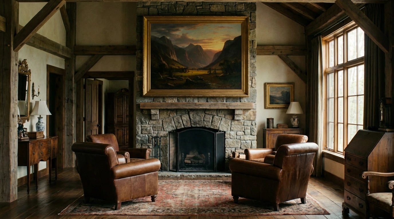
Landscape artwork encompasses a remarkable range of artistic styles, each offering distinct visual impact and emotional resonance. Traditional realistic landscapes capture nature with photographic precision, featuring detailed depictions of mountains, forests, beaches, and countryside scenes. These pieces often evoke nostalgia and tranquility, making them ideal for classic or traditional living room designs.
Impressionist landscapes take a softer approach, using loose brushwork and vibrant colors to convey the essence of a scene rather than precise details. Artists like Monet pioneered this style, which remains incredibly popular for contemporary homes. Meanwhile, abstract landscape art distills natural scenery into simplified forms, colors, and textures. This style works exceptionally well in modern, minimalist spaces where bold statements are valued over literal representation.
Additionally, contemporary landscape photography has become increasingly accessible and affordable. High-quality prints of stunning natural vistas can rival traditional paintings in visual impact. When exploring different landscape art styles for home decor, consider how each aesthetic aligns with your existing furniture and architectural elements.
Regional and Cultural Variations
Different geographical regions inspire unique landscape traditions. Australian landscape art, for instance, often features distinctive eucalyptus trees, red earth tones, and unique flora. Asian landscape art emphasizes harmony between elements, often incorporating mountains, water, and mist with calligraphic precision. European landscapes might showcase rolling countryside, Mediterranean coastlines, or Alpine grandeur.
Understanding these cultural nuances helps you select pieces that resonate with your heritage, travel memories, or aesthetic preferences. Moreover, regional styles can introduce conversation-starting elements that reflect your personality and interests.
Choosing the Right Size and Placement
Scale represents one of the most critical factors when selecting landscape art for your living room. A common mistake involves choosing pieces that are too small for the wall space, creating a disconnected, floating appearance. Conversely, oversized artwork in a small room can overwhelm the space and make it feel cramped.
As a general guideline, artwork should occupy approximately 60-75% of the available wall space above furniture. For a standard sofa measuring 7-8 feet wide, consider a single large piece around 4-5 feet wide, or a gallery arrangement covering similar dimensions. When hanging art above a sofa or console table, maintain 6-8 inches of space between the furniture top and the bottom of the frame.
Height placement matters equally. The center of your artwork should align with average eye level, typically 57-60 inches from the floor. However, in rooms where people primarily sit, you might lower this slightly to ensure comfortable viewing from seated positions. Furthermore, matching art decor for every room requires considering viewing angles from multiple seating positions.
Considering Room Proportions
Room dimensions significantly influence artwork selection. Tall ceilings accommodate vertical landscape orientations beautifully, drawing the eye upward and emphasizing architectural height. Conversely, horizontal panoramic landscapes complement wide walls and low-ceilinged spaces by creating visual breadth. Measure your available wall space carefully before making purchases, accounting for furniture placement, windows, and architectural features.
Color Coordination with Your Existing Decor
Color harmony between your landscape artwork and living room palette creates visual cohesion that feels intentional and polished. Begin by identifying your room’s dominant colors—these typically appear in large furniture pieces, walls, and flooring. Your landscape art should either complement these existing hues or provide controlled contrast as an accent element.
The 60-30-10 rule offers excellent guidance: 60% of your room should feature a dominant color, 30% a secondary color, and 10% an accent color. Your landscape art can reinforce any of these percentages. For instance, in a predominantly neutral room with beige sofas and cream walls, a landscape featuring warm earth tones reinforces the existing palette, while a seascape with blues introduces refreshing contrast.
Temperature matters significantly in color selection. Warm landscapes featuring sunset oranges, golden fields, or autumn foliage create cozy, inviting atmospheres. Cool landscapes with blues, greens, and purples evoke calmness and spaciousness. Consider your living room’s natural lighting as well—north-facing rooms with cooler light benefit from warm-toned artwork, while south-facing spaces can handle cooler palettes effectively.
If you’re new to color theory, the landscape art color matching guide for beginners provides comprehensive strategies for achieving harmonious color relationships.
Testing Before Committing
Many online retailers now offer visualization tools or return policies that allow you to test artwork in your space. Alternatively, create mock-ups using colored paper cut to size, or use digital design apps to preview how different landscape pieces might look on your walls. This testing phase prevents costly mistakes and ensures satisfaction with your final selection.
Framing and Presentation Options
The frame surrounding your landscape artwork significantly impacts its overall presentation and integration with your decor. Traditional wooden frames in oak, walnut, or cherry complement classic interiors and realistic landscape paintings. These substantial frames add gravitas and timeless appeal, particularly with gilded or ornate detailing for formal spaces.
Modern spaces often benefit from sleek metal frames in black, silver, or gold finishes. These minimalist options direct attention to the artwork itself rather than the frame, working beautifully with contemporary and abstract landscapes. Floating frames, which create a small gap between the artwork and frame edge, add sophisticated dimension and work especially well with canvas prints.
Matting provides another design consideration. White or cream mats create clean, gallery-style presentations and prevent visual crowding, especially important with busy or colorful landscapes. Colored mats can pull accent colors from the artwork, though this technique requires careful color matching to avoid clashing. Double matting adds luxurious depth, using two mat layers in complementary colors.
Canvas wraps offer frameless alternatives where the landscape image extends around the canvas edges. This gallery-wrapped style creates contemporary, casual presentations suitable for modern living rooms. When considering different presentation options, reviewing essential tips for buying art prints can help you make informed decisions about quality and longevity.
Glass and Protection
Protective glazing shields your artwork from dust, moisture, and UV damage. Standard glass offers basic protection but can create glare issues in brightly lit rooms. Non-reflective or museum glass eliminates glare and provides superior UV protection, though at higher cost. Acrylic glazing weighs less than glass and resists shattering, making it ideal for large pieces or homes with children.
Creating Gallery Walls with Landscape Prints
Gallery walls transform single-artwork impact into dynamic visual statements by combining multiple landscape pieces. This approach works exceptionally well when you love several smaller landscapes but lack a single statement piece. However, successful gallery walls require planning to avoid chaotic, unbalanced arrangements.
Start by establishing a unifying element—this might be consistent framing, a shared color palette, similar artistic styles, or a common theme like coastal landscapes or forest scenes. Lay out your arrangement on the floor before hanging, experimenting with different configurations. Common layouts include:
- Grid arrangements with uniform spacing and frame sizes for structured, modern aesthetics
- Salon-style groupings with varied frame sizes arranged organically for eclectic charm
- Horizontal rows at consistent heights for streamlined, contemporary presentations
- Asymmetrical clusters anchored by one larger focal piece surrounded by smaller companions
Maintain consistent spacing between frames, typically 2-3 inches, to create visual cohesion. When mixing landscape orientations, balance vertical and horizontal pieces to prevent visual heaviness on one side. Additionally, step back frequently during installation to assess overall balance from viewing distance.
For comprehensive guidance, the ultimate guide to choosing landscape art offers detailed strategies for curating cohesive collections.
Common Mistakes to Avoid
Even with careful planning, beginners frequently encounter predictable pitfalls when selecting landscape art. Understanding these common errors helps you avoid them from the outset, saving time, money, and frustration.
Purchasing artwork impulsively without measuring your space ranks among the most frequent mistakes. That stunning landscape that captivated you online may arrive disappointingly small or overwhelmingly large for your intended wall. Always measure carefully and consider room scale before purchasing.
Ignoring lighting conditions represents another critical oversight. Artwork colors appear dramatically different under various lighting temperatures. Natural daylight, warm incandescent bulbs, and cool LED lights all affect how landscape colors present. Consider your room’s lighting when selecting pieces, and ideally view samples under similar conditions before committing.
Hanging artwork too high creates disconnection from living spaces. Remember, gallery standards differ from home settings—galleries accommodate standing viewers, while living rooms serve seated occupants. Adjust height accordingly for comfortable viewing.
Budget Considerations
Setting unrealistic budgets either severely limits quality options or leads to financial strain. Quality landscape prints exist across price ranges, but understanding what you’re paying for—print quality, paper type, framing—helps you make value-based decisions. According to industry standards for fine art printing, giclée prints offer museum-quality reproduction at accessible prices. Resources like the complete art print buying guide explain pricing factors comprehensively.
Maintaining Your Artwork
Proper maintenance preserves your landscape art’s beauty and value for years. Fortunately, art prints require minimal care when displayed appropriately. Position artwork away from direct sunlight, which causes fading even in UV-protected pieces. South and west-facing walls receive the most intense sun exposure—reserve these for less light-sensitive decor or use window treatments to filter harsh rays.
Humidity control matters significantly, especially in coastal or humid climates. Excessive moisture encourages mold growth, paper buckling, and frame degradation. Maintain relative humidity between 40-60% using dehumidifiers or air conditioning as needed. Conversely, extremely dry conditions can make paper brittle.
Cleaning requires gentle approaches. Dust frames regularly using soft, dry cloths or microfiber dusters. For glazed artwork, clean glass or acrylic with appropriate cleaners applied to the cloth rather than sprayed directly on the frame. Never use water or cleaning products on unprotected artwork surfaces. Professional conservation cleaning may be necessary for valuable or damaged pieces.
Periodically inspect your landscape art for signs of deterioration, including fading, discoloration, foxing (brown spots), or frame damage. Early detection allows for timely professional intervention when necessary. Moreover, you can explore various options at the artwork collection to refresh your space periodically without major investment.
Insurance and Documentation
For valuable pieces, maintain purchase documentation, certificates of authenticity, and photographs for insurance purposes. Some homeowner’s policies cover artwork automatically up to certain limits, while valuable collections may require additional riders or specialized art insurance. Consequently, understanding your coverage protects your investment against damage, theft, or loss.
Selecting landscape art for your living room combines aesthetic judgment with practical considerations of size, color, placement, and maintenance. By understanding fundamental principles—from artistic styles and color coordination to proper hanging heights and preservation techniques—you can confidently curate artwork that transforms your living space. Remember that your choices should ultimately reflect your personal taste and create an environment where you feel comfortable and inspired. Start with pieces that genuinely resonate with you emotionally, then apply these technical guidelines to display them effectively. As your confidence grows, you’ll develop an instinctive sense for what works in your space, making future selections increasingly intuitive and satisfying.

|
joerussell Australian abstract artists based in Byron Bay and curator of the GumPrints art print collection. |
Leave a Reply