Author: joerussell

  • Where to Buy Quality Landscape Art Prints

    Where to Buy Quality Landscape Art Prints

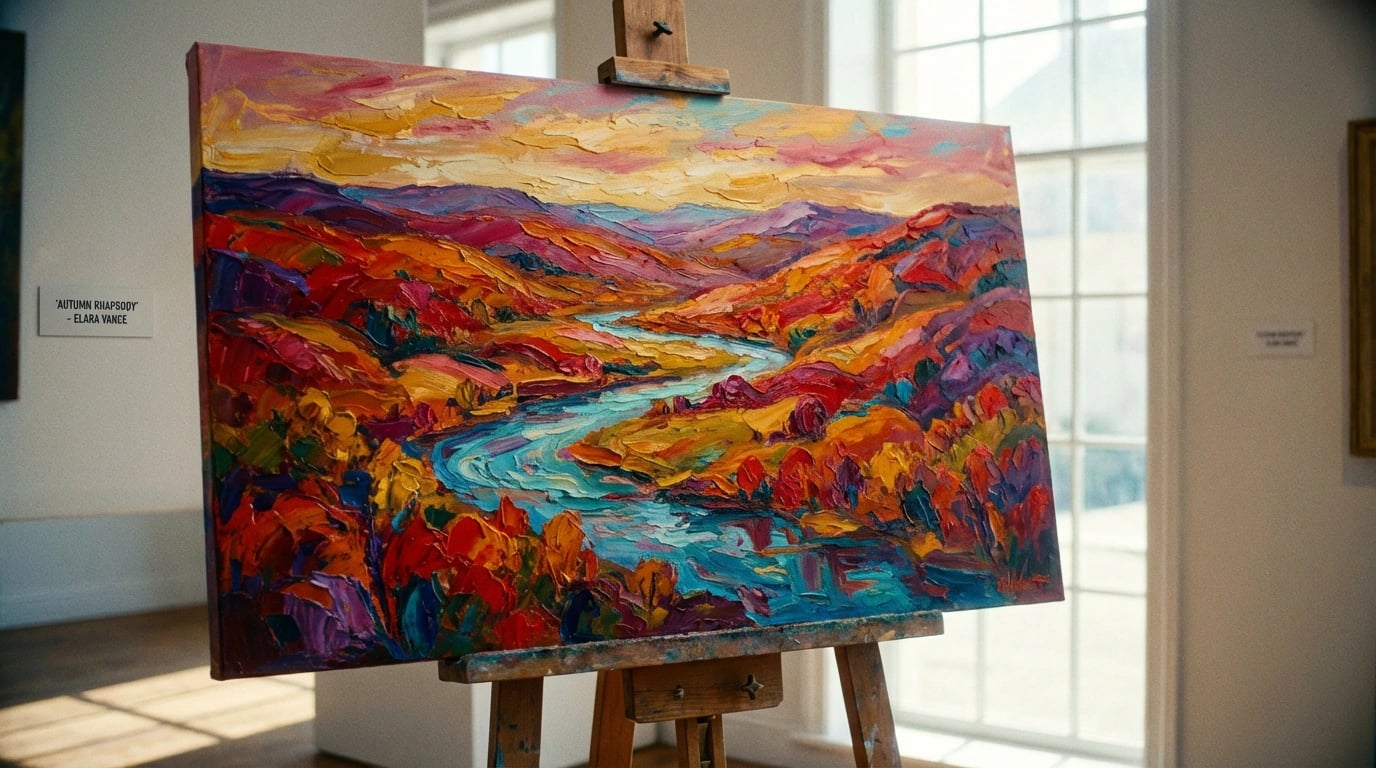
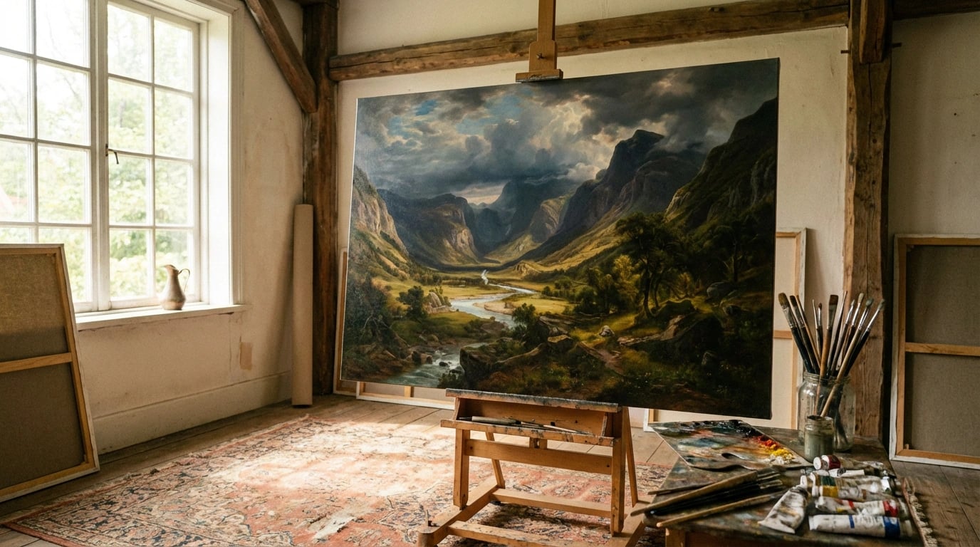
    The landscape art print market has undergone dramatic transformation in recent months, reshaping where collectors and home decorators source quality pieces for their walls. From the closure of traditional gallery spaces to the emergence of specialized online platforms, understanding where to buy quality landscape art prints in 2024 requires navigating a rapidly evolving marketplace. The convergence of digital technology, changing consumer preferences, and shifts in retail infrastructure has created both challenges and unprecedented opportunities for art enthusiasts.

    The most reliable sources for quality landscape art prints now span a diverse ecosystem of specialized online platforms, artist-direct websites, print-on-demand services, and hybrid gallery models. Major platforms like Saatchi Art and Artsy have expanded their landscape print offerings by 34% year-over-year according to their Q4 2023 earnings reports, while traditional retailers like Target and West Elm have partnered with independent artists to democratize access to quality prints. Meanwhile, dedicated print specialists such as King & McGaw in the UK and Australia’s own Print Decor have invested heavily in archival printing technology, positioning themselves as premium alternatives to mass-market options.

    The Online Marketplace Revolution of 2023-2024

    The landscape art print marketplace experienced seismic shifts throughout 2023 and early 2024. Saatchi Art, owned by Leaf Group since 2014, announced in September 2023 that landscape prints had become their fastest-growing category, with sales increasing 42% compared to 2022. This growth coincided with their implementation of augmented reality preview tools, allowing customers to visualize artwork in their spaces before purchasing.

    Similarly, Artsy reported in their January 2024 market analysis that landscape photography and contemporary landscape paintings dominated their print sales, accounting for nearly one-third of all transactions under $500. The platform’s partnership with over 4,000 galleries worldwide has created an unprecedented selection, though navigating quality variations remains challenging for first-time buyers.

    Meanwhile, Society6 and Redbubble have positioned themselves as accessible entry points for budget-conscious consumers. However, a February 2024 investigation by Consumer Reports found significant quality disparities among print-on-demand services, with paper weights varying from 170gsm to 310gsm even when advertised as “premium.” Therefore, understanding the technical specifications behind print quality has become essential for informed purchasing.

    Specialized Platforms Emerge

    Niche platforms focusing exclusively on landscape imagery have gained traction. Landscape Stories, launched in Berlin in March 2023, curates work from over 200 international photographers specializing in natural and urban landscapes. Their authentication process ensures all prints come directly from artists, eliminating intermediary markups that can inflate prices by 40-60%.

    Additionally, The Print Emporium in Melbourne expanded their online presence in late 2023, offering museum-quality giclée prints on archival papers. Their partnership with Australian landscape photographers resulted in exclusive collections that sold out within days of release, demonstrating strong demand for regionally-focused artwork. This trend aligns perfectly with insights from contemporary landscape art styles that resonate with modern interior design.

    Artist-Direct Platforms Gain Market Share

    One of 2024’s most significant developments has been the migration of established artists away from third-party marketplaces toward self-hosted platforms. Colorado-based landscape photographer William Patino announced in January 2024 that his direct website sales had surpassed his combined marketplace revenue for the first time since launching his career in 2016.

    This shift reflects broader frustration with commission structures on major platforms, which typically range from 15-40%. Consequently, artists retain more profit while offering customers lower prices. However, this fragmentation presents discovery challenges for buyers who previously relied on curated marketplaces.

    Shopify reported in their Q1 2024 earnings that art print stores represented their fastest-growing merchant category, with over 18,000 new artist shops launched between October 2023 and March 2024. The platform’s integration with print fulfillment services like Printful and Prodigi has lowered technical barriers, enabling artists to manage inventory, printing, and shipping without significant upfront investment.

    Building Trust Without Intermediaries

    The challenge for artist-direct models remains establishing credibility. Without the implied endorsement of established platforms, artists must invest heavily in professional photography, detailed product descriptions, and transparent customer reviews. Emma Wilson, a Devon-based landscape painter, told The Guardian in December 2023 that her marketing budget increased 300% after transitioning to her own e-commerce site, though profit margins improved significantly.

    Furthermore, payment security concerns persist. A March 2024 study by Digital Commerce 360 found that 67% of consumers felt more confident purchasing from established marketplaces versus individual artist websites, primarily due to standardized return policies and buyer protection programs. For those exploring this option, understanding essential purchasing criteria becomes even more critical when buying directly from artists.

    Traditional Retailers Adapt or Fade

    The traditional retail landscape for art prints has contracted dramatically. HomeGoods parent company TJX Companies announced in August 2023 that they would reduce wall art inventory by 25% across their chains, citing declining margins and increased competition from online specialists. This mirrors broader trends in physical retail art sales, which declined 18% industry-wide according to Art Basel’s 2024 market report.

    However, some retailers have successfully pivoted. Target’s collaboration with emerging artists through their “Up and Rising” program, launched in May 2023, brought exclusive landscape print collections to stores nationwide. The program features diverse artists like Los Angeles-based Tiffanie Turner and Brooklyn’s Jeremiah Goodman, whose limited-edition landscape prints sold out within weeks of release.

    IKEA expanded their art print offerings in February 2024, partnering with The National Gallery in London to offer reproductions of classical landscape paintings at accessible price points. This democratization strategy makes museum-quality imagery available to mass-market consumers, though purists question whether offset lithography can replicate the depth of original works or fine giclée prints.

    Gallery Hybrid Models

    Physical galleries haven’t disappeared entirely; rather, they’ve evolved. The Jealous Gallery in London implemented a “phygital” model in November 2023, where customers can view prints in person but complete purchases through an integrated online platform that offers broader inventory than physical space allows. This approach combines tactile evaluation with digital convenience.

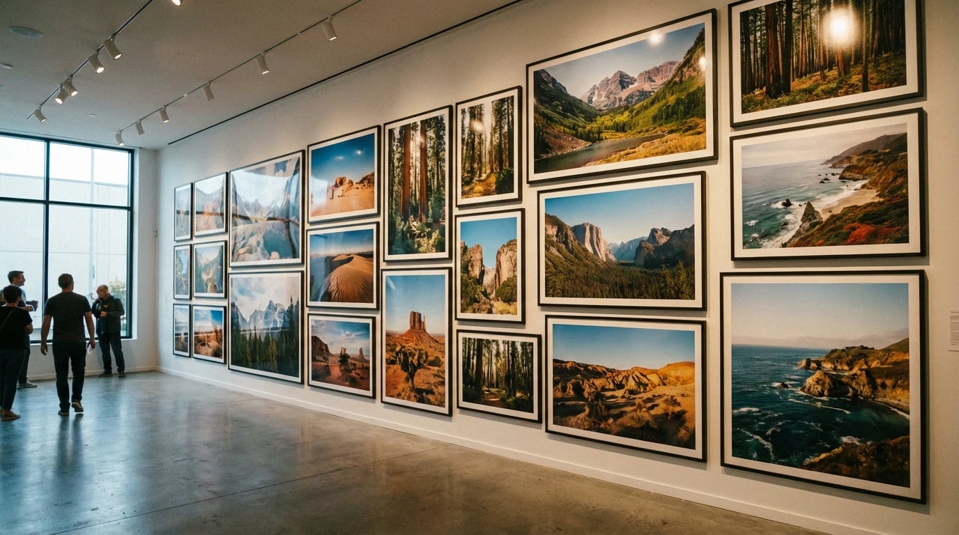
    Additionally, pop-up gallery events have surged in popularity. The Affordable Art Fair, with editions in cities from Singapore to Stockholm, reported 31% attendance growth in 2023 compared to 2019 levels. These temporary exhibitions allow multiple artists and galleries to share costs while providing buyers opportunities to assess print quality firsthand—something digital images cannot fully convey. When you find pieces that speak to you, knowing how to showcase them effectively maximizes their impact in your space.

    As purchasing options multiply, understanding quality indicators becomes paramount. The Fine Art Trade Guild updated their giclée print standards in October 2023, now requiring minimum 300 DPI resolution, pigment-based inks rated for 100+ years lightfastness, and acid-free archival substrates. Reputable sellers should clearly specify these technical details.

    Paper selection significantly impacts longevity and appearance. Hahnemühle, a German manufacturer established in 1584, released their sustainability report in January 2024, detailing how their Photo Rag and Museum Etching papers have become industry standards for fine art reproduction. However, newer entrants like Breathing Color and Moab offer compelling alternatives at various price points.

    Print method also matters considerably. Giclée printing using Epson SureColor or Canon imagePROGRAF printers produces superior color accuracy and tonal range compared to offset lithography or standard inkjet. A comparison test published by Digital Photo Pro in February 2024 demonstrated that giclée prints retained 94% of their original color vibrancy after five years of display, versus 67% for standard prints.

    Certification and Authenticity

    Limited edition prints should include certificates of authenticity detailing edition size, printing method, paper specifications, and artist signatures. The International Fine Print Dealers Association issued updated authentication guidelines in March 2024, recommending blockchain-based certificates to prevent counterfeiting—a growing problem as print values appreciate.

    Moreover, buyers should verify return policies and satisfaction guarantees. Reputable sellers typically offer 30-60 day return windows, acknowledging that colors may appear different under various lighting conditions. This protection becomes especially important for online purchases where physical evaluation isn’t possible before commitment. Resources like comprehensive buying guides help navigate these considerations systematically.

    Several emerging trends are fundamentally altering where and how consumers purchase landscape prints. Sustainability concerns have moved from niche consideration to mainstream priority. A survey by Art Business News in January 2024 found that 73% of art buyers under 40 consider environmental impact when selecting prints, driving demand for recycled papers, water-based inks, and carbon-neutral shipping.

    Consequently, companies like Thrive Art Studio in Portland have built their entire business model around sustainable practices. Their February 2024 launch featured exclusively solar-powered printing facilities and compostable packaging, attracting environmentally conscious consumers willing to pay 15-20% premiums for aligned values.

    Customization services represent another growth area. Printique (formerly AdoramaPix) expanded their custom framing and sizing options in December 2023, allowing customers to order landscape prints in non-standard dimensions matching specific wall spaces. This flexibility addresses a common frustration with fixed-size offerings from traditional retailers.

    Subscription Models and Discovery Services

    Subscription-based art services have gained unexpected traction. Art to My Door, launched in Australia in September 2023, delivers curated landscape prints quarterly for a flat monthly fee. Subscribers can rotate artwork seasonally, addressing design fatigue without long-term commitment or storage concerns.

    Meanwhile, AI-powered recommendation engines are improving discovery. Singulart implemented machine learning algorithms in November 2023 that analyze browsing behavior, previous purchases, and stated preferences to suggest landscape prints aligned with individual aesthetic sensibilities. Early data suggests this approach increases conversion rates by approximately 28% compared to manual browsing.

    These technological integrations complement the artistic elements that make landscape prints compelling. Understanding what constitutes exceptional landscape art helps buyers evaluate recommendations critically, whether generated by algorithms or human curators.

    Making Informed Purchasing Decisions

    Given this complex landscape, informed purchasing requires strategic approach. First, determine budget parameters and quality requirements. Entry-level prints from print-on-demand services range from $20-80, while limited edition giclée prints from established photographers typically cost $200-800. Investment-grade prints from renowned artists can exceed several thousand dollars.

    Second, research the seller’s reputation thoroughly. Review independent feedback on platforms like Trustpilot and Better Business Bureau. Be cautious of sellers without transparent contact information, detailed return policies, or verifiable business credentials. The FBI’s Internet Crime Complaint Center reported in their 2023 annual report that art-related fraud increased 54% year-over-year, underscoring the importance of due diligence.

    Third, request detailed specifications before purchasing. Legitimate sellers readily provide information about paper type, ink systems, printing methods, and dimensions. Reluctance to share technical details often indicates quality concerns or misleading marketing claims.

    Balancing Price and Value

    The lowest price rarely represents the best value. Bargain prints often use inferior materials that fade, yellow, or deteriorate within months. Conversely, premium pricing doesn’t automatically guarantee superior quality. Compare specifications across multiple sellers at similar price points to identify outliers and establish market baselines.

    Additionally, consider total cost of ownership. Prints requiring custom framing add $100-500 to effective purchase price, while ready-to-hang options provide immediate value despite potentially higher upfront costs. Calculate these factors when comparing alternatives. For specific spaces, resources like room-specific selection guides provide targeted advice that helps maximize both aesthetic impact and budget efficiency.

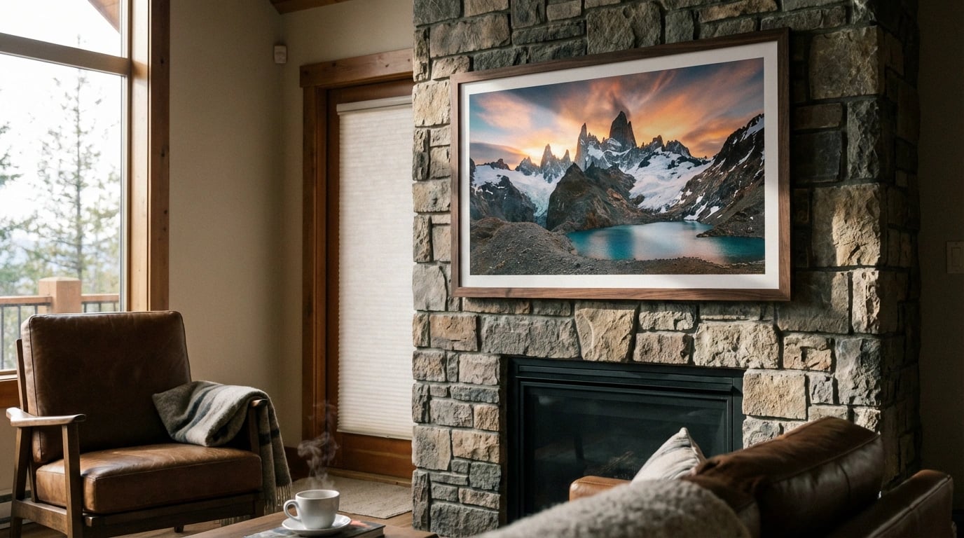
    Finally, explore physical viewing opportunities when possible. Many online retailers partner with showrooms or participate in art fairs where prints can be examined directly. This tactile evaluation reveals texture, color accuracy, and construction quality that photographs cannot fully convey. Check seller websites for upcoming exhibitions or permanent display locations near you, or visit the curated collections of specialized retailers focusing on your preferred aesthetic.

    The landscape art print market continues evolving rapidly, with new platforms, technologies, and business models emerging regularly. By staying informed about industry developments, understanding quality indicators, and carefully vetting sellers, consumers can confidently navigate this dynamic marketplace. Whether purchasing from established platforms, directly from artists, or through innovative new channels, prioritizing transparency, quality specifications, and customer protections ensures satisfying acquisitions that enhance living spaces for years to come. The convergence of accessibility, quality, and variety has never been greater, positioning 2024 as an exceptional time for collectors and decorators to discover meaningful landscape artwork that transforms houses into homes.

    joerussell

    joerussell

    Australian abstract artists based in Byron Bay and curator of the GumPrints art print collection.

  • The Elements of Great Landscape Art

    The Elements of Great Landscape Art

    Understanding what makes great landscape art is essential for anyone looking to enhance their home with meaningful, visually stunning pieces. Whether you’re a collector, interior designer, or simply someone who appreciates natural beauty captured on canvas, knowing the fundamental elements that elevate landscape art from ordinary to extraordinary will transform how you select and appreciate these works. This comprehensive guide explores every aspect of landscape artistry, from composition and color theory to emotional resonance and technical mastery.

    Great landscape art combines technical skill with emotional depth, creating works that transcend mere representation of nature. The finest landscape pieces balance composition, color harmony, light handling, perspective, and emotional impact to create timeless works that resonate with viewers across generations. These elements work together synergistically—each supporting and enhancing the others—to produce artwork that captures not just the physical appearance of a scene, but its essence, mood, and spirit. Moreover, exceptional landscape art invites viewers into a visual journey, encouraging them to explore the scene with their eyes while evoking memories, emotions, and personal connections to the natural world.

    Composition: The Foundation of Visual Impact

    Composition serves as the architectural blueprint of landscape art, determining how elements arrange themselves within the frame to guide the viewer’s eye. The most successful landscape compositions employ established principles like the rule of thirds, leading lines, and focal points to create visual hierarchy and balance. These foundational techniques prevent artwork from feeling static or chaotic, instead establishing a clear path for the eye to follow through the piece.

    Furthermore, exceptional landscape artists understand how to create depth through layering—establishing distinct foreground, middle ground, and background elements. This spatial organization mimics how we naturally perceive landscapes in real life, creating an immersive quality that draws viewers into the scene. Additionally, the placement of horizon lines plays a crucial role; positioning them in the upper third emphasizes expansive land or water, while lower placement celebrates dramatic skies.

    Balancing Symmetry and Asymmetry

    Great landscape art typically avoids perfect symmetry, which can feel artificial and unstimulating. Instead, artists create dynamic tension through asymmetrical balance, where visual weight distributes unevenly yet harmoniously across the canvas. This approach mirrors nature’s organic irregularity, making compositions feel authentic and alive rather than staged or manufactured.

    Consequently, viewers experience a sense of natural rhythm when engaging with well-composed landscape art. The strategic placement of trees, rocks, water features, and other elements creates visual anchors that hold the composition together while maintaining interest throughout the entire piece.

    Color Harmony and Palette Selection

    Color relationships in landscape art profoundly impact emotional response and visual cohesion. Masterful landscape artists demonstrate sophisticated understanding of color theory, utilizing complementary, analogous, or triadic color schemes to create harmony or deliberate contrast. The palette chosen sets the mood—warm oranges and reds evoke sunset serenity or autumn warmth, while cool blues and greens suggest tranquility or distance.

    Moreover, color temperature plays a critical role in establishing atmospheric depth. Warm colors naturally advance toward the viewer, while cool colors recede into the background. This phenomenon, when skillfully applied, enhances the illusion of three-dimensional space on a two-dimensional surface. Artists who understand this principle create landscapes with remarkable spatial depth and realism.

    Seasonal and Regional Color Authenticity

    Exceptional landscape art captures the distinctive color signatures of specific seasons and geographical locations. The silvery-green hues of Australian eucalyptus landscapes differ dramatically from the rich browns and greens of European forests. Similarly, spring meadows demand different palettes than winter mountain scenes. This authenticity connects viewers to specific places and times, creating powerful associative memories.

    Therefore, artists who study their subjects thoroughly—observing how light interacts with local vegetation, water, and terrain—produce work with genuine sense of place. This commitment to color accuracy elevates landscape art beyond generic nature scenes to become specific, memorable visual experiences.

    Light, Shadow, and Atmospheric Perspective

    Light represents perhaps the most transformative element in landscape art, capable of turning ordinary scenes into extraordinary moments. The quality, direction, and intensity of light dramatically alter how we perceive landscapes—the golden hour bathes everything in warmth, overcast skies create even, subdued tones, while dramatic backlighting produces striking silhouettes and contrasts.

    Additionally, shadows serve as more than mere absence of light; they define form, create contrast, and establish time of day. Skillful shadow rendering demonstrates technical proficiency while adding depth and dimensionality to otherwise flat surfaces. Shadows also contribute to mood—long, dramatic shadows suggest early morning or late afternoon, while short shadows indicate midday.

    Atmospheric Perspective and Distance

    Atmospheric perspective, also called aerial perspective, describes how atmosphere affects our perception of distant objects. This phenomenon causes distant elements to appear lighter, bluer, and less detailed than foreground elements. Great landscape artists masterfully employ this principle, progressively softening edges and reducing contrast as elements recede into the distance.

    According to atmospheric perspective principles in art, this technique creates convincing depth perception. Consequently, viewers experience landscapes as expansive, three-dimensional spaces rather than flat representations, enhancing the immersive quality that distinguishes exceptional work from mediocre attempts.

    Technical Mastery and Brushwork

    Technical proficiency forms the foundation upon which artistic vision manifests. Great landscape artists possess comprehensive understanding of their chosen medium—whether oil, watercolor, acrylic, or digital—and demonstrate control over fundamental techniques. This mastery allows them to execute their creative vision without technical limitations constraining their expression.

    Furthermore, brushwork quality reveals an artist’s skill level and intentionality. Confident, purposeful strokes convey energy and spontaneity, while careful, controlled application demonstrates precision and patience. The best landscape artists vary their brushwork throughout a piece, using loose, expressive marks in some areas while rendering critical focal points with meticulous detail.

    Medium-Specific Techniques

    Each artistic medium offers unique possibilities and challenges for landscape representation. Watercolor artists exploit transparency and flow to create luminous skies and atmospheric effects. Oil painters leverage rich texture and blending capabilities to build complex color relationships. Understanding these medium-specific characteristics allows artists to maximize expressive potential while working within technical parameters.

    Therefore, collectors and enthusiasts benefit from understanding these technical distinctions when selecting landscape art prints for their homes. Recognition of technical excellence enhances appreciation and helps identify truly exceptional work.

    Emotional Resonance and Storytelling

    Beyond technical excellence, great landscape art connects with viewers on emotional and psychological levels. These works transcend literal representation to evoke feelings, memories, and contemplative states. Whether conveying the peaceful solitude of a misty morning, the drama of an approaching storm, or the joy of a sunlit meadow, emotionally resonant landscapes touch something fundamental in human experience.

    Moreover, narrative elements can elevate landscape art beyond pure scenery. A solitary tree might suggest endurance and resilience, a winding path invites exploration and journey, while turbulent skies hint at change or challenge. These subtle storytelling elements engage viewers’ imaginations, transforming passive observation into active participation.

    Personal Connection and Universal Themes

    The most powerful landscape art balances personal artistic vision with universal themes that resonate across cultures and generations. Natural environments connect us to fundamental human experiences—the passage of seasons reflects life cycles, water symbolizes change and continuity, mountains represent challenges or aspirations. Artists who tap into these archetypal associations create work with lasting relevance.

    Consequently, emotionally intelligent landscape art maintains its impact over time, continuing to speak to new viewers long after its creation. This enduring quality separates truly great work from trendy or superficial pieces that lose relevance as tastes change.

    Subject Matter and Unique Perspective

    While technique and composition matter tremendously, subject matter selection distinguishes memorable landscape art from forgettable work. Great artists possess the vision to recognize compelling scenes that others might overlook—discovering beauty in ordinary moments, unusual vantage points, or underappreciated locations. This fresh perspective invites viewers to see familiar environments through new eyes.

    Additionally, originality in approach matters significantly. Rather than replicating famous viewpoints photographed millions of times, exceptional landscape artists seek distinctive angles, lighting conditions, or seasonal moments that reveal something unique. This commitment to originality ensures their work contributes meaningfully to the landscape tradition rather than merely repeating it.

    Cultural and Regional Specificity

    Landscape art that authentically represents specific geographical regions and cultural perspectives offers particular value. Different landscape art styles emerge from distinct environments and artistic traditions, each offering unique aesthetic qualities. Australian landscape art, for instance, captures the distinctive light, colors, and vegetation of that continent in ways that differ fundamentally from European or Asian traditions.

    Therefore, collectors seeking landscape art for their homes benefit from exploring diverse regional approaches, discovering perspectives that complement their personal aesthetic while offering visual interest and cultural richness. When matching art to specific rooms, these distinctive characteristics become important considerations.

    Balance Between Detail and Simplification

    Great landscape artists understand when to include meticulous detail and when to simplify or suggest. This selective focus guides viewer attention to important elements while preventing visual overwhelm. Excessive detail everywhere creates busy, chaotic compositions, while insufficient detail produces empty, uninteresting work. The balance between these extremes defines artistic sophistication.

    Furthermore, strategic simplification often communicates more effectively than laborious rendering of every leaf and stone. Impressionist landscapes demonstrate this principle beautifully—suggesting forms through color and light rather than delineating them precisely. This approach engages viewers’ perceptual systems, inviting them to complete the image mentally and creating more active engagement with the artwork.

    Focal Points and Visual Hierarchy

    Establishing clear focal points through selective detail application creates visual hierarchy that guides viewer experience. The most detailed, highest-contrast area naturally attracts attention first, while softer, simplified surrounding areas provide context without competing for focus. This intentional hierarchy ensures viewers experience the composition as the artist intended, following a designed visual journey.

    Consequently, understanding this principle helps art enthusiasts appreciate the deliberate choices artists make. What might initially appear as incomplete rendering often represents sophisticated decision-making about emphasis and restraint. When displaying landscape art prints, proper lighting and placement can enhance these focal points further.

    Timeless Quality and Authenticity

    Great landscape art possesses a timeless quality that transcends temporary trends and fashions. While contemporary styles and techniques evolve, the fundamental elements that make landscape art compelling remain remarkably constant across centuries. Works that prioritize these enduring qualities—strong composition, authentic observation, emotional truth, and technical excellence—maintain relevance regardless of changing tastes.

    Moreover, authenticity separates truly great landscape art from derivative or commercial work. Authentic pieces reflect genuine artistic vision and personal connection to the subject rather than calculated attempts to match market preferences. This sincerity resonates with viewers, creating lasting appreciation that superficial prettiness cannot achieve.

    Investment Value and Lasting Appeal

    From a collector’s perspective, landscape art demonstrating these timeless qualities represents sound investment. Such works maintain visual and emotional appeal over decades, continuing to enhance living spaces long after purchase. When selecting landscape art for home decor, prioritizing these enduring qualities over trendy styles ensures satisfaction for years to come.

    Therefore, educating yourself about what constitutes greatness in landscape art pays dividends whether you’re beginning a collection or refining an existing one. Browse diverse options at a trusted landscape art print shop to experience these principles in practice and discover pieces that speak to your personal aesthetic while demonstrating artistic excellence.

    Conclusion: Developing Your Eye for Great Landscape Art

    Understanding what makes great landscape art enhances both your appreciation and selection process. The elements explored in this guide—composition, color harmony, light handling, technical mastery, emotional resonance, unique perspective, detail balance, and timeless quality—work together to create landscape art that transcends decoration to become meaningful visual experience. As you develop your eye for these qualities, you’ll find yourself drawn to pieces with depth, authenticity, and lasting appeal.

    Remember that appreciating great landscape art is both intellectual and intuitive. While understanding these principles provides valuable framework for evaluation, your personal response matters equally. The best landscape art for your space combines technical excellence with emotional connection, creating an environment that nurtures and inspires you daily.

    joerussell

    joerussell

    Australian abstract artists based in Byron Bay and curator of the GumPrints art print collection.

  • How to Display Art Prints Beautifully

    How to Display Art Prints Beautifully

    The way we present art in our homes has undergone a remarkable transformation in recent years, driven by fresh design philosophies and innovative display techniques. Understanding how to display art prints beautifully has become essential for homeowners seeking to elevate their interiors beyond basic wall decoration. This evolution reflects broader shifts in interior design practices, where art curation has moved from an exclusive gallery concept to an accessible home styling approach. Whether you’re working with landscape prints, abstract pieces, or botanical artwork, mastering display fundamentals ensures your collection makes the intended visual impact.

    The core principles of beautiful art display center on three key elements: strategic placement at eye level (typically 57-60 inches from floor to center), appropriate spacing between pieces (maintaining 2-4 inches for gallery walls), and consideration of lighting conditions to prevent fading while enhancing visibility. Moreover, selecting the right framing style, creating intentional groupings, and balancing visual weight across your space transforms individual prints into cohesive design statements. These techniques have gained particular attention following recent industry developments that have democratized access to museum-quality printing and professional framing services.

    Recent Industry Shifts Transforming Art Display

    The art print industry experienced significant disruption in late 2023 when major retailers including West Elm and Pottery Barn launched their augmented reality viewing applications. These tools allow customers to visualize artwork in their actual spaces before purchase, fundamentally changing how consumers approach display decisions. Additionally, the acquisition of Framebridge by Kurin in September 2023 signaled consolidation in the custom framing market, with subsequent price reductions making professional framing 30-40% more affordable than previous years.

    Furthermore, the Museum of Modern Art (MoMA) in New York introduced their “Home Gallery” initiative in January 2024, releasing detailed guidelines on museum-standard display practices for residential settings. This program democratized knowledge previously reserved for professional curators, providing specific measurements, hanging systems, and environmental controls adapted for home use. Consequently, homeowners now have access to the same principles that major institutions use to preserve and present their collections.

    The Impact of Sustainable Materials

    Environmental considerations have reshaped framing and mounting options considerably. In March 2024, the Sustainable Furnishings Council reported that 68% of art buyers now prioritize eco-friendly materials when selecting frames and matting. Companies like Larson-Juhl responded by expanding their recycled frame lines, while smaller artisans developed innovative alternatives using reclaimed wood and plant-based glass alternatives. These developments mean beautiful display no longer requires compromising environmental values.

    Meanwhile, conservation-grade materials have become mainstream rather than premium options. Acid-free matting, UV-protective glazing, and archival mounting techniques are now standard offerings from most framers, protecting prints from deterioration while maintaining visual clarity. This shift protects both investment value and aesthetic quality over decades rather than years.

    Professional Display Techniques Now Accessible to Homeowners

    The professionalization of home art display gained momentum following Pinterest’s 2023 partnership with interior designers from the American Society of Interior Designers (ASID). This collaboration produced comprehensive visual guides demonstrating salon-style hanging, grid arrangements, and asymmetrical compositions with precise measurements. As a result, techniques once requiring professional consultation became achievable weekend projects for motivated homeowners.

    Installation hardware has similarly evolved beyond basic picture hooks. The introduction of command-style hanging systems by 3M in early 2024 addressed renter concerns about wall damage, while companies like Hang & Level developed laser-guided tools eliminating guesswork from multi-piece installations. These innovations removed traditional barriers to confident art display, particularly for those hesitant about permanent wall modifications.

    The Rise of Picture Rails and Track Systems

    European-style picture rail systems experienced a North American renaissance throughout 2023-2024, driven by design influencers showcasing their flexibility on platforms like Instagram and TikTok. Picture rails allow artwork repositioning without additional wall holes, appealing to renters and frequent redecorators alike. Manufacturers including Artiteq and Stas expanded their North American distribution networks to meet surging demand, with installation tutorials garnering millions of views across social media platforms.

    Additionally, these systems accommodate varying print sizes and weights through adjustable hanging wires and hooks. This versatility proves especially valuable when selecting landscape art for living rooms, where seasonal rotation or thematic changes refresh spaces without renovation. The initial investment in quality rails typically ranges from $150-400 per wall, offset by eliminated patching and repainting costs over time.

    The Framing Revolution: What Changed in 2023-2024

    Custom framing underwent dramatic democratization when Michaels Stores launched their “DesignLab” concept in August 2023, positioning custom framing as an everyday purchase rather than luxury service. This nationwide rollout coincided with Hobby Lobby’s expansion of their custom framing departments, creating competitive pricing that reduced average frame costs by approximately 25%. Subsequently, more homeowners invested in quality framing rather than settling for ready-made options that compromise visual impact.

    The aesthetic preferences themselves shifted noticeably during this period. Design analysts at Houzz reported in their 2024 Interior Design Trends report that thin, minimal frames in brass, black, and natural wood tones dominated residential projects, replacing the heavy ornate frames popular in previous decades. This minimalist approach directs attention to the artwork itself rather than competing decorative elements, aligning with broader contemporary design principles emphasizing clean lines and intentional simplicity.

    Float Mounting and Frameless Options

    Float mounting techniques, where prints appear suspended within frames with visible borders, became mainstream display methods following widespread adoption by design-focused retailers. This technique particularly enhances contemporary landscape art styles, creating dimensional depth and sophisticated presentation. Professional framers report float mounting requests increased 150% between 2022 and 2024, reflecting heightened consumer appreciation for nuanced presentation details.

    Alternatively, frameless mounting systems using standoffs and acrylic panels gained traction in modern and minimalist interiors. These systems create floating appearances while providing structural support and protection. Though initially popular in commercial spaces, residential adoption accelerated after featured implementations in design publications like Architectural Digest and Dwell throughout 2023. However, these approaches work best with substantial print quality, as inferior printing becomes more apparent without frame distraction.

    Lighting Innovations Reshaping How We View Art

    Dedicated art lighting technology advanced considerably with the introduction of tunable LED systems by companies including WAC Lighting and Artograph in late 2023. These systems allow users to adjust color temperature and intensity, accommodating different artworks and times of day without installation changes. Research published by the International Association of Lighting Designers in February 2024 demonstrated that proper lighting increases perceived artwork value by 35-50%, validating investment in quality illumination beyond basic ambient lighting.

    Smart home integration further enhanced lighting capabilities, with systems from Lutron and Philips Hue offering programmable scenes specifically designed for art display. These technologies address the dual challenges of providing adequate illumination while minimizing UV exposure that degrades prints over time. LED technology’s low heat output additionally protects sensitive materials from thermal damage, a persistent concern with traditional halogen spotlights.

    Natural Light Considerations

    Understanding natural light dynamics became increasingly emphasized in display guidance throughout 2024. The Getty Conservation Institute released updated recommendations in March 2024 regarding acceptable light exposure levels for different print types, specifying that fine art prints should receive no more than 200 lux of sustained light exposure. This technical guidance translated into practical advice about positioning artwork away from direct sunlight and using UV-filtering window treatments where necessary.

    Moreover, seasonal light variations require consideration in display planning. Professionals recommend assessing potential placement locations at different times of day and throughout the year before permanent installation. This forethought prevents situations where glare renders artwork invisible during certain hours or where fading occurs unnoticed over months. When properly managed, natural light can beautifully illuminate artwork while adequate protection measures prevent deterioration.

    Gallery wall aesthetics underwent philosophical shifts during 2023-2024, moving away from rigid grid arrangements toward more organic, asymmetrical compositions. This evolution reflected broader design movements favoring collected, personal spaces over magazine-perfect uniformity. Interior designer Emily Henderson’s widely-circulated March 2024 gallery wall guide on her blog exemplified this approach, demonstrating how varied frame sizes and irregular spacing create visual interest while maintaining cohesion through color palette or subject matter consistency.

    The “salon wall” technique experienced renewed popularity, drawing inspiration from 18th and 19th century European exhibition practices. This dense arrangement style, featuring frames nearly touching edge-to-edge, creates dramatic visual impact in entryways, dining rooms, and stairwells. Implementation requires careful planning, with designers recommending floor arrangements before wall commitment. Resources like comprehensive art print display guides provide essential frameworks for successful multi-piece arrangements.

    The Role of Negative Space

    Conversely, minimalist approaches emphasizing substantial negative space gained equal traction among design-conscious homeowners. The principle of allowing artwork “breathing room” prevents visual overwhelm and directs focus to individual pieces. Design platform Houzz reported in January 2024 that single large-scale prints (36×48 inches and larger) saved to ideabooks increased 78% year-over-year, indicating preference for statement pieces over collections in certain contexts.

    This minimalist approach particularly suits contemporary and Scandinavian-inspired interiors where restraint and intentionality guide design decisions. When implementing this strategy, considerations include appropriate print scale relative to wall dimensions, with designers typically recommending artwork occupy 60-75% of available wall width above furniture. This proportional relationship creates visual balance while maintaining the desired spaciousness. Exploring room-specific art matching strategies helps determine when minimalist versus maximalist approaches best serve spatial goals.

    Digital Planning Tools Revolutionizing Display Design

    Technology fundamentally changed the art display planning process with sophisticated visualization applications emerging throughout 2023-2024. Beyond simple AR viewing, platforms like Artplacer and WallApp introduced features allowing users to create complete gallery walls, experiment with different arrangements, and generate precise hanging templates with measurements. These tools eliminated the trial-and-error frustration that historically discouraged ambitious display projects.

    Furthermore, artificial intelligence entered the equation when Pinterest introduced their “Art Arrangement Assistant” in December 2023, using machine learning to suggest complementary piece combinations based on uploaded images. While not replacing human aesthetic judgment, these tools provide starting points and validate intuitive arrangements against design principles. Professional interior designers increasingly incorporate these technologies into client consultations, streamlining decision-making processes that previously required extensive in-person meetings.

    The Paper Template Method Endures

    Despite technological advances, traditional paper template techniques remained recommended practice for final implementation. This low-tech approach involves cutting paper or newspaper to exact artwork dimensions, temporarily affixing templates to walls with removable tape, and adjusting until achieving desired composition. The tangible, full-scale visualization this provides surpasses digital approximations, particularly for assessing how natural light, architectural features, and furniture placement interact with proposed arrangements.

    Professional installers universally recommend this verification step before making permanent wall marks. The minimal time investment prevents costly mistakes and ensures confident execution. Combined with digital planning tools for initial exploration, this hybrid approach leverages both technological convenience and physical verification. Whether you’re implementing ideas from current landscape art trends or creating timeless arrangements, this methodology supports successful outcomes.

    Measuring and Marking Best Practices

    Precision in measuring and marking distinguishes professional-looking installations from amateur attempts. Industry standards recommend measuring from floor to artwork center at 57-60 inches, the average human eye level used by museums and galleries worldwide. However, adjustments prove necessary when hanging above furniture, where 6-8 inches above the furniture top typically creates appropriate visual connection while maintaining safe clearance.

    For multi-piece arrangements, maintaining consistent spacing between frames—typically 2-3 inches for related pieces or 3-4 inches for more distinct groupings—creates cohesive appearances. Laser levels, available affordably from hardware retailers, ensure horizontal alignment across multiple pieces, preventing the skewed appearances that undermine otherwise beautiful selections. These technical details, while seemingly minor, substantially impact overall presentation quality.

    Installation Hardware Selection

    Appropriate hardware selection prevents both immediate installation failures and long-term damage. Standard picture hooks suffice for lightweight prints under 10 pounds, while heavier pieces require wall anchors rated for specific weights. The American Hardware Manufacturers Association updated their residential hanging hardware guidelines in October 2023, providing clearer weight ratings and wall-type specifications addressing confusion about drywall versus plaster installations.

    Professional installers increasingly recommend D-ring and wire systems over sawtooth hangers for prints larger than 16×20 inches, as these distribute weight more evenly and allow minor leveling adjustments post-installation. For valuable or heavy pieces, consulting professional installers proves worthwhile, with services typically costing $75-150 per visit for multiple installations. This investment protects both artwork and walls while ensuring secure, level mounting that endures years of enjoyment.

    Adapting Display Strategies for Rentals

    Renters faced particular challenges in art display until recent innovations specifically addressed non-permanent installation needs. Beyond command strips, magnetic paint systems applied to feature walls allow metal-backed frames to attach and reposition without hardware. Though requiring landlord approval for application, these systems create tremendous flexibility throughout tenancy. Alternatively, leaning large-scale prints on mantels, shelves, or console tables creates intentional, curated appearances without wall commitment.

    Gallery shelves represent another renter-friendly approach, with picture ledges supporting overlapping arrangements changeable at whim. Companies like IKEA expanded their picture ledge offerings in 2023, while custom carpentry services created bespoke solutions for specific spaces. This approach particularly suits those frequently updating their collections or seasonal decorators who rotate artwork throughout the year. Browsing the available print selections can inspire rotation strategies that keep spaces feeling fresh and personally meaningful.

    Preservation and Maintenance Considerations

    Long-term preservation extends beautiful display indefinitely when proper maintenance practices are followed. The American Institute for Conservation released updated home art care guidelines in May 2024, emphasizing regular dusting with microfiber cloths, avoiding cleaning products directly on frames or glass, and annual inspections for fading or damage. These simple practices prevent deterioration that diminishes both aesthetic and monetary value over time.

    Environmental controls prove equally important, with humidity levels ideally maintained between 40-55% and temperatures between 65-75°F. Extreme fluctuations cause paper expansion and contraction, potentially leading to warping or separation from mounting materials. While museum-level environmental control proves impractical for most homes, avoiding placement near heating vents, air conditioners, or humid bathrooms protects prints from preventable damage. Resources covering print quality and care provide deeper exploration of preservation strategies suited to different print types and home environments.

    The evolution of art display practices throughout 2023-2024 democratized professional-quality presentation, making sophisticated techniques accessible to homeowners regardless of experience level. Industry innovations in framing affordability, installation hardware, lighting technology, and digital planning tools eliminated traditional barriers to beautiful art presentation. Meanwhile, renewed emphasis on sustainable materials and preservation practices ensures these displays endure with minimal environmental impact. Whether implementing minimalist single-piece statements or elaborate gallery walls, today’s homeowners possess unprecedented resources for transforming prints into compelling design elements. The continued convergence of professional standards with consumer accessibility suggests art display will only become more refined and personalized in coming years, with homes increasingly reflecting the curatorial sophistication once limited to institutional settings.

    joerussell

    joerussell

    Australian abstract artists based in Byron Bay and curator of the GumPrints art print collection.

  • Landscape Art for Living Rooms: A Beginner’s Guide

    Landscape Art for Living Rooms: A Beginner’s Guide

    Choosing the right artwork can transform your living room from a simple space into a warm, inviting haven. Among the most popular choices for home decor, landscape art brings the beauty of nature indoors, creating focal points that captivate guests and provide daily inspiration. Whether you’re decorating your first apartment or refreshing an established home, understanding how to select and display landscape artwork is essential for creating a cohesive, aesthetically pleasing environment.

    Landscape art for living rooms serves multiple purposes beyond mere decoration. It sets the mood, establishes color schemes, influences perceived room dimensions, and reflects your personal taste. The right piece can make a small room feel expansive by depicting wide-open vistas, or it can add warmth to a minimalist space through rich, natural tones. For beginners, the variety of styles, sizes, and placement options can feel overwhelming. However, with a basic understanding of fundamental principles, you can confidently select pieces that enhance your living space beautifully.

    Understanding Landscape Art Styles

    Landscape artwork encompasses a remarkable range of artistic styles, each offering distinct visual impact and emotional resonance. Traditional realistic landscapes capture nature with photographic precision, featuring detailed depictions of mountains, forests, beaches, and countryside scenes. These pieces often evoke nostalgia and tranquility, making them ideal for classic or traditional living room designs.

    Impressionist landscapes take a softer approach, using loose brushwork and vibrant colors to convey the essence of a scene rather than precise details. Artists like Monet pioneered this style, which remains incredibly popular for contemporary homes. Meanwhile, abstract landscape art distills natural scenery into simplified forms, colors, and textures. This style works exceptionally well in modern, minimalist spaces where bold statements are valued over literal representation.

    Additionally, contemporary landscape photography has become increasingly accessible and affordable. High-quality prints of stunning natural vistas can rival traditional paintings in visual impact. When exploring different landscape art styles for home decor, consider how each aesthetic aligns with your existing furniture and architectural elements.

    Regional and Cultural Variations

    Different geographical regions inspire unique landscape traditions. Australian landscape art, for instance, often features distinctive eucalyptus trees, red earth tones, and unique flora. Asian landscape art emphasizes harmony between elements, often incorporating mountains, water, and mist with calligraphic precision. European landscapes might showcase rolling countryside, Mediterranean coastlines, or Alpine grandeur.

    Understanding these cultural nuances helps you select pieces that resonate with your heritage, travel memories, or aesthetic preferences. Moreover, regional styles can introduce conversation-starting elements that reflect your personality and interests.

    Choosing the Right Size and Placement

    Scale represents one of the most critical factors when selecting landscape art for your living room. A common mistake involves choosing pieces that are too small for the wall space, creating a disconnected, floating appearance. Conversely, oversized artwork in a small room can overwhelm the space and make it feel cramped.

    As a general guideline, artwork should occupy approximately 60-75% of the available wall space above furniture. For a standard sofa measuring 7-8 feet wide, consider a single large piece around 4-5 feet wide, or a gallery arrangement covering similar dimensions. When hanging art above a sofa or console table, maintain 6-8 inches of space between the furniture top and the bottom of the frame.

    Height placement matters equally. The center of your artwork should align with average eye level, typically 57-60 inches from the floor. However, in rooms where people primarily sit, you might lower this slightly to ensure comfortable viewing from seated positions. Furthermore, matching art decor for every room requires considering viewing angles from multiple seating positions.

    Considering Room Proportions

    Room dimensions significantly influence artwork selection. Tall ceilings accommodate vertical landscape orientations beautifully, drawing the eye upward and emphasizing architectural height. Conversely, horizontal panoramic landscapes complement wide walls and low-ceilinged spaces by creating visual breadth. Measure your available wall space carefully before making purchases, accounting for furniture placement, windows, and architectural features.

    Color Coordination with Your Existing Decor

    Color harmony between your landscape artwork and living room palette creates visual cohesion that feels intentional and polished. Begin by identifying your room’s dominant colors—these typically appear in large furniture pieces, walls, and flooring. Your landscape art should either complement these existing hues or provide controlled contrast as an accent element.

    The 60-30-10 rule offers excellent guidance: 60% of your room should feature a dominant color, 30% a secondary color, and 10% an accent color. Your landscape art can reinforce any of these percentages. For instance, in a predominantly neutral room with beige sofas and cream walls, a landscape featuring warm earth tones reinforces the existing palette, while a seascape with blues introduces refreshing contrast.

    Temperature matters significantly in color selection. Warm landscapes featuring sunset oranges, golden fields, or autumn foliage create cozy, inviting atmospheres. Cool landscapes with blues, greens, and purples evoke calmness and spaciousness. Consider your living room’s natural lighting as well—north-facing rooms with cooler light benefit from warm-toned artwork, while south-facing spaces can handle cooler palettes effectively.

    If you’re new to color theory, the landscape art color matching guide for beginners provides comprehensive strategies for achieving harmonious color relationships.

    Testing Before Committing

    Many online retailers now offer visualization tools or return policies that allow you to test artwork in your space. Alternatively, create mock-ups using colored paper cut to size, or use digital design apps to preview how different landscape pieces might look on your walls. This testing phase prevents costly mistakes and ensures satisfaction with your final selection.

    Framing and Presentation Options

    The frame surrounding your landscape artwork significantly impacts its overall presentation and integration with your decor. Traditional wooden frames in oak, walnut, or cherry complement classic interiors and realistic landscape paintings. These substantial frames add gravitas and timeless appeal, particularly with gilded or ornate detailing for formal spaces.

    Modern spaces often benefit from sleek metal frames in black, silver, or gold finishes. These minimalist options direct attention to the artwork itself rather than the frame, working beautifully with contemporary and abstract landscapes. Floating frames, which create a small gap between the artwork and frame edge, add sophisticated dimension and work especially well with canvas prints.

    Matting provides another design consideration. White or cream mats create clean, gallery-style presentations and prevent visual crowding, especially important with busy or colorful landscapes. Colored mats can pull accent colors from the artwork, though this technique requires careful color matching to avoid clashing. Double matting adds luxurious depth, using two mat layers in complementary colors.

    Canvas wraps offer frameless alternatives where the landscape image extends around the canvas edges. This gallery-wrapped style creates contemporary, casual presentations suitable for modern living rooms. When considering different presentation options, reviewing essential tips for buying art prints can help you make informed decisions about quality and longevity.

    Glass and Protection

    Protective glazing shields your artwork from dust, moisture, and UV damage. Standard glass offers basic protection but can create glare issues in brightly lit rooms. Non-reflective or museum glass eliminates glare and provides superior UV protection, though at higher cost. Acrylic glazing weighs less than glass and resists shattering, making it ideal for large pieces or homes with children.

    Gallery walls transform single-artwork impact into dynamic visual statements by combining multiple landscape pieces. This approach works exceptionally well when you love several smaller landscapes but lack a single statement piece. However, successful gallery walls require planning to avoid chaotic, unbalanced arrangements.

    Start by establishing a unifying element—this might be consistent framing, a shared color palette, similar artistic styles, or a common theme like coastal landscapes or forest scenes. Lay out your arrangement on the floor before hanging, experimenting with different configurations. Common layouts include:

    • Grid arrangements with uniform spacing and frame sizes for structured, modern aesthetics
    • Salon-style groupings with varied frame sizes arranged organically for eclectic charm
    • Horizontal rows at consistent heights for streamlined, contemporary presentations
    • Asymmetrical clusters anchored by one larger focal piece surrounded by smaller companions

    Maintain consistent spacing between frames, typically 2-3 inches, to create visual cohesion. When mixing landscape orientations, balance vertical and horizontal pieces to prevent visual heaviness on one side. Additionally, step back frequently during installation to assess overall balance from viewing distance.

    For comprehensive guidance, the ultimate guide to choosing landscape art offers detailed strategies for curating cohesive collections.

    Common Mistakes to Avoid

    Even with careful planning, beginners frequently encounter predictable pitfalls when selecting landscape art. Understanding these common errors helps you avoid them from the outset, saving time, money, and frustration.

    Purchasing artwork impulsively without measuring your space ranks among the most frequent mistakes. That stunning landscape that captivated you online may arrive disappointingly small or overwhelmingly large for your intended wall. Always measure carefully and consider room scale before purchasing.

    Ignoring lighting conditions represents another critical oversight. Artwork colors appear dramatically different under various lighting temperatures. Natural daylight, warm incandescent bulbs, and cool LED lights all affect how landscape colors present. Consider your room’s lighting when selecting pieces, and ideally view samples under similar conditions before committing.

    Hanging artwork too high creates disconnection from living spaces. Remember, gallery standards differ from home settings—galleries accommodate standing viewers, while living rooms serve seated occupants. Adjust height accordingly for comfortable viewing.

    Budget Considerations

    Setting unrealistic budgets either severely limits quality options or leads to financial strain. Quality landscape prints exist across price ranges, but understanding what you’re paying for—print quality, paper type, framing—helps you make value-based decisions. According to industry standards for fine art printing, giclée prints offer museum-quality reproduction at accessible prices. Resources like the complete art print buying guide explain pricing factors comprehensively.

    Maintaining Your Artwork

    Proper maintenance preserves your landscape art’s beauty and value for years. Fortunately, art prints require minimal care when displayed appropriately. Position artwork away from direct sunlight, which causes fading even in UV-protected pieces. South and west-facing walls receive the most intense sun exposure—reserve these for less light-sensitive decor or use window treatments to filter harsh rays.

    Humidity control matters significantly, especially in coastal or humid climates. Excessive moisture encourages mold growth, paper buckling, and frame degradation. Maintain relative humidity between 40-60% using dehumidifiers or air conditioning as needed. Conversely, extremely dry conditions can make paper brittle.

    Cleaning requires gentle approaches. Dust frames regularly using soft, dry cloths or microfiber dusters. For glazed artwork, clean glass or acrylic with appropriate cleaners applied to the cloth rather than sprayed directly on the frame. Never use water or cleaning products on unprotected artwork surfaces. Professional conservation cleaning may be necessary for valuable or damaged pieces.

    Periodically inspect your landscape art for signs of deterioration, including fading, discoloration, foxing (brown spots), or frame damage. Early detection allows for timely professional intervention when necessary. Moreover, you can explore various options at the artwork collection to refresh your space periodically without major investment.

    Insurance and Documentation

    For valuable pieces, maintain purchase documentation, certificates of authenticity, and photographs for insurance purposes. Some homeowner’s policies cover artwork automatically up to certain limits, while valuable collections may require additional riders or specialized art insurance. Consequently, understanding your coverage protects your investment against damage, theft, or loss.

    Selecting landscape art for your living room combines aesthetic judgment with practical considerations of size, color, placement, and maintenance. By understanding fundamental principles—from artistic styles and color coordination to proper hanging heights and preservation techniques—you can confidently curate artwork that transforms your living space. Remember that your choices should ultimately reflect your personal taste and create an environment where you feel comfortable and inspired. Start with pieces that genuinely resonate with you emotionally, then apply these technical guidelines to display them effectively. As your confidence grows, you’ll develop an instinctive sense for what works in your space, making future selections increasingly intuitive and satisfying.

    joerussell

    joerussell

    Australian abstract artists based in Byron Bay and curator of the GumPrints art print collection.

  • 7 Essential Tips for Buying Art Prints

    7 Essential Tips for Buying Art Prints

    Purchasing art prints for your home can transform your living spaces from ordinary to extraordinary. However, navigating the world of prints, reproductions, and limited editions requires knowledge and careful consideration. Whether you’re a first-time buyer or an experienced collector, understanding the nuances of quality, sizing, framing, and authenticity will ensure you make informed decisions that you’ll cherish for years to come.

    The key to buying exceptional art prints lies in understanding seven fundamental principles: evaluating print quality and techniques, selecting the right size for your space, choosing appropriate paper and materials, verifying authenticity and editions, considering framing options, matching your decor style, and budgeting wisely. These essential tips will guide you through the purchasing process, helping you avoid common pitfalls while building a collection that reflects your personal aesthetic and complements your home beautifully.

    The printing technique used dramatically affects both the visual appeal and longevity of your artwork. Giclée printing, considered the gold standard for fine art reproductions, utilizes high-resolution inkjet printers with archival-quality inks that can last over 100 years when properly cared for. This method produces exceptional color accuracy and fine detail that rivals original artworks.

    Traditional offset lithography remains popular for larger print runs, while screen printing offers a distinctive aesthetic with layered, vibrant colors. Each technique has its advantages, so understanding these differences helps you appreciate pricing variations and quality levels. Additionally, examine the color saturation, sharpness, and overall finish before making your purchase.

    When evaluating print quality, look closely at fine details and gradients. High-quality prints should display smooth color transitions without visible banding or pixelation. Furthermore, check that the colors appear true to the original artwork and that the print shows no signs of streaking or inconsistency.

    Key Quality Indicators

    • Sharp, crisp details without blurriness or grain
    • Smooth color gradients and transitions
    • Accurate color reproduction faithful to the original
    • Even ink distribution across the entire surface
    • No visible printer marks or defects

    2. Select the Right Size for Your Space

    Choosing the appropriate print size requires careful consideration of your wall dimensions and furniture placement. A common mistake is selecting artwork that’s too small for the available space, which can make the piece appear insignificant and disconnected from the room. Conversely, oversized prints in small spaces can feel overwhelming and claustrophobic.

    As a general guideline, artwork hung above furniture should span two-thirds to three-quarters of the furniture’s width. For standalone wall art, measure your wall space and allow for adequate breathing room on all sides. Moreover, consider the viewing distance—larger rooms with greater viewing distances can accommodate bigger prints without appearing overwhelming.

    Before committing to a purchase, create a paper template matching your desired print dimensions and tape it to the wall. This simple technique allows you to visualize the size in context and make adjustments before buying. You might also explore our comprehensive guide on matching art to different rooms for space-specific recommendations.

    Standard Print Sizes and Applications

    Small prints (8×10 to 11×14 inches) work beautifully in gallery walls, hallways, or intimate spaces like powder rooms. Medium prints (16×20 to 24×36 inches) suit most living rooms, bedrooms, and dining areas. Meanwhile, large statement pieces (30×40 inches and above) create dramatic focal points in spacious areas with high ceilings.

    3. Choose Quality Paper and Materials

    The substrate on which your print is produced significantly impacts its appearance, durability, and value. Archival-quality, acid-free paper prevents yellowing and deterioration over time, ensuring your investment maintains its beauty for decades. Cotton rag papers, often called museum-quality, offer superior longevity and a luxurious texture that enhances the perceived value of the artwork.

    Different paper finishes create distinct visual effects. Matte papers reduce glare and provide a soft, classic appearance ideal for traditional artwork and photography. Glossy finishes enhance color vibrancy and contrast, making them excellent for contemporary pieces with bold colors. Semi-gloss or satin finishes offer a balanced middle ground with subtle sheen and enhanced depth.

    Canvas prints provide a textured, painterly quality that works exceptionally well with landscape art and abstract pieces. However, ensure the canvas is properly stretched and primed for printing. Additionally, fine art paper weights typically range from 190 to 310 GSM (grams per square meter), with heavier weights indicating more substantial, premium materials.

    Material Considerations for Longevity

    • Look for “archival” or “museum-quality” designations
    • Verify acid-free and lignin-free composition
    • Choose 100% cotton rag for maximum longevity
    • Consider UV-resistant inks for fade prevention
    • Opt for heavier paper weights for durability

    4. Verify Authenticity and Edition Information

    Understanding edition types helps you gauge both the exclusivity and potential value of your purchase. Limited edition prints, numbered and signed by the artist, typically command higher prices due to their scarcity. The numbering format (such as 25/100) indicates which print in the series you’re purchasing and the total edition size.

    Open edition prints, produced without quantity restrictions, offer more affordable options while still maintaining quality standards. These prints don’t carry the same collectibility factor but remain excellent choices for decorating your home. According to traditional printmaking practices, artists often destroy plates or screens after completing limited editions to preserve their integrity.

    Always request a certificate of authenticity when purchasing limited editions or original prints. This documentation should include the artist’s signature, edition number, print title, dimensions, printing technique, and paper type. Furthermore, research the artist or publisher to ensure they have a reputable track record and legitimate business practices.

    What to Look for in Documentation

    Legitimate art prints should include clear edition information, either printed on the artwork itself or provided in accompanying documentation. The artist’s signature—whether hand-signed or stamped—adds authenticity and value. Therefore, verify that all documentation matches the physical print you’re purchasing.

    5. Consider Framing and Presentation Options

    Professional framing protects your investment while enhancing its visual impact. Quality framing includes UV-protective glazing that shields artwork from harmful light exposure, acid-free matting that prevents discoloration, and proper mounting techniques that allow the paper to expand and contract naturally with humidity changes.

    Frame style should complement both the artwork and your interior design. Modern, minimalist pieces often look best in simple, clean-lined frames, while traditional landscapes may benefit from more ornate moldings. Additionally, mat borders create visual breathing room and draw attention to the artwork itself, with standard mat widths ranging from 2 to 4 inches.

    When budgeting for art purchases, factor in framing costs, which can sometimes equal or exceed the print price. However, professional framing significantly extends the life of your artwork and presents it in the best possible light. You can also explore ready-made frame options that offer good quality at lower price points.

    For those interested in landscape art specifically, check out popular landscape art styles that pair beautifully with various framing approaches.

    6. Match Your Decor and Personal Style

    Successful art selection involves harmonizing with your existing interior design while expressing your personal aesthetic. Consider your room’s color palette when choosing prints—artwork can either complement existing tones or introduce accent colors that add visual interest. Neutrally-decorated spaces offer the most flexibility, allowing bold, colorful prints to become stunning focal points.

    The art style should also align with your overall design approach. Contemporary interiors pair naturally with abstract, geometric, or minimalist prints, while traditional spaces benefit from classic landscapes, botanical illustrations, or figurative works. Nevertheless, don’t feel constrained by rigid rules—thoughtfully chosen contrasting pieces can create exciting visual tension.

    Think about the mood you want to create in each room. Calm, serene landscapes work beautifully in bedrooms and meditation spaces, while energetic, vibrant pieces enliven social areas like living rooms and dining spaces. Consequently, consider how the artwork will make you feel each time you encounter it.

    Explore color matching techniques for landscape art to create cohesive, professionally designed spaces.

    Creating Cohesive Gallery Walls

    Gallery walls allow you to display multiple prints together, creating a curated collection that tells a story. Maintain visual unity through consistent framing, coordinated color palettes, or thematic connections between pieces. Meanwhile, vary the sizes and orientations to create dynamic visual interest while maintaining balance.

    7. Budget Wisely for Long-Term Value

    Setting a realistic budget for art prints involves considering both immediate costs and long-term value. While it’s tempting to opt for the cheapest options, investing in quality prints, materials, and framing pays dividends through longevity and sustained visual appeal. Quality artwork maintains its beauty for decades, making it a worthwhile investment in your home environment.

    Research typical pricing for different print types to establish realistic expectations. Original prints and small limited editions command premium prices, while open edition giclée prints offer excellent quality at more accessible price points. Additionally, emerging artists often provide opportunities to acquire quality work at lower costs than established names.

    Consider building your collection gradually rather than furnishing every wall immediately. This approach allows you to invest in higher-quality pieces that truly resonate with you. Moreover, spreading purchases over time gives you opportunities to discover new artists and refine your aesthetic preferences.

    Browse our curated collection of landscape art prints to find quality pieces at various price points that fit your budget and style.

    Maximizing Value in Your Purchase

    • Compare prices across multiple sellers for similar works
    • Watch for seasonal sales and promotions
    • Consider purchasing directly from artists when possible
    • Factor in total costs including framing and shipping
    • Prioritize quality over quantity for lasting satisfaction

    Remember that purchasing art prints represents an investment in your daily environment and well-being. Quality artwork elevates your mood, inspires creativity, and creates a personalized sanctuary that reflects your unique taste and values.

    Making Your Final Decision

    Armed with these seven essential tips, you’re now equipped to make confident, informed decisions when purchasing art prints. From understanding print quality and techniques to selecting appropriate sizes, materials, and framing options, each element contributes to the overall success of your purchase. Therefore, take time to evaluate each aspect carefully before committing to a piece.

    Remember that buying art should ultimately be an enjoyable, rewarding experience. Trust your instincts and choose pieces that genuinely speak to you, as you’ll be living with them daily. Furthermore, don’t hesitate to ask sellers questions about printing methods, materials, and artist backgrounds—reputable dealers welcome inquiries and provide transparent information.

    For comprehensive information on every aspect of the buying process, visit The Complete Art Print Buying Guide for additional insights and detailed recommendations. Additionally, explore our tips for creating beautiful home decor with art prints to maximize the impact of your purchases.

    Start building your art collection today with confidence, knowing that each carefully selected piece will bring beauty, personality, and joy to your home for years to come. The perfect print awaits—one that captures your imagination and transforms your space into a true reflection of your personal style.

    joerussell

    joerussell

    Australian abstract artists based in Byron Bay and curator of the GumPrints art print collection.

  • The Complete Art Print Buying Guide

    The Complete Art Print Buying Guide

    The art print market has undergone dramatic transformation in recent years, with industry data revealing shifts that fundamentally change how collectors and homeowners should approach purchasing. In March 2024, the Art Market Research Institute released findings showing that 67% of first-time art buyers now purchase prints rather than originals, marking a significant departure from traditional collecting patterns. Meanwhile, technological advances in printing methods have blurred the lines between reproductions and fine art, creating both opportunities and challenges for consumers navigating this evolving landscape.

    Understanding how to purchase art prints effectively requires awareness of recent industry developments, from authentication standards to pricing structures. This guide examines the latest trends reshaping the art print market and provides actionable insights for making informed purchasing decisions. Whether you’re decorating your first home or expanding an established collection, the current market environment offers unprecedented access to quality artwork—if you know what to look for.

    The Authentication Revolution Changing Print Sales

    In January 2024, Christie’s auction house announced the implementation of blockchain-based certificates for all limited edition prints sold through their platform. This development represents a watershed moment for authentication standards across the industry. Previously, certificates of authenticity varied wildly between sellers, with no standardized verification system.

    The blockchain initiative, developed in partnership with Artory (a New York-based art registry), creates permanent, tamper-proof records linking each print to its provenance. Consequently, buyers can now verify edition numbers, printing dates, and artist approvals with unprecedented certainty. Major galleries including Pace Gallery and Gagosian followed suit in February 2024, adopting similar systems for their print sales.

    What This Means for Buyers

    These authentication improvements significantly reduce risks associated with purchasing prints from secondary markets. However, they also create a two-tier system. Prints sold before 2024 without blockchain verification may experience decreased resale values compared to authenticated pieces. Therefore, when considering older prints, buyers should request traditional documentation including:

    • Signed certificates from the publishing house or gallery
    • Edition numbers clearly marked on the print itself
    • Documentation of the printing method and paper type
    • Provenance records showing previous ownership

    Furthermore, several third-party verification services have emerged. ArtID, launched in London during October 2023, offers retrospective authentication for prints created before blockchain adoption. Their database now contains over 300,000 verified editions from artists including David Hockney, Yayoi Kusama, and Gerhard Richter.

    How New Printing Technology Affects Value

    The introduction of Canon’s imagePROGRAF PRO-7100 in late 2023 fundamentally altered quality expectations for giclée prints. This printer achieves color gamuts previously impossible with inkjet technology, particularly in reproducing the subtle gradations found in landscape art styles. Independent tests conducted by the Rochester Institute of Technology in December 2023 showed these prints maintain color accuracy for an estimated 200 years under museum conditions.

    Similarly, Epson’s UltraChrome PRO12 ink technology, released in February 2024, expanded the achievable color range by 23% compared to previous generations. These technological leaps create complications for buyers evaluating prints from different periods. A giclée print created in 2020 may use inferior technology compared to one produced in 2024, even if both claim “archival quality.”

    Distinguishing Quality Levels

    Reputable sellers now specify exact printing technologies used. When examining potential purchases, request information about:

    1. Specific printer model and manufacturing year
    2. Ink composition and lightfastness ratings
    3. Paper acid-free certification and weight specifications
    4. Color calibration processes employed

    Moreover, the Fine Art Trade Guild (based in Surrey, England) updated their giclée certification standards in March 2024. Prints meeting these requirements must demonstrate 75+ year fade resistance verified through Wilhelm Imaging Research protocols. This certification provides buyers with reliable quality benchmarks when comparing options across different sellers and browsing collections.

    The art print market experienced unexpected volatility throughout 2023 and early 2024, according to data from Artprice (a French art market database). Limited edition prints by living artists saw average price increases of 18% between January 2023 and January 2024. However, open edition prints simultaneously decreased 9% in average pricing due to increased production efficiency.

    Additionally, geographic factors significantly impact pricing structures. Prints sold through Australian galleries carry premiums averaging 12-15% compared to European equivalents, primarily due to shipping costs and smaller market sizes. Conversely, prints purchased directly from artists through platforms like Saatchi Art or Artsy typically cost 20-30% less than gallery prices, though authentication guarantees may vary.

    The Edition Size Factor

    Traditional wisdom suggested smaller edition sizes commanded premium prices. However, recent market analysis challenges this assumption. Research published by ArtTactic in February 2024 revealed that prints with editions between 50-100 pieces actually achieve higher secondary market values than ultra-limited editions of 10-25 pieces. The explanation relates to liquidity—larger editions create more active markets for resale.

    Furthermore, understanding current landscape art print trends helps buyers anticipate which styles may appreciate versus depreciate. Botanical subjects experienced particular surges, with eucalyptus and native plant imagery increasing 34% in sales volume during 2023 across Australian markets.

    Sustainability Standards Reshaping Production

    Environmental considerations have emerged as critical factors influencing both production methods and buyer preferences. In November 2023, the Sustainable Art Materials Alliance (SAMA), founded by representatives from 47 international galleries, established the first comprehensive sustainability certification for art prints. This framework evaluates paper sourcing, ink composition, energy consumption during production, and packaging materials.

    As a result, major publishers including Hahnemühle (Germany) and Canson (France) reformulated their entire paper lines to achieve SAMA certification by March 2024. These papers now utilize 100% cotton or bamboo fibers from verified sustainable sources. Additionally, vegetable-based inks have replaced petroleum derivatives across most premium printing operations.

    Carbon Footprint Considerations

    Shipping represents the largest environmental impact for most art print purchases, according to life-cycle assessments conducted by the Environmental Paper Network. Consequently, purchasing from local or regional sources significantly reduces carbon footprints compared to international orders. Australian buyers selecting locally-printed works reduce shipping emissions by approximately 80% compared to European imports.

    Moreover, several printing studios now offer carbon-neutral options. Melbourne-based Greenhouse Editions, established in August 2023, offsets all production and shipping emissions through certified reforestation projects. While these prints typically cost 8-12% more than conventional alternatives, demand has exceeded initial projections by 340%, indicating strong consumer interest in sustainable options.

    Where Experts Recommend Buying in 2024

    The proliferation of purchasing channels creates both opportunities and confusion for buyers navigating the current market. Gallery sales remain the gold standard for authentication and quality assurance, though prices reflect overhead costs. Direct artist sales through platforms like Instagram and individual websites gained legitimacy following Instagram’s introduction of integrated certificate generation tools in December 2023.

    However, online marketplaces require careful evaluation. Etsy’s art print category expanded by 156% between 2022 and 2024, but quality varies dramatically. Similarly, Society6 and Redbubble offer accessibility but typically produce prints-on-demand using standard commercial equipment rather than fine art specifications. These platforms serve decorative purposes effectively but lack investment potential.

    Evaluating Online Sellers

    When purchasing through unfamiliar online sources, verify several credibility indicators:

    • Physical business addresses rather than P.O. boxes
    • Detailed return policies specific to art purchases
    • Customer service accessible through multiple channels
    • Portfolio showing printing facilities or partnerships
    • Transparent information about printing methods and materials

    Furthermore, specialized platforms focusing exclusively on art prints generally provide better quality control than general marketplaces. Sites like Minted and Artfully Walls curate their collections and maintain consistent printing standards. When matching art decor for specific rooms, these curated platforms offer filtering tools that streamline the selection process.

    Investment Potential: What Collectors Should Know

    The perception of art prints as investment vehicles has evolved considerably following several notable auction results. In September 2023, Sotheby’s London sold a 1970 Andy Warhol screenprint for £187,500, nearly triple its estimate. This sale, alongside similar results for prints by Banksy, KAWS, and Takashi Murakami, demonstrated that strategic print collecting can yield substantial returns.

    Nevertheless, investment success requires understanding market dynamics. Prints by deceased artists with established art historical importance offer more predictable appreciation than works by emerging contemporary artists. Data from the Mei Moses Art Index shows that prints by blue-chip modern artists (Picasso, Matisse, Miró) appreciated an average of 6.8% annually between 2014 and 2024, outperforming many traditional investment categories.

    Factors Predicting Appreciation

    Several characteristics correlate with long-term value increases for art prints. Edition prints created during significant periods in an artist’s career—such as breakthrough exhibitions or critical acclaim—tend to appreciate more reliably. Additionally, prints featuring signature motifs or styles command premiums. For instance, David Hockney’s pool imagery and Yayoi Kusama’s infinity nets consistently outperform their other print subjects.

    Moreover, condition dramatically affects value retention. Professional framing using UV-protective glass, acid-free matting, and climate-controlled storage preserves print quality. Conversely, sun damage, foxing (brown spots from humidity), or improper handling can reduce values by 40-60%. Therefore, conservation framing represents essential investment protection rather than optional enhancement.

    Emerging Artists and Speculation

    Purchasing prints from emerging artists involves higher risk but potentially greater rewards. Galleries like White Cube (London) and Hauser & Wirth (multiple locations) offer limited edition prints by their represented artists at accessible price points. These works provide entry-level collecting opportunities for artists whose paintings sell for six or seven figures.

    However, speculation requires research beyond artistic merit. Exhibition history, critical reception, museum acquisitions, and gallery representation all indicate professional trajectory. Artists featured in institutions like the Tate Modern, MoMA, or the National Gallery of Australia demonstrate validation suggesting potential long-term value appreciation. When considering prints for both aesthetic and investment purposes, reviewing tips for beautiful home decor alongside market analysis provides balanced perspective.

    Documentation and Resale Considerations

    Maintaining comprehensive documentation proves crucial for eventual resale. Beyond certificates of authenticity, retain all purchase receipts, correspondence with galleries or artists, exhibition catalogs featuring the work, and conservation records. This provenance documentation can increase resale values by 15-25% according to Heritage Auctions specialists.

    Additionally, insurance appraisals should be updated every three to five years. The art insurance market expanded significantly following AXA Art’s introduction of specialized print coverage in January 2024. These policies protect against damage, theft, and market value fluctuations, providing security for serious collectors building substantial print portfolios.

    The art print market in 2024 offers unprecedented opportunities for educated buyers. Recent developments in authentication technology, printing quality, and market transparency have created conditions favoring informed consumers. However, navigating this landscape successfully requires understanding the distinctions between decorative prints and investment-grade editions, recognizing quality indicators, and staying current with evolving industry standards. By applying the insights outlined in this guide, buyers can approach art print purchases with confidence, whether furnishing homes or building collections. The combination of technological innovation and market maturation means that quality landscape prints and other artwork have never been more accessible—or more deserving of careful consideration before purchase.

    joerussell

    joerussell

    Australian abstract artists based in Byron Bay and curator of the GumPrints art print collection.

  • 10 Best Landscape Art Styles for Home Decor

    10 Best Landscape Art Styles for Home Decor

    Choosing the right landscape art style for your home can transform any space from ordinary to extraordinary. Whether you’re decorating a cozy living room or a spacious hallway, understanding the best landscape art styles available helps you make informed decisions that reflect your personal taste while enhancing your interior design. The right artwork creates focal points, sets moods, and ties together your entire decorating scheme.

    The best landscape art styles for home decor include impressionism for its soft emotional appeal, minimalist landscapes for contemporary spaces, abstract landscapes for bold statements, realism for traditional homes, watercolor landscapes for gentle ambiance, contemporary digital art for modern aesthetics, vintage travel posters for nostalgic charm, Asian-inspired landscapes for tranquility, Australian native landscapes for unique character, and panoramic photography for dramatic impact. Each style offers distinct visual characteristics that complement different interior design approaches and personal preferences.

    Impressionist Landscapes: Timeless Elegance

    Impressionist landscape art brings a soft, dreamlike quality to any interior space. This style, pioneered by masters like Claude Monet and Pierre-Auguste Renoir, captures fleeting moments of light and atmosphere rather than precise details. The brushwork appears loose and spontaneous, creating movement and emotion that draws viewers into the scene.

    Moreover, impressionist landscapes work exceptionally well in traditional and transitional homes. The muted color palettes and gentle compositions create calming atmospheres perfect for bedrooms, living rooms, and dining areas. These pieces often feature pastoral scenes, garden views, or waterside landscapes that evoke peaceful emotions and memories.

    Additionally, impressionist art prints complement various color schemes because of their layered, nuanced tones. They pair beautifully with neutral furnishings while adding visual interest without overwhelming the space. For guidance on matching these pieces with your existing decor, explore how to match art decor for every room.

    Minimalist Landscapes: Less is More

    Minimalist landscape art embraces simplicity and clean lines. This contemporary style reduces natural scenes to their essential elements, often featuring vast skies, single focal points, or stark horizons. The result is artwork that breathes calm and sophistication into modern living spaces.

    Furthermore, minimalist landscapes work perfectly in contemporary and Scandinavian-inspired interiors. Their understated nature allows them to function as subtle focal points without competing with architectural features or furniture. These pieces typically use limited color palettes, making them incredibly versatile for various decorating schemes.

    Consequently, homeowners seeking a zen-like atmosphere find minimalist landscapes ideal. The negative space inherent in these compositions creates visual breathing room that makes smaller spaces feel larger and cluttered areas appear more organized. They’re particularly effective in offices, bedrooms, and meditation spaces.

    Abstract Landscapes: Bold and Expressive

    Abstract landscape art interprets nature through color, form, and emotion rather than literal representation. These pieces capture the essence and feeling of landscapes using geometric shapes, bold color blocks, or expressive brushwork. They offer viewers the freedom to interpret and connect with the artwork personally.

    Therefore, abstract landscapes suit adventurous decorators who appreciate contemporary art. These statements pieces anchor modern living rooms, entryways, and creative workspaces. The bold nature of abstract art demands attention while sparking conversation and imagination among guests.

    Additionally, abstract landscapes provide exceptional flexibility in color coordination. Since they often incorporate multiple hues, you can pull accent colors from the artwork to use throughout your room’s accessories and textiles. This approach creates cohesive design schemes that feel intentional and professionally curated.

    Choosing the Right Abstract Style

    Not all abstract landscapes function the same way in interiors. Consider whether you prefer geometric abstraction with clean edges or expressionist styles with emotional brushwork. Each subgenre creates different moods and works better with specific furniture styles and architectural features.

    Realistic Landscapes: Classic Beauty

    Realistic landscape art captures natural scenes with precision and detail. This traditional approach has endured through centuries because it allows viewers to virtually transport themselves to beautiful locations. From mountain vistas to coastal scenes, realistic landscapes bring the outdoors inside with stunning accuracy.

    Moreover, realistic landscape prints suit traditional, farmhouse, and cottage-style homes beautifully. They work particularly well in spaces where you want to create a sense of escape or connection to nature. According to landscape art history, this genre has been celebrated for its ability to document and celebrate the natural world.

    In addition, realistic landscapes often evoke specific locations or memories. A coastal scene might remind someone of summer vacations, while mountain landscapes can inspire feelings of adventure and exploration. This emotional connection makes realistic art deeply personal and meaningful to homeowners.

    Watercolor Landscapes: Soft and Serene

    Watercolor landscape art offers delicate beauty with its translucent layers and flowing forms. This medium creates ethereal quality that brings gentleness and light to interior spaces. The natural bleeding of watercolor pigments produces organic textures that feel alive and spontaneous.

    Furthermore, watercolor landscapes excel in bedrooms, bathrooms, and reading nooks where tranquil atmospheres are desired. Their soft edges and muted tones create restful environments that promote relaxation. These pieces pair wonderfully with light, airy color schemes and natural materials like linen and wood.

    Consequently, watercolor prints work particularly well in collections or gallery walls. Multiple smaller watercolor pieces create cohesive groupings while maintaining individual character. This approach allows you to build visual interest through repetition and variation. To learn more about creating stunning arrangements, check out art print tips for beautiful home decor.

    Contemporary Digital Art: Modern Innovation

    Contemporary digital landscape art represents the cutting edge of artistic expression. Created using digital tools and software, these pieces blend traditional landscape elements with modern techniques. The result is artwork that speaks to tech-savvy homeowners while maintaining connection to natural beauty.

    Therefore, digital landscapes suit modern and ultra-contemporary interiors perfectly. Their crisp lines and often vibrant colors complement sleek furniture and architectural details. These pieces work especially well in home offices, entertainment rooms, and urban lofts where contemporary aesthetics dominate.

    Additionally, digital art offers exceptional print quality and color accuracy. Modern printing technologies reproduce these works with stunning clarity and longevity. This makes them practical choices for high-traffic areas where durability matters alongside aesthetic appeal.

    Emerging Digital Styles

    The digital landscape genre continues evolving rapidly. Styles range from hyper-realistic renderings to glitchy, cyberpunk-inspired interpretations of nature. Exploring current trends helps you discover pieces that feel fresh and forward-thinking while maintaining timeless landscape foundations.

    Vintage Travel Posters: Nostalgic Appeal

    Vintage travel poster landscapes combine artistic illustration with graphic design elements. These mid-century pieces advertised destinations through stylized, romanticized landscape depictions. Their retro aesthetic brings warmth, nostalgia, and personality to modern homes.

    Moreover, vintage travel posters work wonderfully in eclectic, bohemian, and mid-century modern interiors. Their bold typography and limited color palettes create instant focal points. These pieces are particularly effective in entryways, home bars, and spaces where you want to inspire wanderlust and adventure.

    In addition, collecting vintage travel posters allows you to showcase destinations meaningful to you. Whether featuring places you’ve visited or dream of exploring, these artworks tell personal stories. They spark conversations and add layers of meaning beyond pure decoration.

    Asian-Inspired Landscapes: Eastern Tranquility

    Asian-inspired landscape art draws from traditions like Chinese ink painting and Japanese woodblock prints. These styles emphasize harmony, balance, and the philosophical connection between humanity and nature. The minimalist compositions and careful use of negative space create profoundly peaceful environments.

    Furthermore, Asian landscape aesthetics complement zen, minimalist, and natural interiors beautifully. Their restrained color palettes—often black ink on white backgrounds or subtle earth tones—bring sophistication without visual clutter. These pieces work particularly well in meditation spaces, bathrooms, and bedrooms.

    Consequently, Asian-inspired landscapes often feature symbolic elements like mountains representing stability or bamboo symbolizing resilience. Understanding these symbols adds depth to your decorating choices. For Australian homeowners interested in botanical themes, exploring gum trees reimagined in various art styles offers similar philosophical connections to native landscapes.

    Australian Native Landscapes: Distinctive Character

    Australian native landscape art celebrates the unique beauty of the continent’s diverse ecosystems. From red desert expanses to eucalyptus forests and coastal scenes, these works capture distinctly Australian character. They resonate deeply with local homeowners while intriguing international audiences with their unusual beauty.

    Moreover, Australian landscape prints bring authentic regional flavor to interiors. They connect homes to their geographical context while celebrating national identity. These pieces work across style spectrums, from contemporary interpretations to traditional realism, making them versatile decorating choices.

    Additionally, Australian native art often features distinctive flora and fauna. Eucalyptus trees, in particular, have inspired countless artists with their sculptural forms and silvery foliage. Understanding the ultimate guide to choosing landscape art helps you select pieces that authentically represent Australian environments.

    Regional Variations

    Australian landscapes vary dramatically by region. Tropical Queensland offers lush rainforest scenes, while the Outback provides stark, dramatic vistas. Coastal landscapes from Byron Bay to Tasmania each possess unique character. Selecting art representing your specific region creates meaningful connections to place.

    Panoramic Photography: Dramatic Impact

    Panoramic landscape photography captures expansive views with stunning detail and scale. These ultra-wide format images create immersive experiences that transport viewers into vast natural settings. The horizontal emphasis makes them particularly suited for specific architectural applications.

    Therefore, panoramic prints excel above sofas, beds, and long hallways where their proportions complement horizontal spaces. Their dramatic scale commands attention while providing visual balance. These pieces work especially well in modern and contemporary homes with clean lines and open floor plans.

    Furthermore, high-quality landscape photography offers unmatched realism and detail. Viewers can study intricate textures, lighting subtleties, and atmospheric conditions captured in single moments. This photographic precision appeals to those who appreciate documentary accuracy alongside artistic composition. For more inspiration, explore current landscape art print trends.

    Printing Considerations

    Panoramic prints require careful consideration of printing technology and sizing. Large-format prints need high-resolution source files to maintain sharpness. Additionally, consider mounting options that support wider formats without warping or sagging over time. Professional printing services ensure optimal results for these impressive pieces.

    Making Your Selection

    Selecting among these ten landscape art styles depends on your personal taste, existing interior design, and the atmosphere you wish to create. Each style offers unique advantages and aesthetic qualities that complement different spaces and decorating approaches. Consider your room’s lighting, color scheme, and function when making decisions.

    Moreover, don’t hesitate to mix styles thoughtfully throughout your home. Different rooms can feature different landscape approaches, creating variety while maintaining overall cohesion. The key is ensuring each piece feels intentional and connected to its specific space rather than randomly placed.

    Finally, investing in quality prints from reputable sources ensures your artwork maintains its beauty for years. Whether you prefer classic impressionism or cutting-edge digital art, choosing pieces that genuinely resonate with you creates homes filled with meaning and beauty. Browse the curated collection of landscape prints to discover works that speak to your unique aesthetic vision.

    joerussell

    joerussell

    Australian abstract artists based in Byron Bay and curator of the GumPrints art print collection.

  • How to Match Art Decor for Every Room

    How to Match Art Decor for Every Room

    Choosing the right artwork for your home can transform any space from ordinary to extraordinary. However, many homeowners struggle with understanding how to coordinate art pieces across different rooms in a cohesive way. The key to successful art decor matching lies in understanding fundamental design principles, color theory, and the unique function of each space in your home. With the right approach, you can create a harmonious flow throughout your living areas while still allowing each room to express its own personality.

    The answer to matching art decor for every room involves balancing three essential elements: color harmony, style consistency, and room-specific functionality. Start by selecting a core color palette of 3-5 colors that appear throughout your home, then choose artwork that incorporates these hues in varying proportions. Meanwhile, maintain a general stylistic theme—such as contemporary, traditional, or eclectic—while allowing flexibility for each room’s purpose. For instance, living areas might feature bold statement pieces, while bedrooms benefit from calming landscapes. This approach creates visual connection between spaces without making your home feel monotonous or overly coordinated.

    Understanding Color Coordination in Art Selection

    Color serves as the most powerful tool for creating cohesion between artwork and your overall home design. Therefore, begin by identifying your home’s dominant colors—those found in flooring, walls, and major furniture pieces. These foundational colors should guide your art selection process rather than dictate it completely.

    Consider using the 60-30-10 rule commonly employed by interior designers. Your dominant color should appear in approximately 60% of the room, secondary colors in 30%, and accent colors in 10%. Consequently, your artwork can either reinforce these proportions or provide the accent colors that add visual interest. Our color matching guide for beginners offers detailed strategies for coordinating artwork with your existing palette.

    Working with Complementary and Analogous Colors

    Complementary colors—those opposite each other on the color wheel—create vibrant, energetic combinations that work well in social spaces. For example, blue and orange landscape prints can add excitement to living rooms or dining areas. However, these bold combinations require careful balance to avoid overwhelming the space.

    Alternatively, analogous colors sit adjacent on the color wheel and create more harmonious, soothing effects. Blue-green-teal combinations or warm earth tones from yellow through red-orange produce naturally calming environments. This approach works exceptionally well in bedrooms and private spaces where relaxation is the primary goal.

    Neutral Foundations with Colorful Accents

    Many modern homes feature neutral color schemes in grays, whites, and beiges. In these spaces, artwork becomes the primary source of color and personality. Moreover, neutral backgrounds allow you to rotate seasonal art pieces or update your decor without major renovations. Bold landscape prints featuring vibrant skies or colorful foliage can transform neutral rooms while maintaining flexibility for future changes.

    Establishing Style Consistency Across Rooms

    While colors create visual harmony, artistic style provides the underlying structure that connects your rooms conceptually. Nevertheless, maintaining style consistency doesn’t mean every piece must match perfectly. Instead, look for unifying elements such as subject matter, artistic technique, or framing choices that create subtle connections.

    Contemporary homes typically benefit from minimalist artwork with clean lines, abstract compositions, or simplified landscape forms. Traditional spaces work beautifully with classical landscape paintings, realistic botanical prints, or vintage-inspired artwork. Eclectic homes can successfully mix styles, but they require a more discerning eye to prevent the space from feeling chaotic. For comprehensive guidance, explore these essential art print tips for beautiful home decor.

    Mixing Styles with Intention

    Successfully mixing artistic styles requires identifying a common thread that connects disparate pieces. This might be a shared color palette, similar framing, matching subject matter, or consistent scale. For instance, you might combine modern abstract landscapes with traditional botanical prints if they share an earthy color scheme and similar-sized frames.

    Furthermore, the 80-20 rule applies well to mixed-style collections. Approximately 80% of your artwork should reflect your primary style, while 20% can explore complementary aesthetics. This approach maintains cohesion while allowing creative expression and preventing design monotony throughout your home.

    Room-Specific Considerations for Art Placement

    Each room in your home serves a distinct function, and your art selection should support these purposes while maintaining overall consistency. Living rooms, as social gathering spaces, can handle bolder statements and larger pieces. Bedrooms require calming imagery that promotes relaxation. Meanwhile, functional spaces like kitchens and bathrooms need artwork that withstands humidity and temperature fluctuations.

    Living Rooms and Social Spaces

    Living rooms provide excellent opportunities for statement pieces that anchor the entire space. Large-scale landscape prints above sofas or mantels create focal points that draw the eye and establish the room’s aesthetic direction. Additionally, these spaces can accommodate gallery walls featuring multiple complementary pieces that tell a visual story. Choosing the right landscape art for these prominent locations requires considering viewing distance and lighting conditions.

    Conversation areas benefit from artwork that sparks discussion without overwhelming intimate gatherings. Mid-sized prints featuring interesting subjects or techniques encourage engagement while maintaining comfortable visual balance. Consider pieces with depth and detail that reveal more upon closer inspection.

    Bedrooms and Private Retreats

    Bedrooms require artwork that promotes tranquility and personal connection. Soft landscape scenes, gentle abstracts, or meaningful personal photography work well in these intimate spaces. Colors should lean toward cooler tones—blues, greens, and soft neutrals—which research from color psychology studies suggests promote relaxation and better sleep quality.

    Furthermore, bedroom art should resonate personally with the occupant rather than impress guests. This makes bedrooms ideal for more experimental or emotionally significant pieces that might not fit your public spaces. Position artwork where it’s visible from the bed, creating a pleasant visual experience during quiet moments.

    Kitchens, Bathrooms, and Functional Spaces

    These utilitarian areas present unique challenges due to moisture, temperature changes, and limited wall space. However, thoughtfully selected artwork elevates these spaces from purely functional to genuinely enjoyable. Choose prints with protective glazing or consider framed pieces specifically designed for humid environments.

    Small-scale botanical prints, food-themed artwork, or cheerful abstracts work particularly well in kitchens. Bathrooms benefit from nature-inspired imagery that reinforces the cleansing, refreshing purpose of the space. Keep pieces smaller and consider their maintenance requirements when making selections for these areas.

    Size and Scale: Getting Proportions Right

    Even perfectly styled and colored artwork fails if the scale doesn’t suit the space. Wall size, furniture proportions, and viewing distance all influence appropriate artwork dimensions. As a general guideline, artwork above furniture should span two-thirds to three-quarters of the furniture width below it.

    For standalone wall pieces, consider the wall’s total dimensions and surrounding architectural features. A piece that’s too small appears lost and insignificant, while oversized artwork can overwhelm and create visual imbalance. Additionally, ceiling height affects perceived scale—higher ceilings accommodate larger pieces more successfully than standard eight-foot ceilings.

    Creating Balance with Multiple Pieces

    Gallery walls and multi-piece arrangements follow different scaling principles than single artworks. The collective visual weight of grouped pieces should match your furniture’s scale, not individual print sizes. Therefore, a gallery arrangement spanning 48-60 inches wide works well above a standard sofa, even if individual pieces measure only 12-18 inches.

    Maintain consistent spacing between grouped pieces—typically 2-3 inches—to create unified compositions rather than scattered collections. Moreover, vary sizes within the grouping to add visual interest while keeping the overall arrangement balanced and intentional.

    Creating Visual Flow Between Adjacent Spaces

    Open-concept homes and visible sightlines between rooms require extra attention to visual flow. When standing in one room, you should sense connection to visible artwork in adjacent spaces without experiencing jarring transitions. This doesn’t mean identical pieces, but rather thoughtful coordination that guides the eye naturally throughout your home.

    Repeating certain elements—specific colors, similar framing styles, or related subjects—across connected spaces creates this flow effectively. For example, if your living room features coastal landscape prints in blues and grays, adjacent hallways might incorporate smaller pieces sharing these colors. Transitional spaces like hallways serve as bridges that can introduce elements from both connected rooms. Current landscape art print trends emphasize this cohesive yet varied approach to whole-home design.

    Strategic Use of Accent Walls and Focal Points

    Accent walls provide opportunities to feature artwork that might overwhelm in other contexts. These intentional focal points draw attention and can house bolder, larger, or more colorful pieces than you’d use elsewhere. However, ensure these statement areas connect to your overall scheme through shared colors or complementary styles.

    Furthermore, consider sightlines carefully when positioning dramatic pieces. The view from your home’s entrance, down hallways, and from primary seating areas should reveal intentional compositions rather than random placements. This strategic positioning enhances the professional, curated feeling of your entire home.

    Common Mistakes to Avoid When Matching Art

    Even with solid principles in mind, several common pitfalls can undermine your art coordination efforts. Recognizing these mistakes helps you avoid costly errors and achieve better results more quickly.

    Over-Matching and Creating Monotony

    The most frequent mistake involves matching too precisely, creating spaces that feel like catalog showrooms rather than lived-in homes. Artwork should coordinate without being matchy-matchy. Consequently, vary your pieces’ subjects, sizes, and specific hues within your color scheme. A room featuring five nearly identical landscape prints lacks visual interest regardless of perfect color coordination.

    Similarly, using identical frames throughout your home creates visual monotony. Instead, select 2-3 complementary frame styles that work together without being uniform. Mix wood tones, frame widths, or finishes while maintaining similar aesthetics that support your overall design direction.

    Ignoring Lighting Conditions

    Artwork appears dramatically different under various lighting conditions. Natural light reveals true colors but changes throughout the day. Artificial lighting can shift color perception based on bulb type and placement. Therefore, evaluate potential artwork in your actual rooms at different times before committing to purchases. Colors that look perfect in bright gallery lighting may appear muddy or washed out in your dimmer bedroom.

    Additionally, avoid placing valuable prints in direct sunlight, which causes fading over time. Consider UV-protective glazing for pieces in sun-exposed locations, or select positions where artwork receives gentle, indirect natural light that enhances without damaging.

    Neglecting Personal Connection

    Design principles provide helpful guidance, but your home should ultimately reflect your personality and preferences. Artwork that perfectly coordinates but holds no personal meaning creates beautiful yet soulless spaces. Therefore, allow room for pieces you genuinely love, even if they require adjusting your color scheme or stylistic approach slightly.

    Practical Techniques for Testing Your Choices

    Before making final purchases or creating permanent arrangements, several practical techniques help you visualize and refine your selections. These methods prevent expensive mistakes and increase confidence in your choices.

    Creating Mock-Ups and Using Digital Tools

    Cut paper templates matching your potential artwork dimensions and tape them to walls. This simple technique reveals scale issues and helps you experiment with positioning before making holes. Furthermore, many retailers offer visualization tools that digitally place artwork into photos of your actual rooms, providing realistic previews of final results.

    Collect paint chips, fabric swatches, and small samples of your existing decor elements. Place these alongside artwork samples or online images to test color coordination in your home’s actual lighting. This hands-on approach catches potential clashes that might not be apparent when viewing pieces separately.

    Starting Small and Building Gradually

    Rather than purchasing an entire home’s worth of artwork simultaneously, begin with one or two key pieces per room. Live with these selections for several weeks, observing how they function in your space throughout different times of day and seasons. Subsequently, build your collection gradually, using successful pieces as anchors that guide future selections.

    This measured approach allows your taste to evolve naturally and prevents the overwhelming feeling that comes from trying to perfect every room immediately. Moreover, you can browse curated landscape art collections at your own pace, making thoughtful decisions rather than hasty purchases.

    Seeking Second Opinions Wisely

    While personal preference matters most, fresh perspectives can identify issues you’ve overlooked. However, choose advisors carefully—seek input from people whose aesthetic judgment you trust and who understand your goals. Too many conflicting opinions create confusion rather than clarity.

    Professional interior designers offer valuable expertise if you’re struggling with particularly challenging spaces or significant investments. Many designers offer hourly consultations that provide targeted guidance without requiring full-service contracts. This targeted assistance can prevent costly mistakes while still allowing you to implement changes yourself.

    Successfully matching art decor across your home combines technical knowledge with personal creativity. By understanding color theory, maintaining stylistic consistency, and respecting each room’s unique function, you create spaces that feel both cohesive and personally meaningful. Remember that perfect coordination develops over time through thoughtful selection and occasional experimentation. Your home should tell your story while demonstrating thoughtful design principles that create comfortable, beautiful spaces for daily living. Start with solid foundational pieces, build gradually, and trust your instincts as you develop confidence in your decorating abilities. The result will be a home that reflects your personality while demonstrating sophisticated design sensibility.

    joerussell

    joerussell

    Australian abstract artists based in Byron Bay and curator of the GumPrints art print collection.

  • The Ultimate Guide to Landscape Art Print Trends

    The Ultimate Guide to Landscape Art Print Trends

    Transforming a house into a home often begins with the art you choose to display on your walls. Among the most enduring and versatile choices, landscape art prints continue to captivate homeowners and interior designers alike. Whether you’re drawn to serene coastal scenes, dramatic mountain vistas, or the distinctive beauty of Australian bushland, understanding current landscape art print trends empowers you to make selections that feel both contemporary and timeless. This comprehensive guide explores the evolving world of landscape art prints, helping you navigate styles, color palettes, and display techniques to create spaces that truly reflect your aesthetic vision.

    The landscape art print market is experiencing a dynamic shift toward authenticity, sustainability, and personalization. Today’s trends favor prints that tell stories, evoke specific emotions, and connect viewers to places both real and imagined. Moreover, advances in printing technology have made museum-quality reproductions accessible to everyday collectors, while contemporary artists are reimagining traditional landscape subjects through innovative techniques. From the resurgence of botanical elements to the growing appreciation for abstract interpretations of natural scenes, the current landscape points toward art that bridges the gap between nature and modern living spaces.

    Minimalist Landscapes: Less Is More

    One of the most prominent trends in landscape art prints today is the embrace of minimalism. These compositions strip away extraneous details, focusing instead on essential elements that capture the essence of a place. Think expansive skies meeting calm waters, solitary trees against empty horizons, or simple mountain silhouettes rendered in muted tones.

    Minimalist landscape prints work exceptionally well in contemporary homes where clean lines and uncluttered spaces dominate the design philosophy. Furthermore, they offer remarkable versatility, complementing various interior styles from Scandinavian to modern farmhouse. The reduced visual complexity creates a calming effect, making these prints particularly suitable for bedrooms, meditation spaces, and home offices.

    Why Minimalist Landscapes Resonate Today

    The appeal of minimalist landscape art reflects broader cultural shifts toward intentional living and mindfulness. In our increasingly digital and visually saturated world, these simplified compositions provide visual respite. Additionally, they allow homeowners to project their own interpretations and emotions onto the artwork, creating a more personal connection with the piece.

    When selecting minimalist landscape prints, consider compositions that use negative space effectively. The empty areas in these works are just as important as the painted elements, creating balance and allowing your eye to rest. This approach aligns perfectly with the principles outlined in choosing landscape art that enhances your space.

    Color psychology plays a crucial role in how landscape art prints influence the atmosphere of your home. Current trends reveal fascinating shifts in palette preferences, moving away from traditional earth tones toward more nuanced and unexpected combinations.

    Warm neutrals remain popular, but with increased sophistication. Instead of basic beiges and browns, contemporary landscape prints incorporate terracotta, clay, warm grays, and dusty rose tones. These colors create inviting, cozy environments while maintaining a refined aesthetic. Meanwhile, cooler palettes featuring sage greens, soft blues, and muted lavenders bring tranquility to spaces.

    Monochromatic and Duotone Approaches

    Monochromatic landscape prints—those utilizing variations of a single color—have gained significant traction among design-conscious homeowners. These pieces offer visual cohesion and can tie together existing color schemes effortlessly. Similarly, duotone prints that combine two complementary or contrasting colors create striking focal points without overwhelming a room.

    For those seeking guidance on harmonizing art with existing interiors, the landscape art color matching guide provides practical strategies for achieving balanced, aesthetically pleasing results. Understanding color relationships ensures your landscape prints enhance rather than compete with your overall design scheme.

    Australian Native Landscapes and Botanical Focus

    Australian landscapes possess a distinctive character that sets them apart from European or North American scenes. Consequently, prints featuring native flora and uniquely Australian vistas have experienced remarkable growth in popularity, both domestically and internationally.

    The iconic eucalyptus tree, with its distinctive peeling bark and silvery foliage, has become a particularly sought-after subject. These trees represent not only Australian identity but also possess aesthetic qualities that translate beautifully to art prints. Their muted color palettes and organic forms align perfectly with contemporary design sensibilities.

    The Botanical Renaissance

    Beyond full landscape scenes, detailed botanical studies of native plants have surged in popularity. These prints bridge the gap between traditional botanical art and contemporary design, offering scientific precision combined with artistic interpretation. Gum leaves, wattle blossoms, and banksia flowers feature prominently in this trend.

    This botanical focus reflects broader interest in biophilic design—the practice of connecting interior spaces with the natural world. According to research from environmental psychology studies, incorporating natural elements into home decor can reduce stress and improve overall wellbeing. The biophilia hypothesis suggests humans possess an innate tendency to seek connections with nature, making landscape and botanical prints more than mere decoration.

    Regional Australian Landscapes

    Different Australian regions inspire distinct artistic interpretations. Coastal scenes capturing the meeting of land and sea remain perennially popular, particularly those featuring the dramatic cliffs and turquoise waters of the continent’s extensive coastline. Meanwhile, outback landscapes with their red earth and endless skies offer striking color contrasts that create powerful visual statements.

    The unique challenges and rewards of depicting Australian subjects have long fascinated artists, as explored in discussions about why gum trees presented such artistic challenges. These distinctly Australian elements add cultural authenticity and connection to place.

    Abstract Interpretations of Natural Scenes

    While photorealistic landscape prints maintain their appeal, abstract interpretations of natural scenes represent one of the fastest-growing segments in the landscape art market. These pieces capture the essence, mood, or emotional response to landscapes rather than their literal appearance.

    Abstract landscape prints typically employ simplified forms, expressive brushwork, and interpretive color choices. They might reduce a coastal scene to horizontal bands of color or represent a forest through gestural marks and layered textures. This approach creates artwork that feels both connected to nature and thoroughly contemporary.

    Benefits of Abstract Landscape Prints

    Abstract interpretations offer several advantages for home decorators. First, they provide flexibility in interpretation, allowing them to complement various design schemes without being too literal or prescriptive. Second, they often age better aesthetically than highly realistic images, which can sometimes feel dated as photographic styles evolve.

    Additionally, abstract landscape prints create conversation starters, inviting viewers to engage more actively with the artwork. The ambiguity inherent in abstraction allows different people to see different things, making these pieces particularly engaging in shared living spaces. For inspiration on diverse artistic approaches, explore how artists have experimented with reimagining gum trees through various styles.

    Sustainable Printing and Ethical Art Consumption

    Environmental consciousness has profoundly influenced landscape art print trends, with consumers increasingly seeking sustainably produced artwork. This shift reflects recognition that art celebrating nature should be created through environmentally responsible methods.

    Modern sustainable printing practices include using archival-quality, acid-free papers made from recycled or sustainably harvested materials. Water-based inks have largely replaced solvent-based alternatives, reducing environmental impact without compromising color vibrancy or longevity. Furthermore, many print producers now offset their carbon emissions and minimize packaging waste.

    Supporting Local Artists and Print Makers

    Part of ethical art consumption involves supporting local artists and print makers rather than purchasing mass-produced imports. This practice not only reduces transportation-related carbon emissions but also supports local creative economies and ensures you’re acquiring authentic, often limited-edition pieces.

    When purchasing landscape art prints, inquire about production methods, paper sources, and the artist’s environmental commitments. Transparent producers readily share this information, demonstrating their commitment to sustainable practices. Many collectors find that understanding the creation process deepens their appreciation for the final artwork.

    Contemporary Display Techniques

    How you display landscape art prints has evolved significantly, moving beyond traditional single-frame presentations toward more dynamic and personalized approaches. These contemporary techniques allow you to create gallery-worthy displays that reflect current design trends.

    Gallery walls featuring multiple landscape prints in varying sizes create visual interest and allow you to tell a more complex story. When curating a gallery wall, consider mixing landscape orientations (horizontal, vertical, and square), varying frame styles subtly, and maintaining consistent matting or spacing for cohesion.

    Framing and Presentation Trends

    Current framing trends favor simplicity that allows the artwork to shine. Thin frames in natural wood tones, matte black, or white remain popular choices. Some homeowners opt for frameless presentations using magnetic hangers or floating mounts, creating a modern, minimalist aesthetic.

    Large-scale prints have also gained favor, with many homeowners choosing single oversized pieces as statement elements rather than multiple smaller works. These commanding pieces anchor a room and create immediate visual impact. The key to successfully incorporating large prints lies in ensuring they’re proportionate to your wall space and furniture scale.

    For comprehensive advice on incorporating prints effectively throughout your home, the art print tips for beautiful home decor offer practical guidance for achieving professional-looking results.

    Seasonal Rotation and Collection Building

    Another emerging trend involves treating art prints as part of a rotating collection rather than permanent fixtures. This approach allows you to refresh your space seasonally or as your tastes evolve, without significant expense. Building a small collection of landscape prints in complementary styles provides flexibility while maintaining aesthetic coherence.

    Digital tools and apps now exist to help visualize how different prints will look in your space before purchasing. These technologies reduce uncertainty and help ensure your selections will work harmoniously with your existing decor.

    Choosing Prints That Stand the Test of Time

    While staying aware of trends helps you make informed choices, the most successful art selections balance contemporary appeal with timeless quality. The goal is finding landscape prints that resonate personally while possessing aesthetic qualities that endure beyond fleeting fashions.

    Start by identifying landscapes and natural scenes that genuinely move you. Whether you’re drawn to mountains, oceans, forests, or deserts, your emotional response provides the foundation for lasting appreciation. Authentic personal connection ensures you’ll continue loving your art long after specific trends fade.

    Quality Indicators in Landscape Art Prints

    Several factors distinguish investment-worthy prints from disposable decor. Look for archival-quality printing on acid-free paper, which ensures your print won’t yellow or deteriorate over time. Limited edition prints signed by the artist often hold value better than unlimited reproductions.

    Pay attention to color reproduction quality, ensuring subtle tonal variations are preserved rather than flattened. High-quality prints should exhibit depth and richness comparable to the original artwork. When possible, view prints in person before purchasing, as digital representations don’t always accurately convey texture and color nuance.

    Building a Cohesive Collection

    If you plan to acquire multiple landscape prints over time, consider establishing loose parameters for your collection. This might involve focusing on a particular region, color palette, artistic medium, or style. These guidelines provide direction without being overly restrictive, allowing your collection to grow organically while maintaining visual coherence.

    Remember that your home’s art should reflect your journey and experiences. Mixing pieces acquired at different times creates layers of meaning and visual interest. Don’t feel compelled to purchase complete sets or perfectly matched pieces—some of the most compelling home galleries feature eclectic combinations unified by the owner’s distinctive taste.

    For those ready to begin exploring options, browsing through a curated collection of landscape art prints provides inspiration and helps clarify your preferences.

    Conclusion: Creating Your Landscape Art Story

    Landscape art print trends reflect our evolving relationship with nature, design, and the spaces we inhabit. From minimalist compositions to richly detailed botanical studies, from sustainable production methods to innovative display techniques, today’s landscape art market offers unprecedented variety and quality.

    The most important trend, however, transcends specific styles or techniques: the movement toward intentional, meaningful art selection. Rather than purchasing prints merely to fill wall space, contemporary collectors seek pieces that resonate emotionally, reflect personal values, and enhance daily living experiences.

    As you navigate the landscape art print market, let these trends inform rather than dictate your choices. Use them as starting points for exploration, but ultimately trust your instincts and select works that speak to you personally. The best landscape prints for your home are those that bring you joy each time you see them, create the atmosphere you desire, and tell your unique story.

    Whether you’re drawn to the distinctive beauty of Australian native landscapes, the calming simplicity of minimalist compositions, or the expressive freedom of abstract interpretations, the current landscape art market offers something for every taste and space. By understanding these trends and applying thoughtful selection criteria, you can curate a collection that feels both current and timeless, transforming your house into a true reflection of your aesthetic vision.

    joerussell

    joerussell

    Australian abstract artists based in Byron Bay and curator of the GumPrints art print collection.

  • The Ultimate Guide to Choosing Landscape Art

    The Ultimate Guide to Choosing Landscape Art

    Choosing the right landscape art for your home can feel overwhelming when you’re faced with countless options. From sweeping coastal vistas to serene forest scenes, the variety is endless. The question which landscape art fits your home isn’t just about aesthetics—it’s about creating harmony between your living space and the natural beauty you bring into it. Understanding your room’s characteristics, your personal style, and how different landscape elements interact with your decor will guide you toward the perfect choice.

    The key to selecting landscape art that truly fits your home lies in assessing three core elements: your room’s lighting and size, your existing color palette, and the emotional atmosphere you want to create. Large, dramatic landscapes work best in spacious rooms with ample natural light, while smaller, intimate scenes suit cozy spaces. Cool-toned landscapes with blues and greens bring calmness to bedrooms and bathrooms, whereas warm-toned pieces with golden hues and earthy browns energize living areas and dining rooms. By matching the scale, color temperature, and mood of your landscape art to your space, you’ll create a cohesive environment that feels intentional and inviting.

    Understanding Your Room’s Characteristics

    Before selecting landscape art, you must thoroughly evaluate the physical characteristics of your space. Natural light dramatically affects how colors appear throughout the day. A north-facing room receives cooler, indirect light that can make warm-toned landscapes appear muted, while south-facing rooms bathe in warm sunlight that enhances golden and earthy tones.

    Room dimensions play an equally important role in determining which landscape will work best. Ceiling height, wall width, and overall square footage all influence your art selection. A small room with an oversized landscape can feel cluttered, whereas a tiny print on a vast wall gets lost in the space. Therefore, measuring your available wall space is essential before making any decisions.

    Assessing Light Quality

    The quality and quantity of light in your room should guide your landscape choice. Rooms with abundant natural light can handle darker, more dramatic landscape scenes without feeling oppressive. Conversely, dimly lit spaces benefit from brighter landscapes featuring expansive skies and lighter color values that reflect available light and make the room feel more open.

    Additionally, consider artificial lighting. Track lighting, picture lights, or strategic lamp placement can transform how your landscape art appears during evening hours. Testing how your chosen piece looks under different lighting conditions helps ensure it maintains its appeal throughout the day.

    Architectural Elements and Features

    Your room’s architectural features—such as molding, built-in shelving, fireplaces, or large windows—affect art placement and selection. Landscape art should complement these features rather than compete with them. For instance, a horizontal landscape perfectly balances above a fireplace mantel, while vertical orientations suit narrow wall spaces between windows or doorways.

    Color Coordination and Palette Matching

    Color harmony between your landscape art and existing decor creates visual cohesion that makes your space feel professionally designed. Start by identifying your room’s dominant colors in furniture, textiles, and wall paint. Your landscape should either complement these colors or provide intentional contrast that serves as a focal point.

    Many interior designers recommend the 60-30-10 rule: 60% dominant color, 30% secondary color, and 10% accent color. Your landscape art can reinforce this balance or provide that crucial accent color that ties everything together. For detailed guidance on matching artwork to your existing palette, explore our landscape art color matching guide for beginners.

    Warm Versus Cool Color Schemes

    Understanding color temperature is fundamental to selecting appropriate landscape art. Warm landscapes featuring oranges, reds, and yellows create energy and intimacy, making them ideal for social spaces like living rooms and dining areas. These tones advance visually, making walls feel closer and spaces more intimate.

    Cool landscapes dominated by blues, greens, and purples recede visually, creating a sense of spaciousness and tranquility. These work beautifully in bedrooms, bathrooms, and home offices where calm concentration is desired. Moreover, cool tones pair exceptionally well with contemporary and minimalist decor styles.

    Neutral Palettes and Versatility

    Neutral landscapes—featuring grays, beiges, blacks, and whites—offer maximum versatility. These pieces adapt to changing decor trends and color schemes, making them wise long-term investments. Neutral landscapes also allow you to introduce color through accessories like pillows, throws, and decorative objects without creating visual chaos.

    Choosing the Right Artistic Style

    The artistic style of your landscape should align with your home’s overall aesthetic and your personal taste. From photorealistic representations to abstract interpretations, landscape art spans numerous styles, each evoking different emotions and working with specific decor schemes.

    Traditional homes with classic furnishings pair beautifully with realistic landscape paintings or botanical art that celebrates detailed natural forms. Contemporary spaces, however, often benefit from abstract landscapes or stylized interpretations that emphasize shape, color, and composition over literal representation.

    Realistic and Photographic Landscapes

    Realistic landscape art provides immediate recognition and connection. These pieces transport viewers to specific places, evoking memories of travels or aspirations for future adventures. Photographic landscapes work particularly well in modern and transitional homes, offering crisp detail and contemporary appeal.

    However, highly detailed realistic landscapes require careful consideration. They command attention and can overwhelm small spaces or rooms already filled with patterns and visual interest. Balance is crucial when incorporating this style into your decor scheme.

    Impressionistic and Abstract Landscapes

    Impressionistic landscapes offer softer focus and emotional interpretation rather than precise detail. These pieces work wonderfully in spaces where you want to suggest rather than define, creating atmosphere without demanding constant attention. The loose brushwork and color harmonies in impressionistic pieces often complement eclectic and bohemian design styles.

    Abstract landscapes push interpretation further, reducing natural scenes to essential elements of color, line, and form. According to abstract art principles, these pieces invite personal interpretation and work exceptionally well in contemporary and minimalist spaces. They provide visual interest without the literal representation that might clash with modern design sensibilities.

    Regional and Cultural Considerations

    Landscapes reflecting your regional environment create authentic connections to place. Australian homes, for example, might feature eucalyptus forests, coastal scenes, or outback vistas. These locally-inspired pieces resonate deeply with residents while introducing visitors to the unique character of the area. Discover how Australian artists have captured these distinctive landscapes in hidden stories behind Australian eucalyptus art.

    Scale and Proportion Considerations

    Getting the scale right is perhaps the most common challenge when selecting landscape art. A piece that’s too small disappears on the wall, while oversized art overwhelms the space and other furnishings. Professional designers use specific guidelines to determine appropriate sizing for different wall spaces and room contexts.

    For wall art above furniture, the general rule suggests the artwork should span approximately two-thirds to three-quarters of the furniture width. This creates visual balance without making either element appear disproportionate. For instance, art above a 72-inch sofa should ideally measure between 48 and 54 inches wide.

    Gallery Wall Versus Statement Piece

    You must decide whether a single statement landscape or a gallery collection better suits your space and style. Large statement pieces simplify decision-making and create immediate visual impact, working especially well in minimalist spaces where the art becomes the focal point. These bold choices require confidence but deliver dramatic results.

    Gallery walls featuring multiple smaller landscapes offer flexibility and personality. They allow you to combine different perspectives, seasons, and styles while maintaining a cohesive theme. This approach works beautifully in eclectic homes or when you want to display personal travel photography alongside purchased art. Furthermore, gallery walls can grow and evolve as your collection expands.

    Orientation and Composition

    Landscape orientation (horizontal) naturally suits landscape subject matter, hence the shared terminology. Horizontal compositions create stability and calm, making them perfect for above sofas, beds, and console tables. They emphasize width and can make narrow rooms feel more spacious.

    However, don’t overlook vertical landscapes, especially for tall, narrow wall spaces. Vertical compositions draw the eye upward, emphasizing ceiling height and working well in entryways, hallways, and between architectural features. Additionally, square formats offer balanced versatility for various placement scenarios.

    Creating the Right Mood and Atmosphere

    Beyond aesthetics, landscape art profoundly influences a room’s emotional atmosphere. Different landscape elements evoke specific psychological responses, making mood consideration essential when determining which piece fits your home. Water scenes promote tranquility, forests encourage contemplation, and mountain vistas inspire ambition and strength.

    Consider each room’s purpose when selecting landscape themes. Bedrooms benefit from serene scenes that promote relaxation—gentle seascapes, misty morning forests, or peaceful meadows. Living rooms and family spaces can handle more dynamic landscapes with dramatic skies, active water, or striking seasonal elements that stimulate conversation and engagement.

    Seasonal Considerations

    Seasonal landscape art allows you to rotate pieces throughout the year, keeping your decor fresh and responsive to changing light and weather. Spring and summer landscapes featuring blooming flora and vibrant greenery energize spaces during warmer months. Autumn scenes with golden foliage and harvest tones create warmth as temperatures drop, while winter landscapes with snow-covered scenes or bare-branch compositions align with the season’s quiet introspection.

    Alternatively, selecting neutral-season landscapes—those without obvious seasonal indicators—provides year-round appeal without requiring rotation. Coastal scenes, desert landscapes, and evergreen forests typically work across all seasons, making them practical choices for permanent installations.

    Biophilic Design Principles

    Incorporating landscape art aligns with biophilic design, which recognizes humans’ innate connection to nature. Research consistently demonstrates that natural imagery reduces stress, improves mood, and enhances cognitive function. Therefore, bringing landscape art into your home isn’t merely decorative—it’s a wellness strategy that supports mental health and overall well-being.

    Maximize biophilic benefits by choosing landscapes featuring elements proven to reduce stress: water, verdant vegetation, natural light, and expansive views. These elements trigger positive psychological responses even when experienced through artistic representation rather than direct exposure.

    Strategic Placement and Display Techniques

    Once you’ve selected your landscape art, proper placement maximizes its impact and integration with your space. Eye-level placement remains the standard guideline, typically positioning the artwork’s center approximately 57 to 60 inches from the floor. This height aligns with average human sight lines in museums and galleries, ensuring comfortable viewing.

    However, adjust this guideline based on viewing context. Art in dining rooms should be viewed while seated, suggesting slightly lower placement. Conversely, artwork in hallways where people typically stand and move might sit slightly higher. Always consider the primary viewing position when determining final placement.

    Lighting Your Landscape Art

    Proper lighting transforms good art into stunning focal points. Natural light offers the truest color representation but varies throughout the day and seasons. Supplement with dedicated picture lighting, adjustable track lights, or strategically placed accent lighting to maintain consistent visibility and impact during evening hours.

    Avoid direct sunlight on valuable prints, as UV rays cause fading and deterioration over time. If your artwork hangs in bright natural light, consider UV-protective glazing or periodically rotating pieces to preserve their vibrancy. For comprehensive display strategies, review these art print tips for beautiful home decor.

    Creating Conversation with Surrounding Decor

    Your landscape art should dialogue with surrounding elements rather than exist in isolation. Echo colors from the artwork in nearby textiles, incorporate natural materials that complement landscape themes, and position complementary objects on nearby surfaces. This creates visual rhythm and demonstrates intentional design thinking.

    Negative space around artwork is equally important. Avoid crowding art with too many nearby elements, which creates visual competition and diminishes impact. Allow breathing room for the eye to focus on and appreciate the landscape without distraction.

    Common Mistakes to Avoid

    Several common mistakes undermine even carefully selected landscape art. Recognizing these pitfalls helps you achieve professional-looking results that enhance rather than detract from your space.

    Size Misjudgment

    The most frequent error is selecting art that’s too small for the intended space. What appears substantial in a gallery or online often disappoints when placed on your wall. Always measure your space and visualize dimensions using painter’s tape or paper templates before purchasing. When uncertain between sizes, larger typically succeeds better than smaller.

    Ignoring Frame Quality and Style

    Even exceptional landscape art suffers when paired with inappropriate or low-quality framing. Your frame should enhance the artwork while complementing your room’s style. Modern spaces typically favor simple, clean-lined frames in black, white, or natural wood, while traditional rooms accommodate ornate gilded or detailed wood frames. Moreover, quality framing with proper matting and UV-protective glass preserves your investment for years.

    Overlooking the Room’s Existing Focal Point

    Every room has natural focal points—fireplaces, large windows, architectural features, or statement furniture. Your landscape art should enhance or create a focal point, not compete with existing ones. Identify your room’s hierarchy and place art accordingly. In rooms with strong architectural features, choose complementary rather than competing artwork.

    Following Trends Over Personal Connection

    Design trends come and go, but you’ll live with your landscape art daily. While staying current has merit, prioritize pieces that personally resonate. Art you genuinely love maintains appeal regardless of shifting trends, whereas trendy selections may feel dated within a few years. Authenticity in art selection creates spaces with genuine character and lasting satisfaction.

    Long-Term Maintenance and Care

    Proper maintenance ensures your landscape art remains beautiful and vibrant for years. Different mediums require specific care approaches, so understanding your artwork’s composition guides appropriate preservation strategies.

    Environmental Protection

    Protect art from environmental damage by controlling humidity, temperature, and light exposure. Excessive humidity encourages mold growth and paper degradation, while extreme dryness causes cracking in certain mediums. Maintain moderate humidity levels between 40-50% for optimal preservation. Similarly, avoid placing art near heat sources, air vents, or in direct sunlight paths.

    Dust accumulation dulls artwork over time. Gently dust frames and glass with soft, lint-free cloths periodically. For unglazed works or textured surfaces, use a soft brush designed for delicate surfaces. Never spray cleaning products directly on artwork; instead, lightly dampen your cloth if necessary and clean only the frame and glass.

    Professional Assessment

    Consider periodic professional assessment for valuable pieces. Art conservators identify potential issues before they become serious problems, offering preservation recommendations specific to your artwork’s medium and condition. This proactive approach protects your investment and ensures future generations can enjoy pieces you’ve carefully selected.

    If you’re passionate about understanding artistic techniques, learning about traditional methods such as making oil paint for beginners deepens your appreciation for the craftsmanship in landscape art and informs your collection choices.

    Bringing Your Vision to Life

    Selecting landscape art that truly fits your home requires thoughtful consideration of multiple factors working in harmony. By assessing your room’s characteristics, coordinating colors thoughtfully, choosing appropriate artistic styles, and getting scale right, you create spaces that feel cohesive and intentional. Remember that the best landscape art speaks to you personally while enhancing your living environment functionally and aesthetically.

    The journey of selecting perfect landscape art should be enjoyable rather than stressful. Take your time, trust your instincts, and don’t hesitate to experiment with placement before making final decisions. When you discover pieces that genuinely resonate with your style and space, the result is a home filled with beauty, connection to nature, and personal expression. Browse our collection at the GumPrints shop to discover landscape art pieces that might be perfect for your home.

    joerussell

    joerussell

    Australian abstract artists based in Byron Bay and curator of the GumPrints art print collection.