Decorating your home with stunning statement pieces can transform any room from ordinary to extraordinary. When it comes to making a bold visual impact, large wall art serves as the perfect focal point to anchor your interior design. Whether you’re working with a spacious living room, a minimalist bedroom, or an open-plan dining area, understanding how to select and display oversized artwork is essential for creating a cohesive, sophisticated look.
For beginners entering the world of home decor, large wall art offers an accessible way to express personal style while filling empty spaces with purpose and personality. This guide presents 25 practical ideas specifically designed to help you navigate the world of oversized art, from understanding proper sizing and placement to exploring various styles that complement your existing decor. By the end, you’ll have the confidence to transform your blank walls into captivating visual displays that reflect your unique aesthetic.
Understanding Scale and Proportion
Before selecting any oversized artwork, it’s crucial to understand the relationship between wall dimensions and art size. As a general rule, your artwork should occupy approximately 60-75% of the available wall space to create visual balance. Moreover, pieces measuring 30 inches or larger in any direction typically qualify as large wall art and require careful consideration of viewing distance.
To determine the ideal size, measure your wall’s width and multiply by 0.65 to find the optimal art width. This calculation ensures your piece commands attention without overwhelming the space. Additionally, consider ceiling height—taller rooms can accommodate vertically-oriented pieces that draw the eye upward, creating an illusion of even greater space.
Measuring Your Wall Space
Start by clearing furniture away from the wall you plan to decorate. Use painter’s tape to outline potential art dimensions directly on the wall, which allows you to visualize the final placement. Furthermore, photograph the taped outline from various angles and distances where you’ll typically view the artwork. This simple exercise prevents costly sizing mistakes and helps you confidently select pieces that enhance rather than dominate your space.
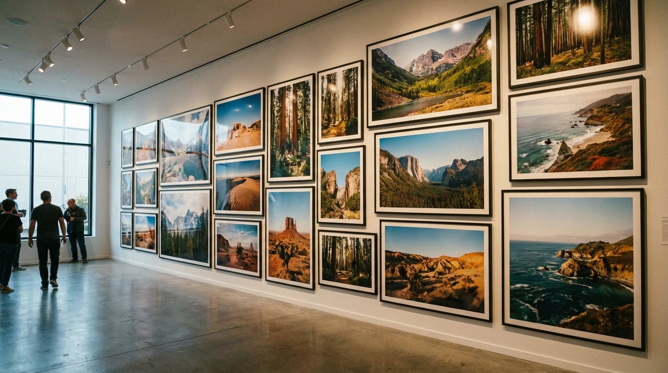
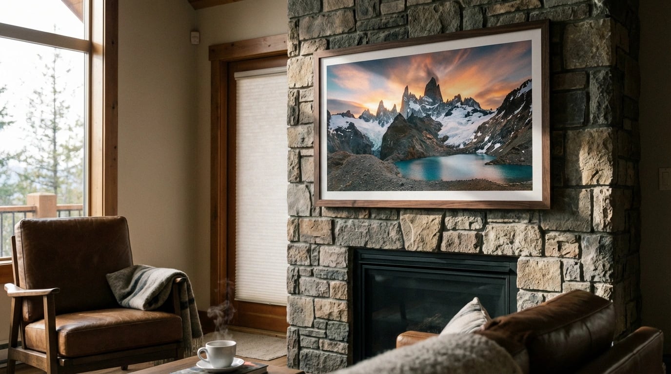
Landscape-Inspired Large Wall Art
Nature-inspired artwork remains one of the most versatile and timeless choices for home decor. Landscape prints bring the serenity of the outdoors inside, creating calming atmospheres that promote relaxation and well-being. Consequently, these pieces work exceptionally well in living rooms, bedrooms, and home offices where you seek a peaceful ambiance.
Consider panoramic coastline scenes that stretch horizontally across a wall, emphasizing width and creating a window-like effect. Similarly, majestic mountain ranges printed on canvas can establish a dramatic focal point above a sofa or bed. For those interested in exploring various natural themes, landscape art styles for home decor offers comprehensive guidance on matching scenery to your aesthetic preferences.
Forest and Woodland Themes
Woodland scenes featuring towering trees create vertical interest that suits rooms with high ceilings. These compositions naturally guide the eye upward, making spaces feel more expansive. Additionally, forest imagery pairs beautifully with natural materials like wood furniture, jute rugs, and linen textiles, reinforcing a cohesive organic design theme throughout your home.
Coastal and Ocean Vistas
Ocean scenes in large format bring tranquility and a sense of escape to any room. Whether you prefer abstract wave interpretations or photographic beach sunsets, coastal artwork complements both modern and traditional interiors. These pieces work particularly well in bathrooms, bedrooms, and relaxation spaces where a calming atmosphere is paramount.
Strategic Placement for Maximum Impact
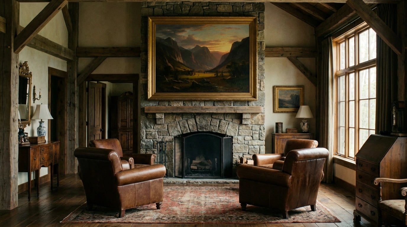
Proper placement significantly influences how effectively your large wall art transforms a space. The standard guideline positions artwork so its center sits at eye level, typically 57-60 inches from the floor. However, when hanging art above furniture, maintain 6-12 inches of space between the furniture top and the artwork’s bottom edge to create visual connection without crowding.
In living rooms, position large pieces above sofas to anchor the seating area and establish a clear focal point. Meanwhile, dining rooms benefit from dramatic artwork centered on the main wall, which guests naturally face during meals. For comprehensive display techniques, our guide to displaying art prints beautifully provides room-by-room recommendations.
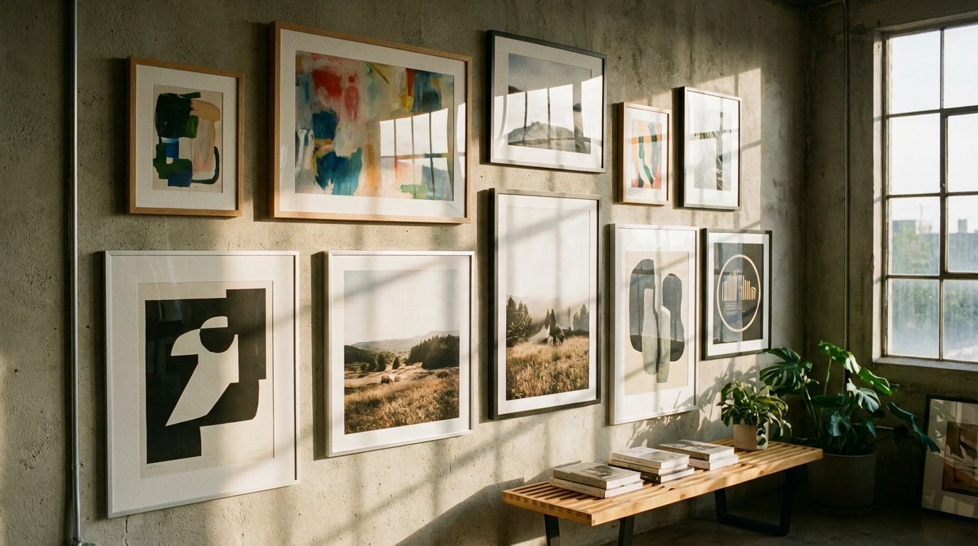
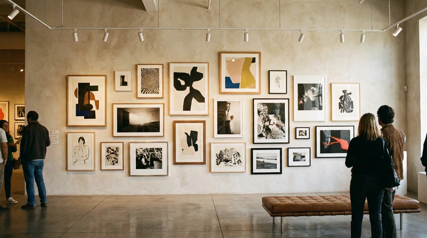
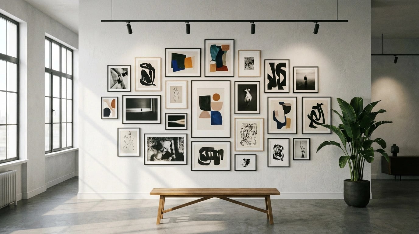
Creating Gallery Walls
While this guide focuses on single large pieces, combining multiple medium-sized artworks can create the visual impact of one large installation. Arrange three to five pieces in asymmetrical layouts, maintaining consistent spacing of 2-3 inches between frames. This approach offers flexibility and allows you to curate personalized collections that evolve with your taste.
Choosing the Right Style for Your Space
Your art style should harmonize with your existing interior design while adding personality and visual interest. Contemporary spaces pair well with abstract compositions, geometric patterns, or minimalist photography. Conversely, traditional homes benefit from classic landscape paintings, botanical prints, or representational artwork with ornate frames.
According to interior design principles, successful spaces balance various elements including color, texture, and style. Therefore, consider how your large wall art contributes to this balance. A modern abstract piece can energize a neutral room, while a serene landscape softens industrial aesthetics.
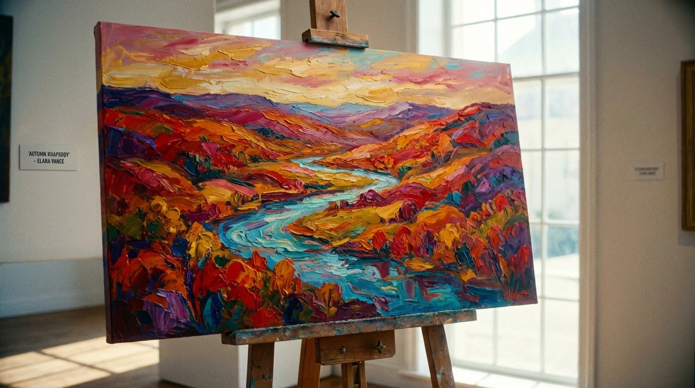
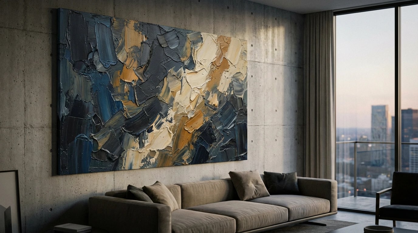
Abstract Expressionism
Abstract art in large format creates dynamic focal points that encourage interpretation and conversation. Bold brushstrokes, vibrant color blocks, or subtle tonal variations offer endless possibilities. These pieces work exceptionally well in minimalist spaces where they provide visual complexity without physical clutter.
Photographic Prints
Oversized photography brings gallery-quality sophistication to residential spaces. Black-and-white architectural photography suits modern interiors, while color nature photography adds warmth and vitality. Furthermore, the crisp detail of large-format photography creates stunning visual impact that commands attention from across the room.
Color Coordination and Room Harmony
Selecting artwork colors that complement your existing palette ensures cohesive design flow throughout your home. Identify the dominant colors in your room—typically found in large furniture pieces, area rugs, or wall paint. Subsequently, choose art that incorporates these hues along with one or two accent colors to create visual interest without clash.
For neutral rooms featuring beige, gray, or white, consider artwork with pops of color that introduce energy and personality. Alternatively, if your space already features bold colors, select art in complementary neutral tones to provide visual rest. The landscape art color matching guide offers detailed strategies for creating harmonious color schemes.
Monochromatic Schemes
Single-color artwork creates sophisticated, calming environments perfect for bedrooms and meditation spaces. Monochromatic pieces in shades of blue promote tranquility, while earth tones establish grounding, organic atmospheres. These selections allow texture and composition to take center stage without color competition.
Practical Installation Tips
Installing large wall art requires proper preparation to ensure both safety and aesthetic success. First, locate wall studs using a stud finder, as large pieces need secure anchoring points. Use appropriate hanging hardware rated for your artwork’s weight—typically D-rings with picture wire for pieces under 50 pounds, or French cleats for heavier installations.
Always enlist help when hanging large artwork, as two people ensure level placement and prevent damage to both walls and art. Mark your desired placement with pencil before drilling, and double-check measurements from multiple points. If you’re exploring options before installation, browse various styles in our art print collection to find pieces that inspire your design vision.
Lighting Considerations
Proper lighting dramatically enhances large wall art’s visual impact. Install picture lights, track lighting, or recessed spotlights to illuminate your artwork without glare. Position lights at 30-degree angles from the wall to minimize shadows and reflections. Additionally, avoid placing art in direct sunlight, which causes fading over time and damages delicate prints.
Maintenance and Care
Large art prints require minimal maintenance but benefit from regular dusting with soft, dry cloths. Glass-covered pieces should be cleaned with streak-free glass cleaner applied to the cloth rather than directly on the glass. Moreover, monitor humidity levels in your home, as excessive moisture can warp canvases and damage paper prints over time.
Common Mistakes to Avoid
Even enthusiastic decorators make predictable errors when selecting and displaying large wall art. The most frequent mistake involves choosing pieces that are too small for the designated wall space, creating a disconnected, floating appearance. Remember that going slightly larger than anticipated typically yields better visual results than undersized selections.
Another common error involves ignoring the room’s existing style and color palette, resulting in artwork that feels out of place. Additionally, hanging art too high—a surprisingly widespread issue—forces viewers to strain their necks and diminishes the piece’s impact. For room-specific guidance, consult our resource on matching art decor for every room.
Budget Considerations
Large wall art represents an investment, but numerous affordable options exist for budget-conscious decorators. High-quality prints offer gallery aesthetics at accessible price points compared to original paintings. Furthermore, choosing unframed prints allows you to control framing costs by sourcing frames separately or displaying prints on mounted canvas.
When making purchasing decisions, prioritize quality over quantity. One stunning large piece creates more impact than multiple mediocre smaller works. Research artists and print retailers carefully, reading reviews and examining return policies. The guide on essential tips for buying art prints helps you make informed decisions that maximize value.
Personal Style Evolution
Your aesthetic preferences naturally evolve over time, so consider this when investing in large wall art. Select timeless pieces that transcend fleeting trends, or choose affordable options that allow for periodic updates. Seasonal rotations keep your decor fresh—swap coastal summer scenes for cozy autumn landscapes to reflect changing moods and seasons.
Ultimately, the best large wall art reflects your personal journey and creates emotional connections. Whether you’re drawn to serene landscapes, vibrant abstracts, or striking photography, choose pieces that resonate with your experiences and aspirations. Your walls tell your story, so curate them thoughtfully with artwork that brings joy each time you enter the room.
As you embark on your decorating journey, remember that selecting large wall art is both an art and a science. By understanding proportions, considering your existing decor, and thoughtfully planning placement, you’ll transform empty walls into captivating focal points. The 25 ideas explored throughout this guide provide a foundation for developing your unique aesthetic vision, whether you prefer nature-inspired landscapes, contemporary abstracts, or classic photographic prints.
Take your time exploring options, measure carefully, and don’t hesitate to experiment with placement before committing to permanent installation. The investment you make in quality large wall art pays dividends through enhanced ambiance, increased home value, and the daily pleasure of living surrounded by beauty. For additional inspiration and practical advice, explore our comprehensive art print tips to continue refining your decorating skills and creating spaces you’ll love for years to come.

|
joerussell Australian abstract artists based in Byron Bay and curator of the GumPrints art print collection. |