Choosing the right artwork for your home can transform any space from ordinary to extraordinary. However, many homeowners struggle with understanding how to coordinate art pieces across different rooms in a cohesive way. The key to successful art decor matching lies in understanding fundamental design principles, color theory, and the unique function of each space in your home. With the right approach, you can create a harmonious flow throughout your living areas while still allowing each room to express its own personality.
The answer to matching art decor for every room involves balancing three essential elements: color harmony, style consistency, and room-specific functionality. Start by selecting a core color palette of 3-5 colors that appear throughout your home, then choose artwork that incorporates these hues in varying proportions. Meanwhile, maintain a general stylistic theme—such as contemporary, traditional, or eclectic—while allowing flexibility for each room’s purpose. For instance, living areas might feature bold statement pieces, while bedrooms benefit from calming landscapes. This approach creates visual connection between spaces without making your home feel monotonous or overly coordinated.
Understanding Color Coordination in Art Selection
Color serves as the most powerful tool for creating cohesion between artwork and your overall home design. Therefore, begin by identifying your home’s dominant colors—those found in flooring, walls, and major furniture pieces. These foundational colors should guide your art selection process rather than dictate it completely.
Consider using the 60-30-10 rule commonly employed by interior designers. Your dominant color should appear in approximately 60% of the room, secondary colors in 30%, and accent colors in 10%. Consequently, your artwork can either reinforce these proportions or provide the accent colors that add visual interest. Our color matching guide for beginners offers detailed strategies for coordinating artwork with your existing palette.
Working with Complementary and Analogous Colors
Complementary colors—those opposite each other on the color wheel—create vibrant, energetic combinations that work well in social spaces. For example, blue and orange landscape prints can add excitement to living rooms or dining areas. However, these bold combinations require careful balance to avoid overwhelming the space.
Alternatively, analogous colors sit adjacent on the color wheel and create more harmonious, soothing effects. Blue-green-teal combinations or warm earth tones from yellow through red-orange produce naturally calming environments. This approach works exceptionally well in bedrooms and private spaces where relaxation is the primary goal.
Neutral Foundations with Colorful Accents
Many modern homes feature neutral color schemes in grays, whites, and beiges. In these spaces, artwork becomes the primary source of color and personality. Moreover, neutral backgrounds allow you to rotate seasonal art pieces or update your decor without major renovations. Bold landscape prints featuring vibrant skies or colorful foliage can transform neutral rooms while maintaining flexibility for future changes.
Establishing Style Consistency Across Rooms
While colors create visual harmony, artistic style provides the underlying structure that connects your rooms conceptually. Nevertheless, maintaining style consistency doesn’t mean every piece must match perfectly. Instead, look for unifying elements such as subject matter, artistic technique, or framing choices that create subtle connections.
Contemporary homes typically benefit from minimalist artwork with clean lines, abstract compositions, or simplified landscape forms. Traditional spaces work beautifully with classical landscape paintings, realistic botanical prints, or vintage-inspired artwork. Eclectic homes can successfully mix styles, but they require a more discerning eye to prevent the space from feeling chaotic. For comprehensive guidance, explore these essential art print tips for beautiful home decor.
Mixing Styles with Intention
Successfully mixing artistic styles requires identifying a common thread that connects disparate pieces. This might be a shared color palette, similar framing, matching subject matter, or consistent scale. For instance, you might combine modern abstract landscapes with traditional botanical prints if they share an earthy color scheme and similar-sized frames.
Furthermore, the 80-20 rule applies well to mixed-style collections. Approximately 80% of your artwork should reflect your primary style, while 20% can explore complementary aesthetics. This approach maintains cohesion while allowing creative expression and preventing design monotony throughout your home.
Room-Specific Considerations for Art Placement
Each room in your home serves a distinct function, and your art selection should support these purposes while maintaining overall consistency. Living rooms, as social gathering spaces, can handle bolder statements and larger pieces. Bedrooms require calming imagery that promotes relaxation. Meanwhile, functional spaces like kitchens and bathrooms need artwork that withstands humidity and temperature fluctuations.
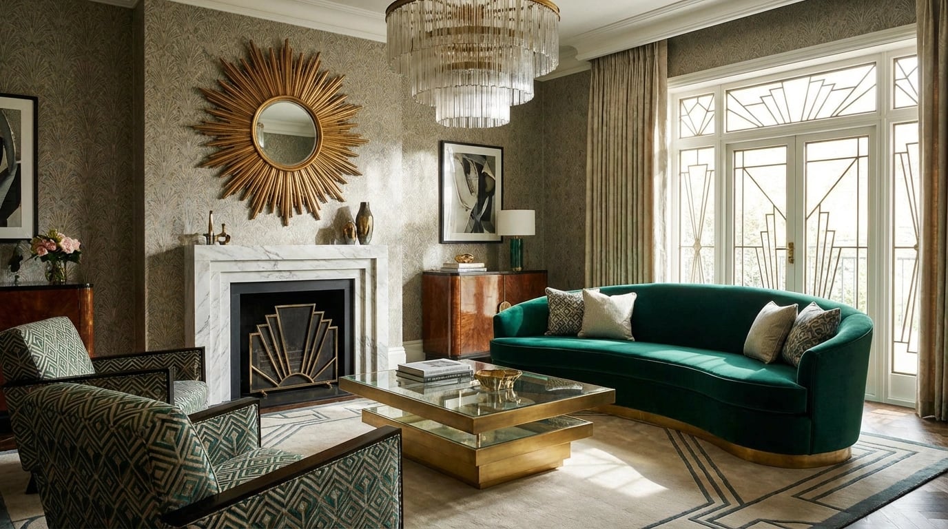
Living Rooms and Social Spaces
Living rooms provide excellent opportunities for statement pieces that anchor the entire space. Large-scale landscape prints above sofas or mantels create focal points that draw the eye and establish the room’s aesthetic direction. Additionally, these spaces can accommodate gallery walls featuring multiple complementary pieces that tell a visual story. Choosing the right landscape art for these prominent locations requires considering viewing distance and lighting conditions.
Conversation areas benefit from artwork that sparks discussion without overwhelming intimate gatherings. Mid-sized prints featuring interesting subjects or techniques encourage engagement while maintaining comfortable visual balance. Consider pieces with depth and detail that reveal more upon closer inspection.
Bedrooms and Private Retreats
Bedrooms require artwork that promotes tranquility and personal connection. Soft landscape scenes, gentle abstracts, or meaningful personal photography work well in these intimate spaces. Colors should lean toward cooler tones—blues, greens, and soft neutrals—which research from color psychology studies suggests promote relaxation and better sleep quality.
Furthermore, bedroom art should resonate personally with the occupant rather than impress guests. This makes bedrooms ideal for more experimental or emotionally significant pieces that might not fit your public spaces. Position artwork where it’s visible from the bed, creating a pleasant visual experience during quiet moments.
Kitchens, Bathrooms, and Functional Spaces
These utilitarian areas present unique challenges due to moisture, temperature changes, and limited wall space. However, thoughtfully selected artwork elevates these spaces from purely functional to genuinely enjoyable. Choose prints with protective glazing or consider framed pieces specifically designed for humid environments.
Small-scale botanical prints, food-themed artwork, or cheerful abstracts work particularly well in kitchens. Bathrooms benefit from nature-inspired imagery that reinforces the cleansing, refreshing purpose of the space. Keep pieces smaller and consider their maintenance requirements when making selections for these areas.
Size and Scale: Getting Proportions Right
Even perfectly styled and colored artwork fails if the scale doesn’t suit the space. Wall size, furniture proportions, and viewing distance all influence appropriate artwork dimensions. As a general guideline, artwork above furniture should span two-thirds to three-quarters of the furniture width below it.
For standalone wall pieces, consider the wall’s total dimensions and surrounding architectural features. A piece that’s too small appears lost and insignificant, while oversized artwork can overwhelm and create visual imbalance. Additionally, ceiling height affects perceived scale—higher ceilings accommodate larger pieces more successfully than standard eight-foot ceilings.
Creating Balance with Multiple Pieces
Gallery walls and multi-piece arrangements follow different scaling principles than single artworks. The collective visual weight of grouped pieces should match your furniture’s scale, not individual print sizes. Therefore, a gallery arrangement spanning 48-60 inches wide works well above a standard sofa, even if individual pieces measure only 12-18 inches.
Maintain consistent spacing between grouped pieces—typically 2-3 inches—to create unified compositions rather than scattered collections. Moreover, vary sizes within the grouping to add visual interest while keeping the overall arrangement balanced and intentional.
Creating Visual Flow Between Adjacent Spaces
Open-concept homes and visible sightlines between rooms require extra attention to visual flow. When standing in one room, you should sense connection to visible artwork in adjacent spaces without experiencing jarring transitions. This doesn’t mean identical pieces, but rather thoughtful coordination that guides the eye naturally throughout your home.
Repeating certain elements—specific colors, similar framing styles, or related subjects—across connected spaces creates this flow effectively. For example, if your living room features coastal landscape prints in blues and grays, adjacent hallways might incorporate smaller pieces sharing these colors. Transitional spaces like hallways serve as bridges that can introduce elements from both connected rooms. Current landscape art print trends emphasize this cohesive yet varied approach to whole-home design.
Strategic Use of Accent Walls and Focal Points
Accent walls provide opportunities to feature artwork that might overwhelm in other contexts. These intentional focal points draw attention and can house bolder, larger, or more colorful pieces than you’d use elsewhere. However, ensure these statement areas connect to your overall scheme through shared colors or complementary styles.
Furthermore, consider sightlines carefully when positioning dramatic pieces. The view from your home’s entrance, down hallways, and from primary seating areas should reveal intentional compositions rather than random placements. This strategic positioning enhances the professional, curated feeling of your entire home.
Common Mistakes to Avoid When Matching Art
Even with solid principles in mind, several common pitfalls can undermine your art coordination efforts. Recognizing these mistakes helps you avoid costly errors and achieve better results more quickly.
Over-Matching and Creating Monotony
The most frequent mistake involves matching too precisely, creating spaces that feel like catalog showrooms rather than lived-in homes. Artwork should coordinate without being matchy-matchy. Consequently, vary your pieces’ subjects, sizes, and specific hues within your color scheme. A room featuring five nearly identical landscape prints lacks visual interest regardless of perfect color coordination.
Similarly, using identical frames throughout your home creates visual monotony. Instead, select 2-3 complementary frame styles that work together without being uniform. Mix wood tones, frame widths, or finishes while maintaining similar aesthetics that support your overall design direction.
Ignoring Lighting Conditions
Artwork appears dramatically different under various lighting conditions. Natural light reveals true colors but changes throughout the day. Artificial lighting can shift color perception based on bulb type and placement. Therefore, evaluate potential artwork in your actual rooms at different times before committing to purchases. Colors that look perfect in bright gallery lighting may appear muddy or washed out in your dimmer bedroom.
Additionally, avoid placing valuable prints in direct sunlight, which causes fading over time. Consider UV-protective glazing for pieces in sun-exposed locations, or select positions where artwork receives gentle, indirect natural light that enhances without damaging.
Neglecting Personal Connection
Design principles provide helpful guidance, but your home should ultimately reflect your personality and preferences. Artwork that perfectly coordinates but holds no personal meaning creates beautiful yet soulless spaces. Therefore, allow room for pieces you genuinely love, even if they require adjusting your color scheme or stylistic approach slightly.
Practical Techniques for Testing Your Choices
Before making final purchases or creating permanent arrangements, several practical techniques help you visualize and refine your selections. These methods prevent expensive mistakes and increase confidence in your choices.
Creating Mock-Ups and Using Digital Tools
Cut paper templates matching your potential artwork dimensions and tape them to walls. This simple technique reveals scale issues and helps you experiment with positioning before making holes. Furthermore, many retailers offer visualization tools that digitally place artwork into photos of your actual rooms, providing realistic previews of final results.
Collect paint chips, fabric swatches, and small samples of your existing decor elements. Place these alongside artwork samples or online images to test color coordination in your home’s actual lighting. This hands-on approach catches potential clashes that might not be apparent when viewing pieces separately.
Starting Small and Building Gradually
Rather than purchasing an entire home’s worth of artwork simultaneously, begin with one or two key pieces per room. Live with these selections for several weeks, observing how they function in your space throughout different times of day and seasons. Subsequently, build your collection gradually, using successful pieces as anchors that guide future selections.
This measured approach allows your taste to evolve naturally and prevents the overwhelming feeling that comes from trying to perfect every room immediately. Moreover, you can browse curated landscape art collections at your own pace, making thoughtful decisions rather than hasty purchases.
Seeking Second Opinions Wisely
While personal preference matters most, fresh perspectives can identify issues you’ve overlooked. However, choose advisors carefully—seek input from people whose aesthetic judgment you trust and who understand your goals. Too many conflicting opinions create confusion rather than clarity.
Professional interior designers offer valuable expertise if you’re struggling with particularly challenging spaces or significant investments. Many designers offer hourly consultations that provide targeted guidance without requiring full-service contracts. This targeted assistance can prevent costly mistakes while still allowing you to implement changes yourself.
Successfully matching art decor across your home combines technical knowledge with personal creativity. By understanding color theory, maintaining stylistic consistency, and respecting each room’s unique function, you create spaces that feel both cohesive and personally meaningful. Remember that perfect coordination develops over time through thoughtful selection and occasional experimentation. Your home should tell your story while demonstrating thoughtful design principles that create comfortable, beautiful spaces for daily living. Start with solid foundational pieces, build gradually, and trust your instincts as you develop confidence in your decorating abilities. The result will be a home that reflects your personality while demonstrating sophisticated design sensibility.

|
joerussell Australian abstract artists based in Byron Bay and curator of the GumPrints art print collection. |
Leave a Reply