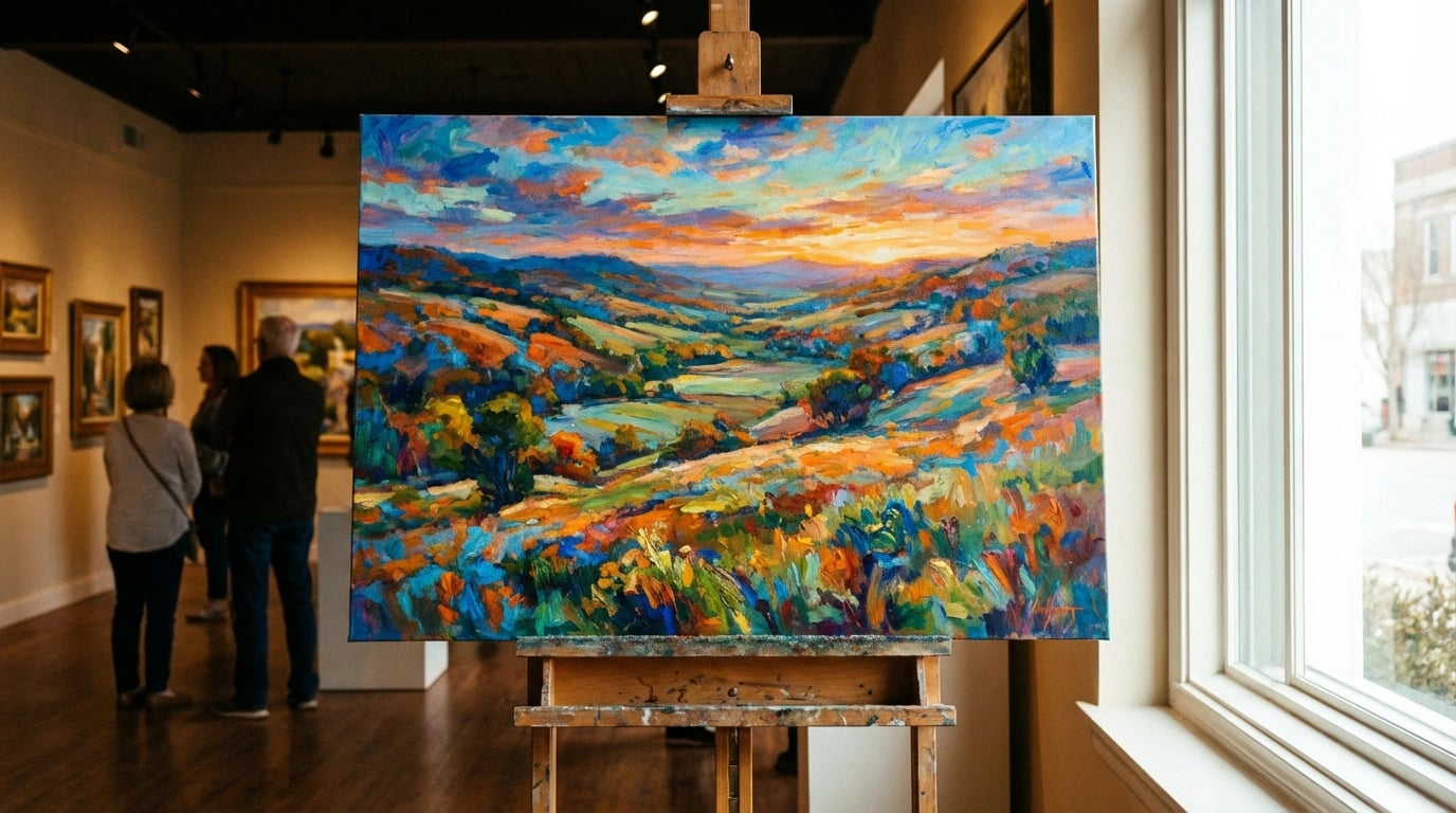
Transforming your living space with art prints offers an accessible and versatile way to express your personal style while creating a cohesive, inviting atmosphere. Whether you’re decorating a new home or refreshing your current space, choosing the right prints and displaying them effectively can dramatically enhance your interior design. The beauty of art prints lies in their ability to set the mood, complement your color scheme, and reflect your unique aesthetic preferences without the investment required for original works.
Successfully decorating with art prints requires more than simply hanging pretty pictures on your walls. The key is understanding how to select pieces that work harmoniously with your existing décor, properly sizing and positioning them for maximum impact, and creating visual narratives throughout your rooms. By following strategic principles about color coordination, scale, placement, and framing, you can achieve a professionally curated look that elevates your entire home. These ten essential tips will guide you through the process of incorporating art prints into your décor, helping you create spaces that feel both personal and polished.
Consider Your Color Palette First
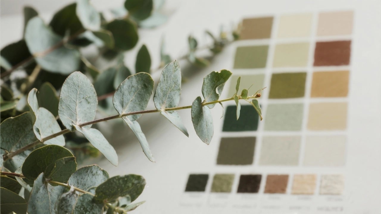
Before purchasing any prints, carefully examine the existing color scheme in your space. The most successful decorating happens when artwork complements your furniture, textiles, and wall colors rather than competing with them. Therefore, identify your room’s dominant and accent colors, then select prints that incorporate at least one of these hues.
You don’t need to match colors exactly; instead, look for harmonious tones that create visual continuity. For example, if your living room features navy blue sofas and cream walls, landscape prints with blue skies or coastal themes can tie the space together beautifully. Moreover, neutral-toned prints offer versatility and work in virtually any setting.
Consider using color matching principles specifically designed for landscape art to ensure your selections enhance rather than clash with your interior palette. This strategic approach prevents costly decorating mistakes and creates a cohesive aesthetic throughout your home.
Scale Your Art to Your Space
One of the most common decorating mistakes involves selecting prints that are either too small or too large for their intended location. Proper scaling ensures your artwork makes an appropriate visual impact without overwhelming the space. As a general rule, your print should occupy roughly two-thirds to three-quarters of the available wall space above furniture.
For instance, above a standard sofa measuring 90 inches wide, aim for artwork or a gallery arrangement spanning approximately 60-68 inches. Conversely, in smaller spaces like hallways or powder rooms, smaller prints prevent the area from feeling cramped. Additionally, consider ceiling height when determining vertical dimensions.
Size Recommendations by Space
- Large living room walls: 30×40 inches or larger for statement pieces
- Above sofas: 24×36 inches minimum, or grouped smaller prints
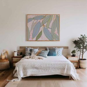
- Bedroom focal points: 24×30 inches to 30×40 inches above headboards
- Hallways and narrow spaces: 11×14 inches to 16×20 inches
- Bathroom accents: 8×10 inches to 16×20 inches
Remember that multiple smaller prints arranged together can create the visual weight of one larger piece. This approach offers flexibility and often costs less than purchasing oversized artwork.
Follow the Eye-Level Rule
Professional art curators and interior designers consistently emphasize the importance of proper hanging height. The center of your artwork should align with the average eye level, typically 57-60 inches from the floor. This positioning ensures comfortable viewing and creates a balanced appearance in your room.
However, adjust this guideline based on your specific circumstances. In dining rooms where people are primarily seated, lowering artwork slightly improves viewing angles. Similarly, in spaces with unusually high ceilings, you might raise pieces to maintain visual proportion with the architecture.
When hanging prints above furniture, maintain 6-8 inches of clearance between the furniture top and the bottom edge of your frame. This spacing creates visual connection while preventing the artwork from appearing to float awkwardly on the wall.
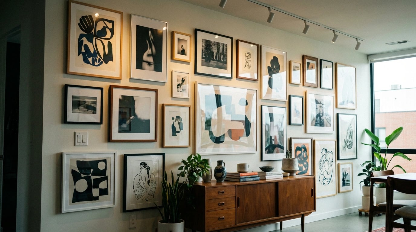
Create Cohesive Gallery Walls
Gallery walls represent an increasingly popular decorating trend that allows you to display multiple prints in an artistic arrangement. Nevertheless, executing this look successfully requires careful planning to avoid a cluttered or chaotic appearance. Start by laying out your arrangement on the floor before committing to hammer and nails.
Choose a unifying element that ties your diverse pieces together, whether that’s consistent frame color, mat style, subject matter, or color palette. For example, a collection of botanical art prints with varying frame styles creates visual interest while maintaining thematic cohesion.
Gallery Wall Layout Approaches
- Grid layout: Uniform spacing and frame sizes for clean, modern aesthetics
- Salon style: Mixed sizes with tighter spacing for eclectic, collected-over-time appearance
- Horizontal line: Aligned tops or centers for streamlined, contemporary look
- Symmetrical arrangement: Balanced around a central focal piece
Additionally, maintain consistent spacing between frames, typically 2-3 inches, to ensure visual unity. Use kraft paper templates taped to your wall before hanging to experiment with arrangements risk-free.
Choose Frames That Enhance, Not Overpower
The right frame elevates your print while the wrong choice can diminish even the most beautiful artwork. Your framing decisions should consider both the print’s style and your room’s overall aesthetic. Contemporary spaces often benefit from simple, thin frames in black, white, or natural wood, while traditional interiors may call for more ornate options.
Mat boards serve multiple purposes beyond aesthetics—they protect your print from glass contact and create visual breathing room around the image. White and off-white mats remain versatile choices, though colored mats can highlight specific tones within your artwork. Furthermore, ensure your mat width balances with your print size; larger prints generally require wider mats for proper proportion.
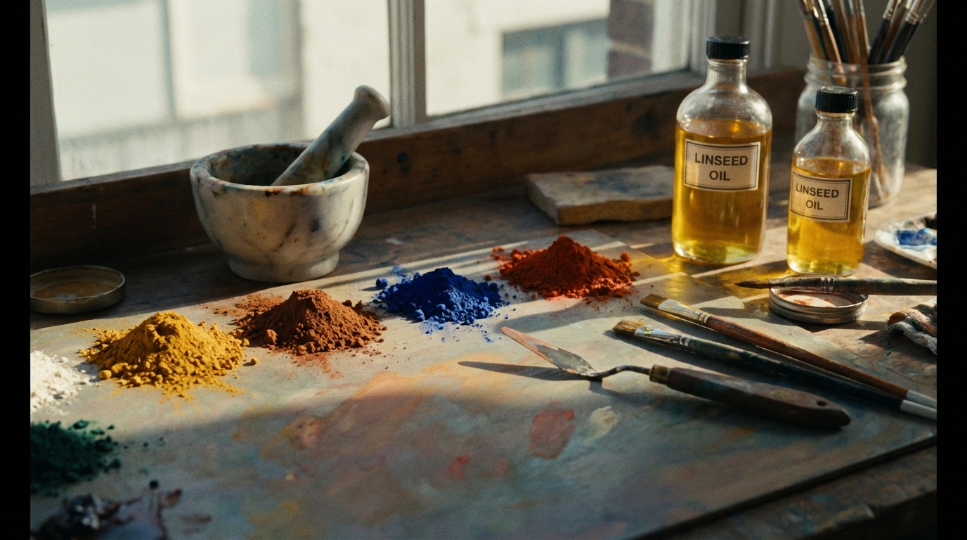
Quality framing represents an investment that protects and showcases your prints. Consider UV-protective glass to prevent fading, particularly for prints displayed in sunny locations. Browse through professional print collections to see how expert framing choices enhance different art styles.
Match Art to Room Purpose
Different rooms serve distinct functions, and your artwork selections should reflect and enhance these purposes. Consequently, the energizing prints appropriate for a home office differ significantly from the calming images ideal for bedrooms. Thoughtful matching between art and room function creates harmonious spaces that support their intended activities.
Bedrooms benefit from serene landscapes, soft abstracts, or gentle nature scenes that promote relaxation and restful sleep. Meanwhile, kitchens and dining areas pair well with food-related imagery, botanical prints, or vibrant colors that stimulate appetite and conversation. Home offices thrive with motivational imagery, inspiring landscape compositions, or abstract pieces that encourage creativity without causing distraction.
Room-Specific Recommendations
- Living rooms: Statement pieces reflecting your personality and style preferences
- Bedrooms: Calming landscapes, soft color palettes, peaceful nature scenes
- Bathrooms: Coastal themes, botanical prints, water-related imagery
- Children’s rooms: Playful illustrations, educational themes, bright colors
- Entryways: Welcoming images that set your home’s aesthetic tone
According to interior design principles, artwork significantly influences mood and perception of space, making these choices particularly important for overall home atmosphere.
Optimize Lighting for Impact
Even the most stunning print loses impact when poorly lit, while proper illumination transforms good artwork into captivating focal points. Natural light beautifully illuminates prints during daytime hours; however, position artwork away from direct sunlight to prevent fading and damage. Eastern and northern exposures typically provide gentler illumination than harsh southern or western light.
For evening viewing and rooms lacking natural light, consider dedicated picture lights, adjustable spotlights, or track lighting. LED options offer energy efficiency and minimal heat output, protecting your prints from thermal damage. Additionally, ensure lighting angles avoid glare on glass-fronted frames by positioning lights at approximately 30-degree angles.
Dimmer switches provide flexibility to adjust lighting levels based on time of day and desired ambiance. This control allows you to highlight your artwork dramatically for entertaining or create subtle background presence during quiet evenings.
Select Prints with Personal Meaning
While following design principles ensures professional-looking results, your home should ultimately reflect your personality and experiences. Choose prints that resonate with you emotionally, whether they depict places you’ve visited, subjects you’re passionate about, or simply images that bring you joy. This personal connection transforms your house into a home.
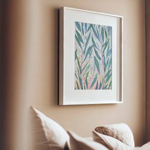
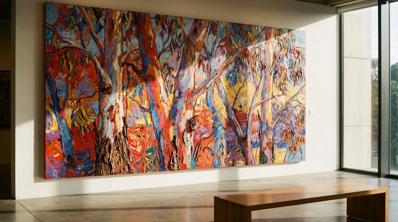
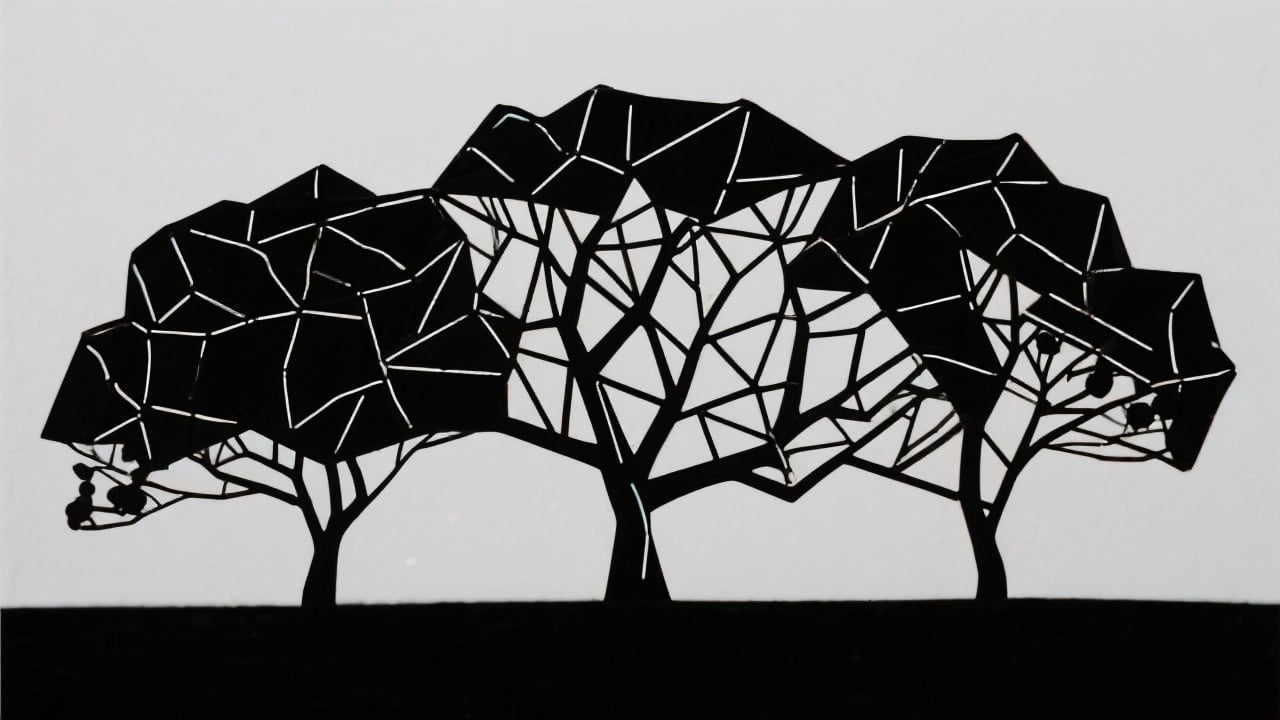
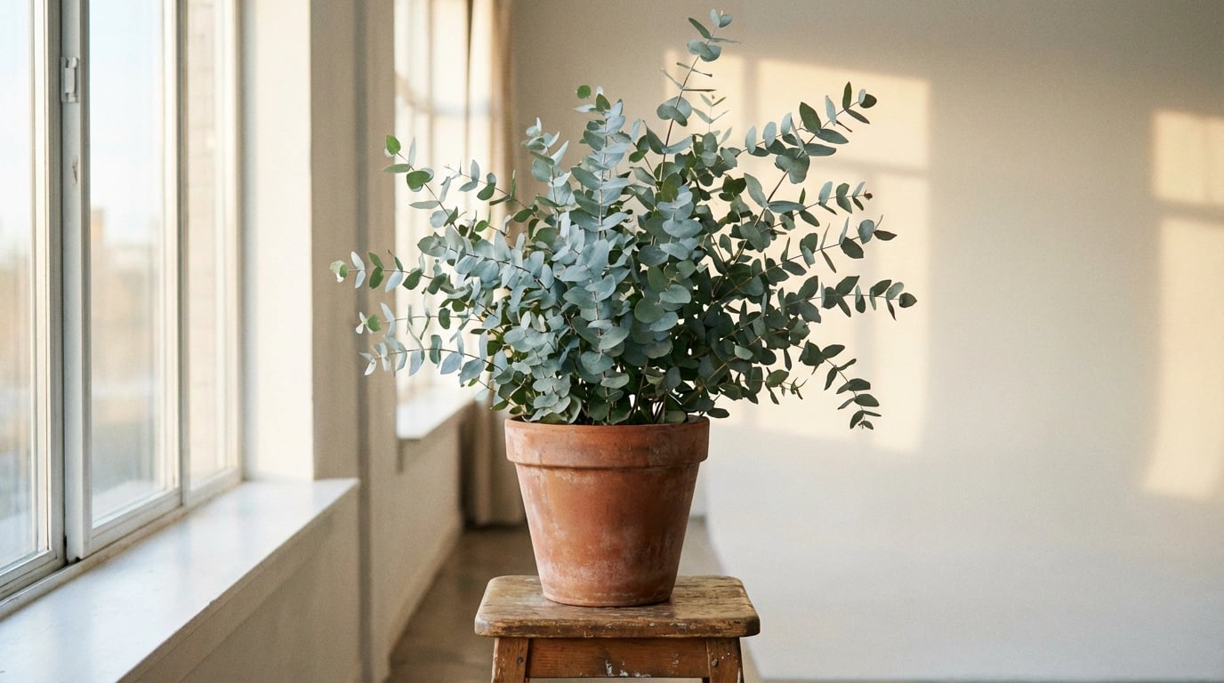
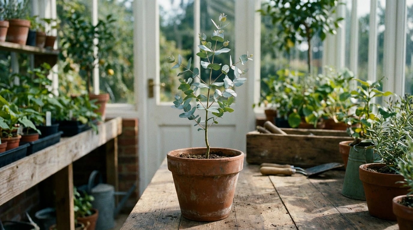
Consider artwork that tells your story or represents your interests. Nature enthusiasts might gravitate toward eucalyptus-themed prints and botanical compositions, while travel lovers could display landscape prints from favorite destinations. Similarly, collectors might focus on specific artists, styles, or periods that fascinate them.
Personal meaning also helps you commit confidently to your choices. When you genuinely love a print, you’re more likely to display it prominently and appreciate it daily, rather than relegating it to storage after brief display. Therefore, let your heart guide selections within the framework of sound design principles.
Mix Styles Thoughtfully
Contrary to popular belief, you don’t need to commit to a single art style throughout your home. Mixing different styles, mediums, and periods can create dynamic, collected-over-time aesthetics that feel authentic and lived-in. However, successful mixing requires intentionality rather than randomness.
Establish connecting elements that unify diverse pieces—this might include consistent color palettes, complementary subject matter, or coordinated framing. For instance, pairing contemporary abstracts with traditional landscapes works when they share similar colors or tones. Likewise, mixing photography with paintings succeeds when unified by black-and-white palettes or common themes.
Start conservatively if you’re new to style mixing, perhaps combining just two distinct approaches. As you develop confidence and eye, gradually introduce additional variety. Remember that each room can have its own personality while contributing to your home’s overall aesthetic narrative.
Rotate Your Collection Seasonally
Finally, consider treating your print collection as a dynamic element of your décor rather than a permanent installation. Seasonal rotation keeps your spaces feeling fresh and allows you to enjoy more pieces from your collection throughout the year. This approach proves particularly valuable for collectors who’ve accumulated more artwork than wall space.
Lighter, brighter prints with floral or coastal themes feel perfect for spring and summer months, while warmer tones and cozier subjects suit autumn and winter. Additionally, rotation prevents the visual fatigue that sometimes occurs when viewing the same images daily for extended periods. You’ll rediscover and appreciate pieces anew after they’ve been stored for several months.
Store rotated prints properly to preserve their condition—keep them in acid-free sleeves or portfolios, stored flat or upright in cool, dry locations away from direct sunlight and humidity. Proper storage ensures your entire collection remains in excellent condition regardless of display frequency.
Creating Your Perfect Gallery
Decorating with art prints combines creative expression with strategic design principles to transform ordinary rooms into extraordinary living spaces. By considering color coordination, proper scaling, thoughtful placement, and personal preferences, you can curate a home gallery that reflects your unique style while adhering to professional design standards. Remember that successful decorating is a journey rather than a destination—your tastes will evolve, your collection will grow, and your arrangements will change over time.
Start with these foundational tips, but don’t be afraid to experiment and adjust based on what works best in your specific spaces. The most beautiful homes are those where residents feel comfortable, inspired, and truly at home. Whether you’re drawn to native botanical themes, dramatic landscapes, or contemporary abstracts, your art print selections offer endless opportunities to personalize and enhance your living environment. Take your time, trust your instincts, and enjoy the creative process of transforming your walls into meaningful displays that bring daily joy and visual interest to your home.

|
joerussell Australian abstract artists based in Byron Bay and curator of the GumPrints art print collection. |